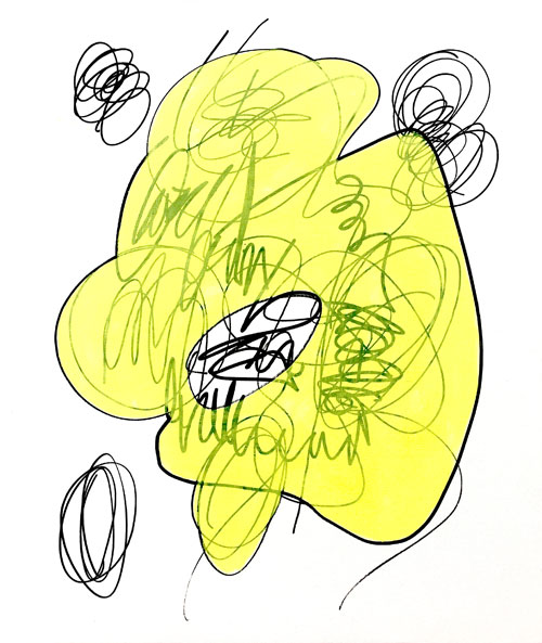
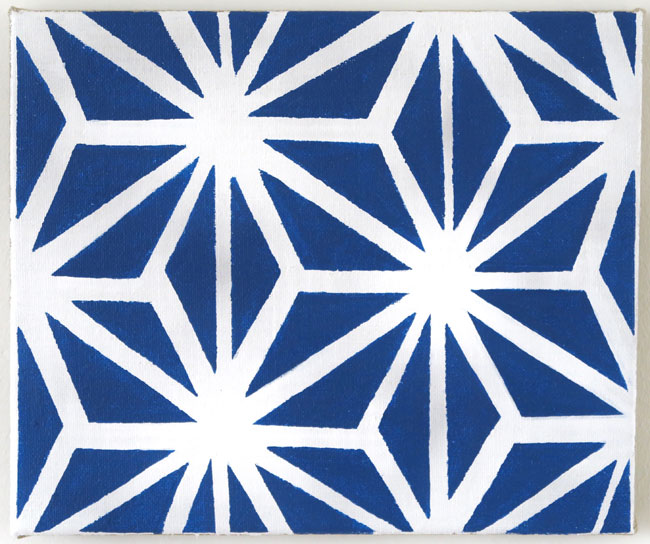
JORGE LUIS BARRAGAN CASTAÑO: 'Paprika Oven', 2019
Slaap Lekker Studio
in AP
7 september - 6 oktober 2019
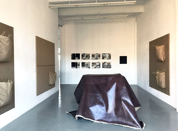
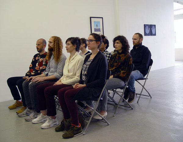
De tentoonstelling 'Slaap Lekker Studio' is een 'wake up call'. Kunst als blockbusters op Instagram, Facebook, YouTube of beurzen en biennales maait het gras voor de voeten van klassiek werkende galeries weg. Invloedrijke galeries versterken hun zichtbaarheid en impact door gedragspatronen van grote bedrijven over te nemen. De bezem moet toch door inhoudelijk ambitieus werkende galeries gehaald worden; ook door die van Galerie van Gelder.
De galerie heeft altijd dicht bij de kunstenaars gestaan en in de groepstentoonstelling 'Slaap Lekker Studio' is die houding terug te vinden. De kunstenaars zijn gevraagd om een werk te komen installeren, een event te doen of in kunstactie te komen. Dat gebeurt op de openingsdag zaterdag 7 september met tussenposen vanaf 15:00 uur. De kunst en kunstenaarshouding komen met nadruk terug bij de kunstenaar en het publiek dat daarbij aanwezig wil zijn.
Acties, events, performances en introducties worden verricht door de volgende kunstenaars:
Özgür Atlagan
Jorge Luis Barragan Castaño
Salim Bayri
Henry Byrne
Stephanie Jack Engelbrecht
Paraskevi Frasiola
Voebe de Gruyter
Kimball Gunnar Holth
Wjm Kok
Jaap Kroneman
Nokukhanya Langa
Lee McDonald
Ian Page
Lisa Smithson
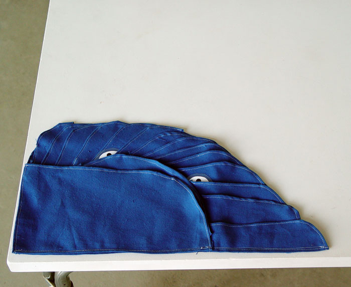
Jorge Luis Barragan Castaño poft een paprika op gloeiende kolen en de hitte wordt afgevoerd via een schoorsteen van keukenfolie. Zijn oven is voorzien van potloodtekeningen.
Nokukhanya Langa knipt het haar van bezoekers en legt een verband tussen knippen en schilderen.
Salim Bayri is geïnteresseerd in eten. In deze tentoonstelling zal hij hangop als sculptuur maken.
Kimball Gunnar Holth dweilt de vloer terwijl hij nadenkt over een mogelijk volgend werk.
Voebe de Gruyter zal tijdens de opening een volgende belangrijke stap in haar werk laten zien; gewoon door er over te vertellen. Voor het eerst brengt zij met behulp van een performance object - een rechtop staande tekening - het verhalende deel ervan extra tot leven. Het narratieve element in haar werk is nu een wezenlijk oraal onderdeel van het werk.
Stephanie Jack Engelbrecht introduceert in een speciale outfit haar alter-ego Barneby toe.
Wjm Kok komt steeds op een andere manier tot de kern van een monochroom.
Lee McDonald bewerkt mechanisch een ingeschakeld tv-scherm met een hamer die uiteindelijk ontploft.
Kortom, ik denk dat deze tentoonstelling over 'acties' en over 'de mentaliteit van de kunstenaars' gaat.
In de AP zal een slaap - annex zitruimte ingericht worden. Die inrichting is op te vatten als een ruimte waar kunstenaars van de Slaap Lekker Studio en collega's uit Groningen kunnen verblijven, opdat er niet op de openingsdag terug gereisd hoeft te worden.
.
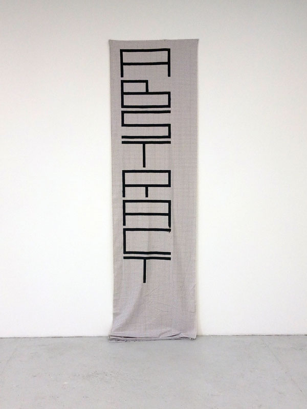
NICOLAS CHARDON: Abstract (banner), 2019
NICOLAS CHARDON
THE BEAR, THE SQUARE & THE EMPHASIS
t/m 14 april 2019
for English text scroll down
Jaren geleden stond op internet een afbeelding van een beer die plat uit een boom viel, terwijl een politieagent toekeek. Nicolas Chardon zoekt in zijn kunst op een vergelijkbare manier ook naar iets dat opduikt, terwijl hij alles onder controle heeft. De geometrische vormen in Chardon zijn werk volgen soepel de golvende lijnen van de bedrukte patronen in de opgespannen stof: er is sprake van concept en spel. Het plezier om met deze elementen een schilderij te maken straalt er vanaf. Een beetje van: waar is de beer?
Voor de tentoonstelling 'The Bear, the Square & the Emphasis' ligt de nadruk op een klein vierkant dat van schilderij tot schilderij in steeds grotere omvang is opgehangen. Zo ontstond een reeks van zwarte vierkanten of verdubbelingen; het resultaat is rigide, maar toch niet.
Ter gelegenheid van de tentoonstelling verschijnt een publicatie 'THE BEAR, THE SQUARE & THE EMPHASIS', uitgegeven door Connoisseurs in Parijs. Elk exemplaar heeft een originele tekening als bijlage.
Nicolas Chardon (1974) woont en werkt in Parijs. Hij heeft solotentoonstellingen gehad in Frankrijk, Nederland, Duitsland, Luxemburg, Italië en Zuid Korea. In 2018 had hij een solotentoonstelling in Kunstverein Bremerhaven in Duitsland. In 2017 richtte hij samen met Karina Bisch een uitgeverij op die Hedendaagse Schilderkunst promoot door van kunstenaarsuitgaven, multiples en fanzines te publiceren.
English text
Years ago an image on the Internet showed a bear falling flat out from a tree while a policeman watched. Nicolas Chardon also looks for something that appears in a similar way, having everything in control. The geometric shapes in Chardon's work smoothly follow the wavy lines of the printed patterns in the stretched fabric: there is concept and play. The pleasure of making a painting with these elements radiates from it. A bit like: where is the bear?
For the exhibition "The Bear, the Square & the Emphasis" the emphasis is on a small square that is hung from painting to painting in a size-increasing row. This resulted in a series of black squares or doublings; the result is rigid, but not yet.
On the occasion of the exhibition Connoisseurs in Paris published a book called 'THE BEAR, THE SQUARE & THE EMPHASIS' with images by Nicolas Chardon and texts by Kees van Gelder. Each copy has an original drawing as inlay.
Nicolas Chardon (1974) lives and works in Paris. He has had solo exhibitions in France, the Netherlands, Germany, Luxembourg, Italy and South Korea. In 2018 he had a solo exhibition at Kunstverein Bremerhaven in Germany. In 2017, together with Karina Bisch, he founded a publishing house that promotes Contemporary Painting by producing artists' publications, multiples and fanzines.
.
ANSUYA BLOM
in AP
ANSUYA BLOM: Portrait of Suzanne U., 2011
Suzanne U.
30 maart - 4 mei 2019
Past exhibitions:
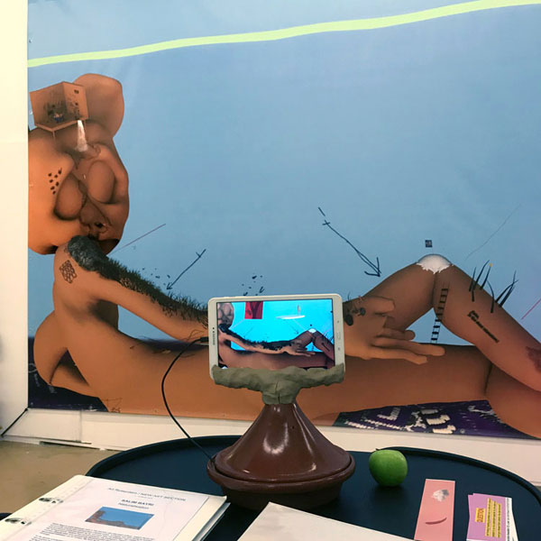
SALIM BAYRI: Naturalisation, 2019
SALIM BAYRI
Naturalisation
16 februari - 23 maart 2019
for English text scroll down
Salim Bayri's werk beweegt zich in het domein van identiteit-cultuur, waarin hij op een humorvolle manier een persoonlijke vrijheid zoekt. In plaats van zich bezig te houden met politieke conflicten geeft hij de voorkeur aan het aftasten van codes en gebruiken die hij tegenkomt. Dat doet hij zonder een oordeel te vellen.
Tijdens het communiceren via Instagram, Facebook of WhatsApp worden dikwijls zeer snel getekende ideogrammen door hem ingebracht om het gespreksonderwerp toe te lichten. Bij hem is de virtuele wereld even concreet als de analoge.
In de eerste solotentoonstelling genaamd 'Sad Ali mapping the place' in Galerie van Gelder in 2018 vertelde Salim Bayri op een TV-scherm over wat hem opvalt in de wereld waarin hij terecht is gekomen. Hij heeft in zijn jeugd kennis gemaakt met een Marokkaanse mengelmoes van culturen: "It's about a Berber population with an Arab culture and a Spanish and French colonial influence, the whole thing painted with a Muslim coat while Unilever shampoo is sold in the market on the back of a donkey. Past and present are superposed."
Voor Salim Bayri is een digitale print (300 x 470 cm) met een AR extensie een samenballing van zijn verwondering over wat hij om zich heen ziet. Met een vriendelijk bevragende toon plaatst hij zijn alter ego Sad Ali in een landschap waarin een object aan de hemel een echt Marokkaans rond brood is. Het heeft niet echt een politieke lading, maar roept toch vragen op over thema's uit het dagelijks nieuws over emigratie vermengd is met beelden uit de cultuur van de Maghreb waar hij mee opgegroeid is. Misschien is niet alleen Europa als een mengelmoes aan het veranderen, maar het lijkt erop dat óók Salim aan al deze invloeden onderhevig is.
Salim Bayri (born in 1992, Casablanca) studeerde af aan de Escola Massana in Barcelona. In 2017 behaalde hij een Masters-graad aan het Art, Design and Technology van het Frank Mohr Instituut in Groningen. Met zijn broer Tayeb Bayri vormt hij de band Bazoga (soundcloud.com/bazoga) die o.a. optrad in Parijs, Berlijn, Rotterdam, Amsterdam en Barcelona.
Salim Bayri was in 2018 genomineerd voor de NN Award 2018, samen met Rafaël Rozendaal, Sam Samiee en winnaar Pauline Curnier Jardin. Vanaf januari 2019 heeft hij een residentie op de Rijksakademie in Amsterdam.
English text
Salim Bayri's work relates to identity and culture, in which he seeks a personal freedom in a humorous way. Instead of engaging in political conflicts, he prefers to scan codes and customs that he encounters. He does that without making a judgment.
When communicating via Instagram, Facebook or WhatsApp, often very quickly drawn ideograms are inserted by him to explain the topic of conversation. For him, the virtual world is as concrete as the analogue.
In the first solo exhibition called 'Sad Ali mapping the place' in Galerie van Gelder in 2018, Salim Bayri showed his works while he talks on a TV screen about what strikes him in the world in which he ended up. In his youth he became acquainted with a Moroccan mix of cultures: "It's about a Berber population with an Arab culture and a Spanish and French colonial influence, the whole thing painted with a Muslim coat while Unilever shampoo is sold in the market on the back of a donkey. Past and present are superposed."
A large digital print (300 x 470 cm) with an AR extension depicts his alter ego Sad Ali in a reclined position. He wonders while he looks around him. With a friendly questioning gesture on his leg he asks: 'Noku, is this about colonialism?', while Sad Ali lies in a landscape in which an object in the sky is a real Moroccan round bread. This canvas does not really have a political meaning, nevertheless it raises questions about what we see in the daily news about emigration mixed with images from a culture of the Maghreb e.g. where he grew up.
Salim Bayri (born in 1992, Casablanca) graduated from the Escola Massana in Barcelona. In 2017 he obtained a Masters degree at Art, Design and Technology from the Frank Mohr Institute in Groningen. Together with his brother Tayeb Bayri he plays in a duo-band Bazoga (soundcloud.com/bazoga) that performed in Paris, Berlin, Rotterdam, Amsterdam and Barcelona.
Salim Bayri was nominated for the 2018 NN Award in 2018, together with Rafaël Rozendaal, Sam Samiee and winner Pauline Curnier Jardin. From January 2019 he has a residency at the Rijksakademie in Amsterdam.
LILY VAN DER STOKKER
in GvG
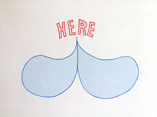
LILY VAN DER STOKKER: Here and here and here, 2017 (detail)
Here and here and here
alongside a solo show in the Stedelijk Museum Amsterdam
23 November 2018 - 30 January 2019
AMSTERDAM ART WEEKEND
.
Monochrome
WJM KOK
in AP
23 November 2018 - 5 January 2019
.
JAAP KRONEMAN
Ik wil er nog geen woorden aan verbinden
27 oktober - 14 november 2018
.
NOKUKHANYA LANGA
27 oktober - 14 november 2018
BRUD: Malpa [Ape], 2018 en Milf [Sexy Mother], 2018
Brud
Love Story
8 september - 20 oktober 2018
OPENING: zaterdag 8 september, 17:00 - 19:00 uur
for English text scroll down
De tentoonstelling 'Love Story' van Brud is een demonstratie van affectie, een PDA - Public Demonstration of Affection. Dit is zowel een exhibitionistisch als voyeuristisch verschijnsel dat sinds de opkomst van Facebook en Instagram meer en meer opgeld doet. Brud toont in 'Love Story' een onderkoelde versie van PDA, zou je kunnen zeggen. Het enorme scala aan ideeën en technische objecten in vorige presentaties is teruggebracht tot gefragmenteerde symbolen van devotie, atmosferische lichteffecten en seks. Dit geheel wordt grafisch verbeeld met een zeefdruk en enkele digitale prints.
De galerie is ondergedompeld in een intens bad van rood en ultraviolet licht dat bij binnenkomst de toon zet. Er zindert een lyrische liefde in delen dat als motief verweven wordt met de suggestie van het kabbelende geluid van een handgemaakt windorgel, zo lijkt het.
Aditya Mandayam studeerde van 2011-2013 aan de Rijksakademie van beeldende kunsten in Amsterdam. In 2014 sloot hij een artist's in residence af in Wiels, Brussel en had een solotentoonstelling in Kim? in Riga, Letland. Vanaf 2016 werkt hij onder de naam Brud steeds nauwer samen met grafisch vormgever Emilia Zalewska. In 2018 maakte Brud zijn eerste institutionele solotentoonstelling in Kunstverein München in Duitsland waar zijn boek The Ooze werd uitgegeven. In november neemt Brud deel aan een groepstentoonstelling 'School of Pain' in Art in General, USA.
English text
Brud / Aditya Mandayam / Emilia Zalewska
The exhibition "Love Story" of Brud is a demonstration of affection, a kind of PDA; a Public Demonstration of Affection. This is both a voyeuristic as well as exhibitionistic phenomenon since Facebook and Instagram were introduced. Brud demonstrates in "Love Story" a cool version of PDA, one could say. The enormous range, ideas and technical objects in previous presentations of materials are reduced to fragmented symbols of devotion, atmospheric lighting and sex. As a whole this is expressed with graphic imaginary like screen print and several digital prints.
The gallery is submerged in an intense cloud of both red and ultra violet light emphasizing a lyrical love formally shaped. And somewhere in the space the purling sound of a handmade wind organ seems to create the potentials and possibilities of a love story at hand.
Aditya Mandayam studied at the Rijksakademie van Beeldende Kunsten from 2011-2013 in Amsterdam. In 2014 he finished an artist's in residence at Wiels, Brussels and had a solo exhibition in Kim? in Riga, Letvia. In 2016 he started to work closer together with graphic designer Emilia Zalewska. In 2018 Brud had its first institutional solo exhibition in Kunstverein München in Germany what published his book "The Ooze" with elaborated texts on what Brud is standing for. In November 2018 Brud will participate in a group exhibition "School of Pain" at Art in General in New York, USA.
Prospects
 STEEL STILLMAN, walldrawing (detail), 2018
STEEL STILLMAN
wallpaintings, photos
in GvG
2 June - 8 July 2018
Steel Stillman is renowned for creating blind spots in his photos, wall drawings and even his text works. In his exhibition "Prospects" the emphasis is put on a site-specific 17-meter-long wall drawing that represents the contours of a flattened interior, which might almost be the result of an exquisite corpse. On it, an enigmatic double portrait is hung. Both the wall painting and the photo have a broken appearance. Something is missing; story, place and situational precision are unclear.
In science it is known that the remembrance of an event changes each time it is recollected. Steel Stillman touches upon the dubious visualisation and reconstruction of personal history. For decades, in his snapshot photography, he has sensed that this is also applicable to his own past and present; his photos often depict a distant recollection of what happened. Hence a nostalgic undertone is noticeable.
The past is difficult to record like the future is difficult to foresee. The time ahead hides a priori blind areas of remembrance. Perhaps it is something we could take into account when telling a story or showing a photo. Our personal recollections have the prospect of becoming bumpy and fragmented. Will they become as uncertain as the pages of a family album, triggering viewers to project what was once there?
Before The Fire Starts
SALIM BAYRI
KIMBALL GUNNAR HOLTH
THIERRY OUSSOU
&
CLEMENTINE EDWARDS
KENJI NAKAMA
in AP
2 June - 8 July 2018
Before the Fire Starts
Works of Salim Bayri and Kimball Gunnar Holth are brought together around a floor sculpture 'Poetry without alphabet' (2016) of Thierry Oussou. The latter represents a plastic garbage bag with branches that in many countries are used for open fires and cooking devices. In the Netherlands these dry sticks can be found or collected everywhere, since we don't associate this naturally with a potential source of energy.
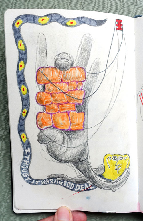
SALIM BAYRI: 'I thought it was a good deal', 2018
The exhibition 'Before the fire Starts' shows works of young artists at the beginning of their career before they are part of the art establishment. As a gesture of dragging a few of their peers with them Salim and Kimball invited Clementine Edwards (Australia) and Kenji Nakama (Japan) to contribute to this exhibition. Their works are shown in a glass vitrine.
KIMBALL GUNNAR HOLTH
in GvG
Wallpapers & gas tanks
31 maart - 25 april 2018
Kimball Gunnar Holth werkt met los getrokken beschilderd canvas, douchetegels, gipsplaat en combineert die met brokken piepschuim en puin. Het levert onrustige installaties op met daarin weinig of geen kant-en-klaar werk. Het proces van werken is na de gedane arbeid in alle stilte achteraf nog steeds in zijn installaties te traceren. Als een bevroren moment van energie liggen een aantal schilderingen en objecten bij elkaar in spanning te wachten. Maar op wat?
In 'Wallpaper & gas tanks' is een los staande galeriemuur beplakt met fotografisch bedrukt behang. Het is een installatie die een brug wil slaan tussen het kant-en-klare en het gebaar dat de schilder toont met kwast, verf op muur of keukentegel. Maar wat doen de jerry cans in deze context; de fik erin? Of is het energie die in toom gehouden moet worden?
English text
Kimball Gunnar Holth works with ripped off painted canvas, shower tiles, plasterboard and combines these with chunks of styrofoam and debris. This results in restless installations with little to no cash-and-carry works. The process of working may still be traced down after the work is done and silence is there. As a frozen moment several paintings and objects are together waiting in suspense. But waiting for what?
In "Wallpaper & gas tanks" a long gallery wall is sticked on with photo printed wallpaper. It is an installation that apparently wants to overcome the ready-and-finished with the gesture that the painter shows with brush, paint on wall or kitchen tile. But what are the gas tanks doing in this context; to light it on fire? Or is it energy that has to be kept in check?
Three is more
JOHN M ARMLEDER, Untitled - Furniture Sculpture 188, 1988
JOHN M ARMLEDER
in AP
17 maart - 25 april 2018
_______________________
The Language
LUCIANO BARTOLINI (1948-1994)
drawings and artist's books
in AP
28 april - 30 mei 2018
_______________________
SALIM BAYRI
in GvG
Sad Ali mapping the place
27 januari - 14 maart 2018
Salim Bayri's werk beweegt zich in het domein van culturele identiteiten, waarin hij op een humorvolle manier een persoonlijke vrijheid zoekt. In plaats van zich bezig te houden met (politieke) conflicten geeft hij de voorkeur aan het aftasten van codes en gebruiken die hij tegenkomt. Tijdens het communiceren via Instagram, Facebook of WhatsApp worden dikwijls zeer snel getekende ideogrammen door hem ingebracht om het gespreksonderwerp toe te lichten. Bij hem is de virtuele wereld even concreet als de analoge.
In de eerste solotentoonstelling genaamd 'Sad Ali mapping the place' toont Salim Bayri zijn werken terwijl hij als een commentator vanaf een TV-scherm verslag uitbrengt over wat hem opvalt in de wereld waarin hij terecht is gekomen. Hij heeft in zijn jeugd kennis gemaakt met een Marokkaanse mengelmoes van culturen:
"It's about a Berber population with an Arab culture and a Spanish and French colonial influence, the whole thing painted with a Muslim coat while Unilever shampoo is sold in the market on the back of a donkey. Past and present are superimposed." In de film deelt hij met een licht kritische ondertoon zijn gedachten en beschouwingen met de kijker. Een van de dingen die hem in Nederland is opgevallen is het verschijnsel 'Kijkshop'; achter glas staat een artikel met een bijbehorend nummer. Na je keuze gemaakt te hebben kan je aan de kassa afrekenen.
"Het is te koop, maar je mag het niet aanraken. Het is een vroege vorm van efficiënt virtueel shoppen", zegt hij hierover. Hierdoor aangezet heeft hij zijn eigen "
wearables" met bijbehorend nummer in een vitrine geplaatst:
'De kijkshop'. In een hoek van de ruimte is een mise-en-scène
'Sandwich break' ingericht. Het is een provisorisch ingerichte plek zoals werklieden op een bouwplaats zonder bouwkeet dat in bepaalde landen doen. Kortom hij speelt met labels en gebruiken die hij kantelt, keert en verwerkt in zijn animatiefilms, foto's, kleine objecten en muzikale performances.
Tijdens de opening op zaterdag 27 januari zal Bayri een aantal muzikale performances ten uitvoer brengen. In een surrealistische setting speelt de ontvoering van Europa door Zeus op een reusachtig canvas een centrale rol. Het barst uit zijn voegen van de attributen en voorwerpen. Voor Salim Bayri is deze digitale print (ca 400 x 350 cm) een samenballing van zijn verwondering over wat hij om zich heen ziet. De ontvoering van Europa door Zeus heeft geen politieke lading, maar roept toch vragen op over waarom dit Grieks mythologische onderwerp vermengd is met beelden uit de cultuur van de Maghreb waar hij mee opgegroeid is. Misschien is het niet alleen Europa dat zichzelf verandert, maar óók Salim die aan al deze invloeden onderhevig is en daarin zijn plaats moet zien te vinden.
Salim Bayri (born in 1992, Casablanca) woont en werkt sinds 2015 in Groningen, studeerde af aan de Escola Massana in Barcelona en behaalde in 2017 een Masters graad aan het Art, Design and Technology van het Frank Mohr Instituut in Groningen. Met zijn broer Tayeb Bayri vormt hij de band Bazoga (soundcloud.com/bazoga) die o.a. optrad in Parijs en Berlijn.
Salim Bayri is genomineerd voor de NN Award 2018. Op woensdag 7 februari wordt om 19.00 uur tijdens de opening van Art Rotterdam de winnaar bekend gemaakt die als aanmoediging een bedrag van € 10.000,- in ontvangst mag nemen. De andere genomineerden zijn Rafaël Rozendaal, Pauline Curnier Jardin en Sam Samiee.
MARIEKE ELZERMAN
in AP
'Marieme / Marieke', 2018
film 21'31''
world première

MARIEKE ELZERMAN: 'Marieme / Marieke', 2018 (film still)
27 januari - 7 maart 2018
scroll down for English text
'Marieme / Marieke'
De nieuwe film 'Marieme / Marieke' (2018) van Marieke Elzerman is van een eenvoudige schoonheid. Het script is simpel: twee meisjes van nèt-geen-tiener-meer besluiten via de WhatsApp elkaar beter te leren kennen. De een studeert en woont in Gent (België) en de ander leeft te midden van haar familie in Dakar (Senegal). Beiden filmen op een luchtige bijna onbeholpen manier hun omgeving. Marieme is uitdagend en expressief, terwijl Marieke meer bedachtzaam en terughoudender is. Dat leidt ertoe dat de een de ander uitdaagt om meer naar buiten te treden en selfies te maken. Tegenstellingen zijn er wel, maar de verschillen zijn ook weer niet zo groot en dat maakt deze film tot een feitelijk vastleggen van twee gelijkwaardige leefwerelden, zonder dat maatschappelijke kritiek onderliggend in de film wordt gestopt. Dat laatste maakt deze debuutfilm vriendelijk en humaan.
Aan het eind van de film is een warm gebaar van Marieke's kant te zien. Twee individuele mensen komen langzaam dichter bij elkaar, maar tegelijkertijd zie je een verstilde levenshouding op het ene continent en een meer pluk-de-dag houding op het andere continent. Die verschillende houdingen lijken meer dan wat dan ook hun leven te zullen bepalen.
De individuele ervaring van het eigen bestaan en levenshouding staan centraal in de film 'Marieme / Marieke' (duur: 21' 31") en zou daarom een existentialistische film anno 2018 genoemd kunnen worden.
Marieke Elzerman (geboren in Amsterdam,1996) studeert momenteel aan de filmacademie KASK te Gent waar zij begeleid wordt door o.a. Renzo Martens, bekend van de film 'Enjoy Poverty'. Een gesigneerde en genummerde editie (13 + 2 AP) van Elzerman's debuutfilm is door Galerie van Gelder Editions / mo-art gallery uitgegeven. Tijdens haar eerste solopresentatie is deze in Galerie van Gelder te zien.
"Marieme / Marieke"
A new film titled "Marieme / Marieke" (2018) by Marieke Elzerman is of a natural beauty. The script is elementary: two girls of just no more teener decide to get to know each other better via WhatsApp. One studies and lives in Ghent (Belgium) and the other lives amidst her family in Dakar (Senegal). Both film their direct surrounding in a light-hearted and almost uneasy manner. Marieme is more defiant and expressive, while Marieke is more reflective and aloof. That brings on that one challenges the other to step more into the open and to make selfies. No doubt there are contrasts in what is registered, but the differences are not that striking and that makes this film into a factual documenting of two equivalent environments of places of birth, without an underlying social-critical undertone. The latter makes this debut film friendly and human.
At the end of the film a warm gesture by Marieke is shown. Two individual youngsters come closer to each other, yet simultaneously one becomes aware of a calm and more timid attitude to life on one continent and a more carpe diem attitude on the other. More than anything else, these opposite attitudes seem to become crucial for the rest of their life.
In "Marieme / Marieke" (duration: 21' 31") the individual experience of one's behaviour and own existence is the heart of the film and could therefore be called a film on existentialism made in 2018.
Marieke Elzerman (born in Amsterdam, 1996) studies at the film academy KASK in Ghent and one of her tutors is Renzo Martens, renown for his film "Enjoy Poverty". A small signed and numbered edition (13 + 2 AP) of Elzerman's debut film is published by Galerie van Gelder Editions/mo-art gallery and is on display during her first solo presentation in Galerie van Gelder.
_______________________
GERHARD RICHTER
in GvG
The second layer: the signature
world première
23 November 2017 - 20 January 2018
for English scroll to bottom
In de tentoonstelling ’De tweede laag; de handtekening van GERHARD RICHTER ’ is sprake van een w e r e l d p r i m e u r van drukwerk dat Gerhard Richter heeft voorzien van een signatuur als extra laag op prentbriefkaarten en boekpagina's. Het is een gebaar dat te vergelijken is met het rakelen van zijn olieverfschilderijen. Elk drukwerk met de kunstenaar ’s handtekening wordt beschouwd als een betekenisvolle beeldtoevoeging aan de reproductie.
Voor het eerst wordt drukwerk van Gerhard Richter gepresenteerd dat officieel niet een autonoom deel van zijn werk in oplage vormt, maar wel door hem met een handtekening en soms met datum beschreven is. Het is gesigneerd werk dat verdient bijgezet te worden in het oeuvre van Gerhard Richter, ook al is dat niet binnen de vier muren van zijn atelier of van een uitgever tot stand gekomen. Enerzijds is het drukwerk dat voor bewonderaars is gemaakt, anderzijds resulteerde dit in een opmerkelijke collectie klein drukwerk in offset, die Richter beeldbewust in de wereld gezet en geautoriseerd heeft.
In algemene zin is een aantrekkelijk beeld een beeld waar je naartoe gezogen wordt of in het geval van een plat vlak waar je jezelf illusionistisch in kan verliezen. De grootste bijdrage die Gerhard Richter aan de beeldende kunst heeft geleverd is zijn vermogen om bij de eerste blik van de toeschouwer een flinke drempel voor de voeten te gooien. In zijn werk is illusie niet het eerste dat op de voorgrond treedt. De aantrekkingskracht is secondair en zit ergens anders. Als je bij hem op een fotografisch scherpe manier wilt zien wat er precies in zijn figuratieve schilderijen aan de hand is, dan lukt dat niet. Deze zien er uit als bewerkte foto's, maar zijn dat niet.
De toegepaste rakeltechniek in Gerhard Richter's fotorealistische schilderijen resulteert in een vervagende laag die als een extra dimensie afstand tot het onderwerp schept. Je wordt even van je stuk gebracht, want wat zie je en waarom is dat onscherp? In zijn abstract expressionistisch geschilderde doeken creëert hij een vergelijkbare afstandelijkheid door met strakke rakelstrepen een schildersgebaar te suggereren, maar in werkelijkheid abstraheert hij de emotionaliteit van het handgebaar; de strepen leveren dikwijls kaarsrechte mechanisch gezette verflijnen op. In deze categorie schilderijen is sprake van een getemperde expressie doordat de ’denkende hand’ de stramheid van een houterig schrapen toont en niet de ambachtelijke virtuositeit van een combinatie van verfvegen.
Gerhard Richter staat er bekend om dat hij op de meest diverse manieren de reproduceerbaarheid van zijn werk aan de kaak stelt, zoals in kunstenaarsboeken, grafiek, offset-drukwerk, multiples en foto’s te zien zijn. Een deel van dat werk in oplage is gesigneerd zonder een oplagenummer of jaaraanduiding. Een goed voorbeeld is de Goslar Kerze-poster die het Mönchehaus-Museum für moderne Kunst in 1988 heeft uitgegeven. In een dolle bui heeft hij zelfs een aantal posters ondertekend met de namen van Joseph Beuys en Georg Baselitz: ”Ich habe damals aus Quatsch auch noch Beuys und Baselitz geschrieben. Das sei keine Provokation, sondern ’Übermut’ gewesen.”
In de tentoonstelling ’De tweede laag; de handtekening van GERHARD RICHTER’ is de karakteristieke aanpak van reproduceerbaarheid en herhaling terug te vinden. Het gaat om een beperkte keuze uit een collectie van ongeveer zestig reproducties die voluit op de afbeelding gesigneerd zijn. Enerzijds kan het drukwerk in de vorm van prentbriefkaarten en bladzijden uit boeken en catalogi als gelegenheidswerk gezien worden, anderzijds is de opvallende manier van de frontaal neergezette handtekeningen - alsof die het resultaat van rakelbewegingen zijn geweest - een reden om dit werk als een zelfstandige beeldgroep op te vatten. De tentoonstelling legt daarmee een basis voor een discussie over de omstandigheden waarin Gerhard Richter het werk wellicht als bagatelle en uit sentiment heeft gesigneerd en tegelijkertijd over de manier van signeren die bewust tot een opmerkelijk nieuw beeld heeft geleid.
Een handtekening zonder enige toevoeging kan in de basis niet anders gezien worden dan een autorisatie. Het is niet ongebruikelijk dat door een kunstenaar een handtekening op bijvoorbeeld een omslag of de titelpagina van een boek gezet wordt. Hier zou Richter’s handtekening, bijvoorbeeld gezet op een losse bladzijde uit een catalogus, gezien kunnen worden als een uit zijn context gerukt vriendelijk gebaar, slechts bedoeld voor een bewonderaar van zijn werk. In dit geval echter zijn de tentoongestelde pagina’s als losse vellen door leden van een ’Autographengruppe’ - grotendeels in de jaren tachtig - aan de kunstenaar opgestuurd met het verzoek die te signeren. Hier en daar is op de achterzijde van de pagina een korte tekst door Richter geschreven, soms ook op een geel Post it-papiertje.
Gerhard Richter wil de objectiviteit van een foto benadrukken door het fotobeeld-als-feit nog nadrukkelijker te laten zien. Dat kan het beste in een geschilderde foto; daar wordt de foto beter van, zegt hij. Om meer afstand te nemen van het beeld moet dat zelfde beeld gemanipuleerd worden om vrij te komen van subjectieve interpretaties. Met dit laatste is het beeld evenwel bewerkt en dus juist niet zo afstandelijk behandeld, maar Richter wil deze tegenspraak opheffen door het beeld precisie en bewust gekozen kleur te ontnemen. Het resultaat is verbluffend, want de kijker wordt niet geconfronteerd met een beeld, maar vooral met zichzelf dat al zoekend betekenis en een context probeert te vinden.
”A photo is already a little tableau, although it is not yet completely that. This characteristic is irritating and pushes you to transform it definitively into a painting” 1), zegt Gerhard Richter in een interview met Irmeline Lebeer. Hij beschouwt fotografie als een eenvoudige manier van schilderen. Door de foto daadwerkelijk te schilderen, zou je kunnen spreken van fotorealisme, maar dat is bij Richter niet meer dan een middel om meer objectiviteit te verkrijgen dan een foto van nature heeft. Voor hem is fotografie een middel om onbevangen en neutraal, en zonder persoonlijke interpretaties, een onderwerp als feitelijk gegeven aan de orde te stellen. Hij schildert een foto dat in beginsel een tableau of plaat was, hij wenst heel erg trouw te blijven aan de feitelijkheid van het vastgelegde basisbeeld. Deze bijzondere opvatting van fotografie en het doordouwen van het geregistreerde geeft
uitdrukking aan de grote aantrekkingskracht die dit medium voor hem bezit, namelijk het vermogen om een beeld vast te leggen zonder gedachte, zonder ideologie, zonder thema, zonder vooropgezet oeuvreplan en zonder erin gelegde betekenissen. Dàt te schilderen is een foto te perfectioneren; de vervolmaking van de registrerende lens. En verder niets.
Naast de fotorealistische en abstract-expressionistische schilderijen in drukwerkvorm is er in de tentoonstelling een derde categorie drukwerk te zien die valt onder de ’Farbtafeln’. Zij bezitten duidelijk minder emotionele expressiviteit vergeleken met de werken uit de andere categorieïn. In deze schilderijen valt op dat de veegtechniek ontbreekt. Daarom zijn lange tijd de ’Farbtafeln’ die hij als een kleine serie in 1966 begon te schilderen als een stijlbreuk gezien. In de tentoonstelling is dit deel van Richter’s oeuvre vertegenwoordigd met twee reproducties die niet frontaal in het beeld gesigneerd zijn, maar in de vrije ruimte op de boekpagina. Op de een of andere manier is de onderbreking met witruimten tussen de stroken verfmonsters daar een obstakel. Daar signeerde hij klaarblijkelijk liever in het wit buiten de reproductie van het schilderij.
Samenvattend kan gesteld worden dat de tentoonstelling ’ De tweede laag; de handtekening van GERHARD RICHTER’ een herschikking voorstelt van de edities van Gerhard Richter.
1) interview in Chronique de l’Art vivant, Irmeline Lebeer, nr 36, 1973, pp.13-16
English text
The second layer; the signature of GERHARD RICHTER
Galerie van Gelder presents the world premiere of prints by Gerhard Richter that are provided with a signature creating an extra layer comparable to the raking in his oil paintings he is so well-known for. The small offset prints with the artist’s handwriting are being looked at as an artistic modification of the reproduction. These are consciously made gestures that lead to an unveiled new body of works.
For the first time printed matter of Gerhard Richter is presented that is not yet an autonomous part of his editioned works, but nevertheless is undeniably authorised. In a specific way book pages, postcards and invites are signed, sometimes also dated. It concerns hand written works that deserves to be categorised in the oeuvre of Gerhard Richter, even so it has not been realised within the four walls of his studio or at a publisher’s house. On one hand the signature was made for admirers of his work, on the other hand the consistent placing of the signature is a clear concept. On each print his signature is written almost like an ultra short drawing and always within de borders of the reproduced painting. Both being a signature and an image aware scribbling these collected prints are more than mere signed offset printed matter.
Generally spoken an attractive image is something one is easily drawn to or in case of a flat surface something one can loose oneself into in an illusionistic way. The most significant contribution Gerhard Richter has achieved is to set a tough threshold when the spectator has a first glance on his work. In his paintings illusion is not the first that comes to the foreground. The power of attraction is created on a secondary level and is not lying in a delusion of pictorial stimulus of phantasy. In case you wish to look at his figurative paintings in a photographic sharp manner, it will be in vain due to a painterly veil in front of the image. They look like manipulated photos, but are in fact not processed in such a way.
The applied technique of raking in Gerhard Richter’s photo based paintings results in a blurred layer that creates an extra dimension on the foreground; there is a gap between viewer and subject. Questions arise like what is it what you see and why is it unsharp? In the abstract expressionistic paintings he creates a similar cooling down by using austere squeegee strokes suggesting a traditional hand gesture of the painter. In stead the stripes often deliver completely straight mechanically drawn lines in the paint surface. In this category of paintings a restrained expression comes to life that is due to a thinking hand using the stiffness of a squeegee that scraped the paint.
Gerhard Richter is renowned for his innovative ways of reproducibility that he shows in artist’s books, graphic prints, printed matter, multiples and photos. A part of these editions is signed without numbering or year of production. A typical example is the Goslar Kerze poster published by the Mönchehaus-Museum für moderne Kunst in 1988. Being in a rowdy mood Richter signed even with the names of Joseph Beuys and Georg Baselitz; ’Ich habe damals aus Quatsch auch noch Beuys und Baselitz geschrieben. Das sei keine Provokation, sondern Übermut gewesen.’
In the exhibition ’The second layer; the signature of Gerhard Richter’ a typical approach of reproducibility and repetition is on display. It is composed of a limited choice from a collection of approximately sixty reproductions that have been ruthless signed on top of each picture. On one hand the printed matter may be looked at as casual work in the form of postcards, invites and pages from books and catalogues, on the other hand the up and down moving and signing hand on each image as if it concerns one of Richter’s squeegee movements is an argument to rank this printed matter as an autonomous body of works.
Gerhard Richter wishes to enhance the objectivity of a photo by demonstrating more prominent the photo image as fact. This can be achieved the best by painting a photo, i.e. this will improve the photo, he says. In order to get more distance from the image that same image has to be manipulated to free it self from subjective interpretations. With the latter the image is edited and so not really detached from its original state. Richter wants to neutralise this paradox by depriving choice and its decoding colour. The result is phenomenal, because the viewer is not so much confronted with an image, but more with himself/herself looking for meaning and a context.
________________________________
GIJS VAN LENTHE
in AP
Lijn en punt
23 november 2017 - 13 januari 2018
________________________________
FRANÇOIS DEY
The quality of doubt, he thought
21 oktober - 18 november 2017
performance #2 - Kitchen talks & the microwaves
on Wednesday 8 November at 19:00 hours
____________________________________________
The archive and storage are open
19 - 29 juli 2017, daarna op afspraak via 06.39782975
Archive and storage are open, 2017
____________________________________________
This tree is growing
4 april - 17 mei 2017
Smallepadsgracht, Amsterdam 2017
Martin Creed
Hreinn Fridfinnsson
Sylvie Fleury
Voebe de Gruyter
Kristján Gudmundsson
Christian Marclay
Jonathan Meese
Jonathan Monk
Myne Søe-Pedersen
The multiple versus series versus a unique work
DAN WALWIN: Untitled, 2016
25 februari - 2 april 2017
Kimball Gunnar Holth
Klaas Kloosterboer
Olivier Mosset
Sylvie Fleury
Ansuya Blom
Jenny Holzer
John M Armleder
Lily van der Stokker
Hreinn Fridfinnsson
Dan Walwin
Daniel Spoerri
Elvire Bonduelle
Aditya Mandayam
Wjm Kok
Jaap Kroneman
Frank Koolen
Aram
David Horvitz
Marijke van Warmerdam
Gijs van Lenthe
Hana Miletić
François Dey
Nicolas Chardon
Sigurdur Gudmundsson
Richard Prince
e.a.
wall: Wjm Kok, Nicolas Chardon, Marijke van Warmerdam, Elvire Bonduelle, Wjm Kok, Marijke van Warmerdam
floor: Elvire Bonduelle and Olivier Mosset
The multiple versus series versus the unique.
Een vermenigvuldigd kunstwerk is een multiple, maar wanneer is sprake van een serie van unieke werken en in hoeverre is een uniek werk uniek als daarbinnen letterlijk beelden herhaald worden? Dat is wat in de tentoonstelling 'The multiple versus series versus a unique work' aan de kaak wordt gesteld. Dat leidt in de praktijk tot ontdekkingen die zowel verrassen als verwarren.
KIMBALL GUNNAR HOLTH
I really like what you're doing!!!!!!!
14 January - 22 February 2017
I really like what you're doing!!!!!!!
In elk atelier is er een moment dat een kunstwerk op het punt staat klaar te zijn. Als de kunstenaar eenmaal heeft besloten dat het af is, dan is het kunstwerk als ding daar. De spanning tussen het werkproces (met het eind in zicht) en het uiteindelijke kunstwerk is het uitgangspunt van de eerste solotentoonstelling van de Australische kunstenaar Kimball Gunnar Holth. Met deze opstelling om bij voorkeur het eindproduct op te schorten is door Holth een groep werken bij elkaar gebracht die misleidend of zelfs verwarrend is. De visuele uitkomst stelt vragen over het werk, maar ook over de invloed van de witte ruimte zoals van een galerie.
Een videofilm genaamd 'I really like what you're doing!!!!!!!' toont de kunstenaar in het atelier, duidelijk in strijd met het werk en waarschijnlijk met zichzelf. Er speelt zich daar klaarblijkelijk van alles af. De film kan beschouwd worden als een documentaire, maar ook als een artefact en dus als een af werk dat op zichzelf staat.
Kimball Gunnar Holth (1982) werkt momenteel aan zijn MFA aan het Frank Mohr Instituut in Groningen. In 2015 had hij een solotentoonstelling in C3 / Contemporary Art Space in St. Abbotsford, Australië. Recentelijk nam hij in 2016 deel aan het winterfestival Orbitfest in Groningen.
English text:
I really like what you're doing!!!!!!!
In each studio there is a moment that an art piece is on the point of being finished. Once the artist has decided that the work is done, the art piece has come into existence. The tension between the work-in-progress (with the end in sight) and the final piece of art is the starting point of the first solo exhibition of Australian artist Kimball Gunnar Holth. With this attitude preferably to suspend a final product Holth brings together a group of works that is misleading and even confusing. The visual outcome arouses questions about the work, but also about the influence of a white space of a gallery.
A video film named 'I really like what you're doing!!!11!!' shows the artist in his studio, clearly disputing with the work and probably with himself. Apparently a lot of things happen there. The movie may be looked at as a documentary, but also as a film on its own, and so as a finished artefact.
Kimball Gunnar Holth (1982) works currently for his MFA at the Frank Mohr Institute in Groningen, Netherlands. In 2015 he had a solo exhibition at C3 / Contemporary Art Space in St. Abbotsford, Australia. Recently in 2016 he participated in Orbitfest, a winter festival in Groningen.
HANA MILETIĆ
Care Taking
in AP
curator Vincent van Velsen
14 januari - 22 februari 2017
Hana Miletić (1982) is a Croatian-born artist based in Brussels. She utilizes street photography as a means of orientation when roving metropolitan areas where she encounters, documents and collects objects and stories as input for her research of social realities and DIY cultures.
The solo exhibition Care Taking is an outcome of the artist literally taking hold and care of objets trouvés. Hereby, Miletić shows responsibility and affection towards her social interweavings and urban surroundings by means of works based on repaired car parts (such as side mirrors, windows and headlights) and architectural elements (including a tree guard, walls and windows). The works address the direct tangible effects of cheap materials and care.
Via reenaction she addresses inventive approaches towards scarcities, damages, and challenges in general. The large textile work is based on a damaged façade cover in Brussels. The smaller hand-woven pieces refer to repaired parts of cars. Through translating her photographic findings into different media, Miletić introduces a sense of focus and temporization into her work process, that serves as space to contemplate, contextualize and research a subject in depth.
The artist's cultural roots inform her work, while her research consists of a reflection on the consequences of political actions and economical influences that reiterate across time and place. Miletić recent weaving works account for a re-connection with the dexterity of her maternal ancestry working in her family's business. It symbolizes the value and emancipatory power of handicrafts and female co-operative practices.
Hana Miletić 's practice is multiform and includes performances, installations, workshops, printed matter. She studied art history and archaeology at the Vrije Universiteit Brussel and photography at the Royal Academy of Fine Arts Antwerp. She currently is a researcher and lecturer in photography at LUCA School of Arts in Brussels. In 2014/15 she was a resident at the Jan van Eyck Academy, Maastricht. Recent exhibitions and performances took place at Beursschouwburg (Brussels), Annie Gentils Gallery (Antwerp), Young Belgian Art Prize/BOZAR (Brussels), RIOT Gallery (Ghent), Spot Gallery (Zagreb), P////AKT (Amsterdam) and Palais de Tokyo (Paris).
The exhibition is part of The Haptic; a series of three solo exhibitions by Stijn Verhoeff, Nickel van Duijvenboden and Hana Miletić, at Galerie van Gelder, initiated by Vincent van Velsen. In this series experience, sensitivity and contiguity form the goal and interaction, contact and relationships between people, art and society constitute the conceptual starting point. The series is generously supported by Amsterdam Fund for the Arts (AFK) and Stichting Stokroos.
text by Vincent van Velsen
Hana Miletić, Materials, Charlotte Crevits, De Witte Raaf, editie 184 november-december 2016
KLAAS KLOOSTERBOER
 VOORRAAD
25 november 2016 - 8 januari 2017
VOORRAAD
25 november 2016 - 8 januari 2017
Store
Klaas Kloosterboer's principle starting point is paint and canvas that often comes with a wide range of materials like empty chairs or cardboard boxes, performances or theatrical settings such as putting his paintings behind industrial printed curtains that may be pulled aside by the gallerist who guides visitors through the exhibition. For him in painting there is more than the pure act of painting and more than the work itself. He says: 'The work does not matter'. Instead of emphasizing the interest of the artifacts as a final result he also questions them, especially in his shows. How do they behave, what meaning could it generate other than in his studio?
In the works of Klaas Kloosterboer gesture is a re-appearing phenomenon. It makes his works energetic and in an attractive way short cut and simple. It is a matter of take-it-or-leave-it and in that sense radical in just executing his plan or program.
In his exhibition 'Voorraad' (Eng. "Store") in Galerie van Gelder he confronts the public with stretchers of rough jute and oversized pockets, each filled with a firm bunch of straw, i.e. a corridor-like installation of four large canvasses that the visitor has to walk through. On the floor a straw bale is standing upright with on its top a touch of straw. A second floor sculpture exists of a few bales couvered with a lacquer painted canvas.
The use of loose straw in the exhibition 'Voorraad' creates an atmosphere of temporality and improvisation. Such a set-up as working attitude is characteristic for Kloosterboer. It makes his work broad in spirit and playful in its final result.
During the exhibition a very limited edition of different copies on newspaper pages will be offered.
Klaas Kloosterboer exhibited a.o. in Museum Boijmans van Beuningen / Submarine Wharf, XXXL Painting, with Chris Martin and Jim Shaw (2013); Villa Romana, Florence, Italy (2010); Reykjavik Arts Festival, Sudsudvestur, Iceland (2009); Kunsthalle, Budapest, Hungary (2007); Badischer Kunstverein, Karlsruhe (2003); Centraal Museum, Utrecht ('Dumb Painting' 1992) and various galleries in Germany, Belgium, Switzerland, England, Norway, Hungary, Australia.
NICKEL VAN DUIJVENBODEN
in AP
curator Vincent van Velsen
Echolocation Solo
sound installation
25 november 2016 - 8 januari 2017
Upon my invitation, Nickel van Duijvenboden has
created the exhibition Echolocation Solo in Galerie Van
Gelder’s AP space. It is a spatial sound installation that
balances spoken texts with other noises, particularly
percussion.
The installation itself consists of an aural landscape in
which speakers, tympans and earphones are positioned
as sound-probes that provide the viewer with a reciprocal
experience through vibrations and sound.
In this bare setting, transparency and honesty towards
one's own position are literally represented in various
manners. Consecutive claps and screeches, scats and
rubbings, whispers and murmurs can be heard while
the artist improvises modes to connect while using and
perusing his surroundings.
The installation provides a sound-image of the artist's
personal space and considerations, with influences
ranging from hip hop to musique concrète. Sharing these
with a public entails a sense of interaction, an attempt to
which one can be an active witness.
Vincent van Velsen
'Dear Nickel, you remind me of a bat,
emitting signals into the world so you can
orient yourself based on their reflections.'
Something a friend wrote me last year.
Echolocation Solo results from several
recording sessions at STEIM (Studios for
Electro-Instrumental Music) as well as my
own studio, mainly at night. Among the
instruments I brought were my drums,
an orchestral tam-tam (gong) and some
idiophonic toys made by my 4-year-old
son.
Squatting in front of the large gong in
a sound-proof chamber, my head a few
inches away from the reverberating metal,
I turned into a vibrating body myself,
relieved of thought, relieved of judgement.
Nickel van Duijvenboden
The work of interdisciplinary artist Nickel van Duijvenboden frequently involves writing, both as medium and as a subject. After Echolocation; A Reading in Temporary Gallery, Cologne (January, 2016) and Echolocation (Session) in Kirkenes, Norway (June, 2016), Echolocation (Solo) at Galerie Van Gelder is the third in a series of performative works under the same heading. The focus on orientation and rhythm results from Van Duijvenboden's use of ongoing written correspondences in his work.
Writer, critic and curator Vincent van Velsen has a background in art and architectural history. He frequently writes for individual artists, several institutions and various magazines. He curated exhibitions for Castrum Peregrini, Framer Framed and the VBCN (Association of Dutch Corporate Collections, in collaboration with Alix de Mordant de Massiac), amongst others. He is a member of the programming commission of Kunsthuis SYB and the board of de Appel. Van Velsen also is an editor at We Are Public and Platform Beeldende Kunst (Platform for the Visual Arts); and he recently finished his residency at the Jan van Eyck Academy, Maastricht.
The exhibition is part of The Haptic; a series of three solo exhibitions by Stijn Verhoeff, Nickel van Duijvenboden and Hana Miletič, at Galerie van Gelder, initiated by Vincent van Velsen. In this series experience, sensitivity and contiguity form the goal and interaction, contact and relationships between people, art and society constitute the conceptual starting point. The series is generously supported by Amsterdam Fund for the Arts (AFK), Stichting Stokroos and STEIM studios for electro-instrumental music.
_____________________
VOEBE DE GRUYTER
in GvG
Atomes Crochus
15 oktober- 23 november 2016
_____________________
STIJN VERHOEFF
15 oktober- 19 november 2016
in AP
voor meer informatie scroll naar beneden
De toekomst ligt in zee
_____________________
VOEBE DE GRUYTER
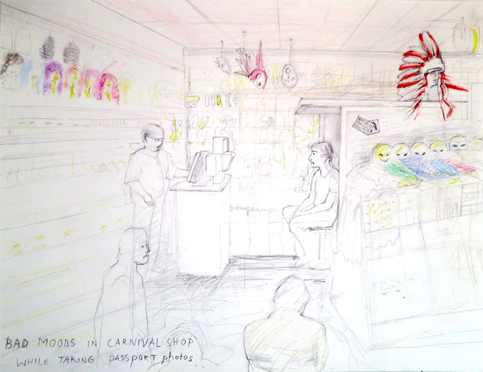
VOEBE DE GRUYTER: Bad moods in carnaval shop, 2016, pencil drawing
Atomes Crochus
In huizen, bedrijven en steden ziet Voebe de Gruyter atomen die worden aangetrokken en afgestoten. Het is een gekrioel vanjewelste met een enorme impact op onze waarneembare wereld, zonder dat wij daar weet van hebben. In de loop van de afgelopen decennia heeft zij dit gedachtegoed ontwikkeld en in de beeldende kunst neemt zij daarmee een unieke positie in.
Elk atoom kan zich aan elk ander atoom vastklampen, ten minste als die dicht genoeg bij elkaar in de buurt zitten en dan ook nog van elkaar houden. Een elektrische lading kan spontaan tot een botsing leiden of tot een hechte samensmelting. Voebe de Gruyter ziet in de wereld om haar heen dit continuüm van onzichtbare deeltjes die elkaar ontmoeten. Als er reacties plaats vinden, ziet Voebe de Gruyter in het gedrag van zowel mensen als dingen gebeurtenissen die tot nu toe door niemand zo op atomair niveau zijn waargenomen.
Een tekst met beeld vertelt over een oude zeeman die in zijn atelier voor 99% zee ziet als hij voor zich uit staart. Wanneer hij zijn ogen sluit vangt hij een glimp op van de naderende havens waar hij ooit aanmeerde, en die probeert hij te schilderen; de havens zèlf ontbreken. Wat is oorzaak, wat is gevolg?
Een ander werk vertelt over ouderen die tijdens het boodschappen doen opzettelijk tegen andere karretjes opbotsen. Via elektrische ontladingen vertellen zij iets dat door de andere winkelende klant thuis achter de computer gedecodeerd kan worden.
Van "Atomes crochus' is sprake als atomen elkaar aanklampen en een lichaam vormen. Als het over personen gaat, voelen deze zich sterk tot elkaar aangetrokken. Bij Voebe de Gruyter kan er ook sprake zijn van chemie tussen mens en ding, want ten slotte is alles en iedereen opgebouwd uit atomen.
Voebe de Gruyter is een narratief conceptueel kunstenaar. Alhoewel tekenen de kern van haar werk vormt, kan elk materiaal gebruikt worden voor het creëren van een beeld. Zo onderzocht zij geplette kauwgom op trottoirs. In haar Kauwgom-tekeningen uit 1994 (collectie Stedelijk Museum Amsterdam) detecteert zij gesprekken die in de kauwgom zijn doorgedrongen en opgeslagen.
In het verleden heeft zij solotentoonstellingen gehad in Marres in Maastricht, Stroom en 1649 in Den Haag. Zij exposeerde verder o.a. in België (MU.zee), Duitsland (Museum Abteiberg), Engeland (Royal College of Arts Galleries), Oostenrijk (Kunstraum Innsbruck), Verenigde Staten (Drawing Center, New York) en China (CEAC, Xiamen). Recentelijk had zij in 2015 een solotentoonstelling in Club Solo in Breda. In 2014 is een grote overzichtscatalogus van haar werk en ideeën bij Roma Publications verschenen.
Van 19-27 november 2016 toont Voebe de Gruyter in Big Art (Diamantbeurs, Amsterdam) een site specific werk waarin Herman Labro (directeur van een kunst-participatie centrum genaamd Wh ha t*, Brussel) tijdens de opening fysiek deel van haar papieren installatie zal zijn. De dagen hierna kunnen bezoekers telefonisch vragen aan hem stellen.
English text:
Atomes Crochus
Voebe de Gruyter observes atoms that attract or repel each other in companies, houses and cities. There is a jostling and swarming with an enormous impact on the world around us, something we do not know anything about at all. In the course of decennia she has developed this body of thoughts and with this she occupies a unique position in the visual arts.
Atoms may seize each other, at least if they come close enough and after that also fall in love with each other. An electrical charge may spontaneously lead to a collision or to a strong merge. Voebe de Gruyter detects this continuum of invisible particles that occasionally meet each other. In case a reaction occurs she sensitively notices the change in behaviour of the people and objects involved; she senses matters on atomic level that no one observed before.
A text with an image by Voebe de Gruyter tells about an old sailor who sees 99% sea when he sits and stares in front of himself in his studio. If he closes his eyes he catches a glimpse of the approaching harbours, places where he once moored. This he tries to paint; the harbours themselves are absent. What is cause, what is consequence?
Another work tells about elderly people doing their shopping and who on purpose bump their carriages into the ones of other clients doing their shopping. Through electrical discharges they tell something to the other client that he or she can read at home sitting behind the computer and decoding the received discharges.
The 'Atomes crochus' come about when atoms take hold of each other and compose a body. And if it concerns people they feel strongly attracted to each other, but in the perception of Voebe de Gruyter chemistry can also come into existence between human being and object, since eventually everything is constructed out of atoms.
Voebe de Gruyter is a narrative conceptual artist. Although drawing is the core of her work, any material may be used for creating an image. For example, she investigated crushed chewing gum residues on the pavement. In her Chewing Gum drawings from 1994 (collection Stedelijk Museum Amsterdam) she detects conversations that penetrated the chewing gum.
In the past she had solo exhibitions in Marres in Maastricht, Stroom and 1649 in The Hague. Furthermore she exhibited a.o. in België (MU.zee), Germany (Museum Abteiberg), England (Royal College of Arts Galleries), Austria (Kunstraum Innsbruck), United States (Drawing Center, New York) and China (CEAC, Xiamen). Recently in 2015 she had a solo show in Club Solo in Breda. In 2014 an extensive catalogue has been published by Roma Publications.
From 19-27 November 2016 Voebe de Gruyter shows in Big Art (Diamantbeurs, Amsterdam) a site specific work in which Herman Labro (director of an art-participation center named Wh ha t*, Brussels) during the opening will be physically part of her paper installation. The days after visitors may ask him questions by telephone.
___________________________________________
STIJN VERHOEFF
De toekomst ligt in zee
in AP
curator Vincent van Velsen
15 oktober- 23 november 2016
 STIJN VERHOEFF: Geluidstekening, 2016
Het werk van Stijn Verhoeff in AP is een ruim 1 uur durend geluidswerk, soms dromerig en verbeeldingsvol, soms rauw en kritisch. Minimale klanken vullen de galerie, opzwepende beats brengen de teksten naar een nieuw plan. Als schilderijen in de tijd komen de teksten aan de toehoorder voorbij. Als ware het een auditieve film reist de luisteraar door een imaginair landschap.
Elke dag wordt het geluidswerk 'De toekomst ligt in zee' om 16:00 uur ten gehore gebracht(de galerie is open op di t/m za van 13:00 - 17:30 uur).
De tentoonstelling is onderdeel van The Haptic; een serie van drie solo-exposities bij Galerie van Gelder, geïnitieerd door Vincent van Velsen. In deze reeks zijn ervaring, gevoel en voeling het doel en vormen interactie, contact en verhoudingen tussen mens, kunst en maatschappij het uitgangspunt.
De toekomst ligt in zee
Stel nu, als denkexperiment, dat we de geschiedenis laten sterven, het arme kind. We geven haar een tijdje niet te eten. We laten haar in haar mandje liggen. We doen alsof ze er niet is. Ze zal krijsen, misschien wel dagen aaneen, maar we leggen haar in een andere kamer en doen de deuren dicht. We stoppen watten in onze oren en voeren een hedendaags gesprek.
De Egyptenaren, we kijken er niet meer naar om. Spijkerschrift? Laat maar liggen in zijn mandje, we timmeren er straks een kistje omheen. De Grieken, geweldige ideeën, maar doen we er iets nuttigs mee? De Romeinen, niet wat je zegt het beste voorbeeld. Hadden zij niet het geld uitgevonden? Het rijtje gaat nog even door. In sneltreinvaart, absoluut, begrijp me niet verkeerd, maar we willen er vanaf. We willen er doorheen.
Vooruit dan, nog even voor de vorm: Fransen, Engelsen, Duitsers, joden, moslims en atheïsten. Een Westers perspectief, ik weet het. Chinezen, Afrikanen, boeddhisten, communisten, ze mogen er allemaal bij. Bovenop de stapel, of onderop, maakt mij niet uit. We laten ze links liggen, of rechts. Ook het politieke spectrum gooien we met het kind en het mandje uit het raam. Net als het feminisme en het marxisme, het neoliberalisme of het anti-kapitalisme.
En buiten, op de grond en in de lucht, zal het zwart zijn. Donker zwart. Licht zwart. Zwaar zwart voor mijn part. Zwart dat zijn weerga niet kent.
Zwart als nooit tevoren.
Stijn Verhoeff
WEDGES
13 september - 12 oktober 2016
LILY VAN DER STOKKER
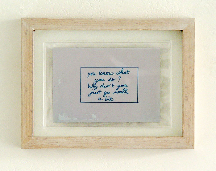
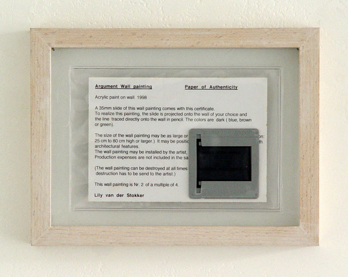
Argument Wall painting, 1998
15,3 x 20,2 x 2 cm
colour photo, certificate of authenticity, colour slide, authorized in print with artist’s full name, plastic sleeve
framed between glass as issued
limited edition 4
John M Armleder
Bernard Aubertin
Ansuya Blom
Voebe de Gruyter
David Horvitz
Klaas Kloosterbloer
Jaap Kroneman
Gijs van Lenthe
David Horvitz
Henk Peeters
Christian Marclay
Olivier Mosset
Takako Saito
Lily van der Stokker
Marijke van Warmerdam
JCJ Vanderheyden
Willem de Ridder e.a.
scroll down for English text
Wedges
In de ruimte van Galerie van Gelder is er chaos, er lijkt een verhuizing gaande. Een aantal schilderijen leunt met de voorkant tegen de muur en slechts een achttal zijn zichtbaar tentoongesteld. Maar, zo blijkt, het is onderdeel van het concept van Wedges is om de werken te rouleren. Er wordt een wig geslagen tussen deel uitmaken van de tentoonstelling en niet. De individuele werken worden bij verhanging bovendien gekozen op hun dubbelheid of tweeledigheid. Zo is er een olieverfdoek van Jaap Kroneman verpakt n speciaal door hem ontworpen pakpapier zit dat deel van het werk is. De eigenaar kan het uitpakken, waardoor het werk als geheel vernietigd is. Twee Lolita's van Henk Peeters zijn een pendant van elkaar doordat het ene werk roze is en het andere donkerbruin. Hij kwam op dat idee nadat hij in Nice tijdens een opening geweigerd had de hand met burgemeester Jean-Marie Le Pen te schudden.
In de achterste ruimte AP is een One-Year installatie van Takako Saito te zien, bekend van de Fluxus-beweging. Zij is inmiddels 87 jaar en nog volop actief als het gaat over kunst maken en performances zelf uitvoeren.
Wedges
In Galerie van Gelder there is chaos, a removal seems to cause problems. Several paintings are leaning against the wall; a few are clearly shown and exhibited. It is part of the concept of Wedges to circulate the objects. Each time when a work is changed for another one the work is chosen on its twofolded presence. In this way an oil painting of Jaap Kroneman is wrapped in special designed wrapping paper as part of the piece. One may choose to unwrap it by which the work is partly destroyed. Two breasts of Henk Peeter's Lolita are each others pendant; one is pink and one is dark brown. Henk Peeters: 'I realised I forgot to make dark skinned Lolita, so I corrected that.' Henk Peeters came to this idea after he refused to shake hands with mayor Jean-Marie Le Pen during an opening of a Zero exhibition in Nice.
In the space AP at the back of the gallery the installation of Takako Saito is still on show. She is quite well-known in the Fluxus movement for her communicative actions and distorted chess works. By now she is 87 and still very active in doing performances and making installations.
___________________________________________
TAKAKO SAITO
Play and Connect
You + Me - Blue Sky wall [one-year installation]
27 November 2015 - 8 October 2016
TAKAKO SAITO: You + Me - Blue Sky wall, 2015
TAKAKO SAITO: You + Me - Blue Sky wall, 2015
status quo in September 2016
You and Me
The wall installation 'You and Me - Blue Sky wall' is a work for which visitors are invited to leave a message or drawing on, i.e. on a speech balloon cut out from empty papers lying on a table in front of the wall. As a homage to a alive and kicking artist the presentation in Galerie van Gelder (AP space) will stay for one year in the backspace AP.
Takako Saito is a Fluxus artist who is known for her disrupted chess and innovative sound pieces. In the early sixties she met George Maciunas, the founder of Fluxus in New York, who inspired her to go on making chess works. She became at an early stage part of the movement and started to make boxes with small objects. An ink stamp on the lid had texts like: "Put something in the box, sign it. Then it is a work of us". This open minded and generous attitude is still to be found in her works she makes today.
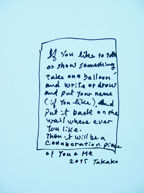
TAKAKO SAITO: instructions for collaboration You + Me, 2015
At the end of the exhibition all speech balloons will be signed by the artist
issue #15
CUT magazine about art, issue #15
is dedicated to Takako Saito.
For the SCS / Special Cut Subscribers she added unique hand painted crumplings
Please, crumple them yourself
different texts / different colours
edition 35
___________________________________________
GIJS VAN LENTHE
Precies recht voor iets staan
28 mei t/m 14 juli 2016
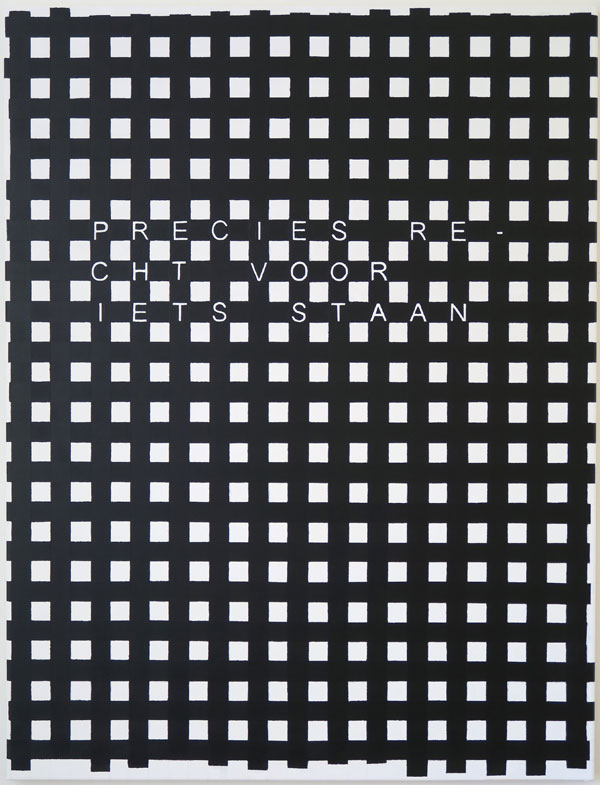
GIJS VAN LENTHE: Precies recht voor iets staan, 2016
Precies recht voor iets staan
In zijn solotentoonstelling 'Precies recht voor iets staan' verdwijnen de doekjes als mini-postzegels tegen de grote wanden van de galerieruimte, maar qua presentie zijn ze zeer aanwezig. Gijs van Lenthe maakt grotendeels klein werk en hij zegt daarover: "Wat ik prettig vind aan kleine werken is dat je van dichtbij nog steeds met afstand naar het werk kan kijken. Als je dichtbij een groot werk staat verlies je het totaal."
Wat opvalt in het werk van Gijs van Lenthe is de brokkeligheid van de beelden, die dikwijls een deel van een groter geheel tonen. Een herhaaldelijk inzoomen zorgt voor een versterking daarvan. Dit gevoel van dichtbij komen wordt extra benadrukt doordat het beeld buiten de randen van het doek optisch doorloopt. Extreem gedetailleerde momentopnamen, zou je ze kunnen noemen. Soms naar de werkelijkheid geschilderd, soms als een puzzel schilderend in elkaar gezet. Het is alsof grip wordt verkregen op de wereld door die in close up te presenteren. Dat de dingen voor hem bovenal een deel van een geheel zijn is ook te zien in de sculpturen Geen titel (hek) uit 2015 en Geen titel (hoek) van dit jaar.
In zijn tentoonstelling 'Starend naar Gods lichtbak' in 2012 was het fragmentarisch denken van Gijs van Lenthe al zichtbaar door het thematisch gebruik van openingen, gaten en vlekken. In de schilderijtjes van zijn tentoonstelling 'Precies recht voor iets staan' speelt stijl een minder belangrijke rol dan de terugkerende thema's van het detail en de eenvoudige directheid. Zo is er een wit hek in het midden van de ruimte dat suggereert dat er een begrenzing is of dat ergens een scheiding aangebracht moet worden. Er is noch begrenzing, noch afscheiding; als deel van een groter geheel gaat het om het hek zelf. Verder niets.
Als je precies recht voor één van zijn werken gaat staan, is het kijken het enige dat telt.
___________________________________________
14 juli - 27 augustus 2016
'Wedges'
JOHN M ARMLEDER
ANSUYA BLOM
FRANÇOIS DEY
VOEBE DE GRUYTER
DAVID HORVITZ
KLAAS KLOOSTERBOER
JAAP KRONEMAN
GIJS VAN LENTHE
OLIVIER MOSSET
TAKAKO SAITO
LILY VAN DER STOKKER
MARIJKE VAN WARMERDAM
and others
zonder afspraak open op elke vrijdag en zaterdag (t/m 27 augustus)
When friendship becomes art
16 april t/m 25 mei 2016
SIGURDUR GUDMUNDSSON: Friends, 2013
AMF / Armleder-Mosset-Fleury
Eva Barto YS
Nicolas Chardon / Karina Bisch
Marlene Dumas
Marliz Frencken
Voebe de Gruyter
Sigurdur Gudmundsson
Kristján Gudmundsson
Mike Kelley
Sigmar Polke
Dieter Roth
Lily van der Stokker
and mystery guest: Hlynur Pálmason
SIGURDUR GUDMUNDSSON, living sculpture 'Audience' 2015
for English text see below
Wanneer vriendschap kunst wordt.
Daar waar de vorige groepstentoonstelling 'After Gerolama Cardano's suspension' zich richtte op interpretaties van de geëxposeerde kunstwerken, zo richt de huidige tentoonstelling 'When friendship becomes art' zich op de meer intieme interpretaties van de kunstenaars zèlf en op hun bewondering voor het werk van collega's. Of in een enkel geval zelfs met groot respect voor een opperwezen zoals bij Sigmar Polke in het drukwerk 'Höhere Wesen befahlen rechte obere Ecke schwarz malen!' Met 'Mother Father and Kids' van Lily van der Stokker en een gietijzeren gevelwerk van Kristján Gudmundsson krijgen de woorden vriendschap en hommages bovendien een connotatie van trouw en bloedverwantschap. Kortom het begrip vriendschap is in de tentoonstelling 'When friendship becomes art' in brede zin opgevat.
De titel van de tentoonstelling is afkomstig van Sigurdur Gudmundsson, die deze bedacht nadat de galeriehouder hem had gevraagd een tentoonstelling te bedenken rondom zijn sculptuur 'Friends' (2013). In dit werk heeft hij de afgebeelde persoon in 'Cocoanuts' (1982) van René Daniels en een zittende jongen uit het schilderij 'Human Tripod' (1988) van Marlene Dumas tot vrienden gemaakt, waarbij de ene persoon met een lange baard een bemoedigende klop op de schouder van de ander lijkt te geven die bij nader inzien over drie benen beschikt.
Door middel van een tekening, een sculptuur of een installatie wordt vriendschap verbeeld via hommage, bewondering, bloedverwantschap en trouw. Een mystery guest heeft zich per mail enkele dagen voor de opening bij Sigurdur als bewonderaar en mogelijke deelnemer aangemeld. Hij brengt nu een hommage aan het werk 'Mountain' (1980) van Sigurdur Gudmundsson.
Sigurdur Gudmundsson zal tijdens de opening een living sculpture 'Audience' door negen performers gedurende drie kwartier laten uitvoeren.
When friendship becomes art
In the previous group exhibition “After Gerolama Cardano’s suspension” the focus was on the interpretations of the art works on display. In the follow up exhibition “When friendship becomes art” the attention is drawn to the more intimate interpretations of the artists themselves and to the admiration towards each other's works or even to a higher being like in the graphic work „Höhere Wesen befahlen rechte obere Ecke schwarz mahlen!” by Sigmar Polke. The works “Mother Father and Kids” of Lily van der Stokker and a cast iron wall relief of Kristján Gudmundsson give the words friendship and homage a different connotation of fidelity and relationship. Altogether in the exhibition “When friendship becomes art” the notion of friendship is understood in a broad sense.
Sigurdur Gudmundsson coined the exhibition’s title after the gallerist had asked him to think of a show with his sculpture ‘Friends’ (2013) as a centrepiece. In this work two characters appear that are derived from a painting “Cocoanuts” (1982) of René Daniels and a painting “Human Tripod” (1988) of Marlene Dumas. He has united these individuals and made them obviously good friends; one figure with a long up right standing beard puts his hand gently on the shoulder of a boy with three legs as if he needs some encouragement.
Friendship is expressed in the form of a drawing, sculpture or small corner installations. When friendship turns into admiration it also appears in the form of a mystery guest who introduced himself just a few days before the opening asking Sigurdur Gudmundsson by mail if his homage to the photo work ‘Mountain’ (1980) could be part of the show on friendship.
During the opening Sigurdur Gudmundsson will have a living sculpture “Audience” carried out by nine performers during three quarters of an hour.
___________________________________________
After Gerolama Cardano's suspension
20 February t/m 9 April 2016
exhibition view After Gerolama Cardano's suspension 2016
Elvire Bonduelle
Nicolas Chardon
François Dey
Hreinn Fridfinnsson
Voebe de Gruyter
Klaas Kloosterboer
Wjm Kok
Olivier Mosset
Gerhard Richter
Takako Saito
Yann Sérandour EB
Marijke van Warmerdam
a gimbal with a Cardan suspension, ca 1550
Naar Gerolama Cardano's ophangsysteem
De omgeving slingert en stampt, maar het object is standvastig en trekt zich zo goed als niets aan van de omgeving. De context waarin gewerkt en gedacht wordt is bepalend voor de kunst die getoond wordt. Het werk is gemaakt binnen in de wereld van de kunstenaar, los van hoe de buitenwereld het werk opvat. Zijn of haar kompas bezit een eigen magnetisch veld waarnaar geluisterd wordt. Dat is de kunst en kunstenaarshouding die in de tentoonstelling 'After Gerolama Cardano's suspension' getoond wordt. Het schommelende kompas is als het oog van de kunstenaar.
Yann Sérandour EB heeft ter plekke een installatie gemaakt verwijzend naar de wiskundige Gerolama Cardano die ook een fervent gokker was. De koper weet niet precies wat hij aanschaft. Het kunstwerk is namelijk ingepakt en alleen de titel kan een beetje helpen om een vermoeden te krijgen. Takako Saito toont een bolhoed die voor haar allereerst een schaakbord is. Gerhard Richter is aanwezig met een pagina uit een catalogus waarop hij in het midden groot zijn handtekening heeft gezet. Nicolas Chardon laat een triptiek zien dat een religieuze connotatie heeft, zonder dat dit een specifieke interesse van hem is. Toch is het daar.
In de tentoonstelling is een groep werken bij elkaar gebracht die ergens misleidend of zelfs verwarrend zijn. De visuele uitkomst is anders dan je zou verwachten als het oeuvre van de kunstenaar in ogenschouw genomen wordt.
English text
After Gerolama Cardano's suspension
The environment sways and stamps, but the object is sustained and is not in the first place moved by its surroundings. The context in which is worked and thought is decisive for the art that is shown. Above all it is made inside the world of the artist, in spite of however the work is understood by the outer world. The compass of the artist is directed by his/her own magnetic field to which is listened to. This is the art and artist's attitude that is put on display in 'After Gerolama Cardano's suspension'. The swaying gimble is like the eye of an artist.
Yann Sérandour EB will make a special installation related to the mathematician Gerolama Cardano who was also a gambler. The buyer will not know exactly what he will purchase. It is packed and only the title may help to get a clue. Takako Saito will show a hat that for her in the first place is a chess game, Gerhard Richter will be present with a page of one of his paintings taken out of a catalogue and afterwards signed by him bluntly on the middle of the color plate. Nicolas Chardon shows a triptych with a religious connotation; the later not being of his particular interest. Yet it is there.
In the exhibition a group of works have been put together that may be misleading or confusing. The visual out come is different from what one would expect when one takes the oeuvre of the specific artist into account.
___________________________________________
ELVIRE BONDUELLE
The Rotating Painting Show
t/m 6 februari 2016
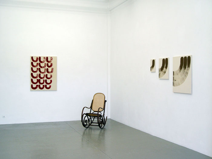
ELVIRE BONDUELE: view The Rotating Painting Show, 2015
The Rotating Painting Show
Elvire Bonduelle continues her quest for happiness. For her a proven method to achieve this goal is to create both moments of action as well as moments of contemplation. In 'The Rotating Painting Show' in Galerie van Gelder she challenges alert visitors by turning the show into something else when they turn their back to her paintings, with the help of the gallerist. After having experienced a possibly exhausting look at the works in motion on the wall the visitor may take a seat in one of the rocking chairs in order to calm down and reflect on what he or she experienced in the space.
English text
The Rotating Painting Show
De tentoonstellingstitel 'The Rotating Painting Show' van Elvire Bonduelle suggereert dat er sprake moet zijn van gedraaide schilderijen. Dat is inderdaad zo, maar niet in de zin van Kinetische Kunst. De tentoonstelling richt zich weliswaar op dat wat geweest is, maar vervolgens wordt een draai daaraan gegeven. Werken die zij tijdens haar verblijf in Los Angeles onlangs maakte doen sterk denken aan de doeken van Ellsworth Kelly en Morris Louis uit de jaren zestig. Elvire Bonduelle noemt ze gordijnen: 'Hard Edge Curtains' of gewoon 'Curtains'.
Op verrassende wijze ziet zij beweeglijkheid in de werken die een geheel andere twist geven aan termen als 'massa', 'kleur' en 'natuur' zoals die door Kelly bijvoorbeeld gebezigd werden. Haar werken in Galerie van Gelder zijn in beweging en er is maar één manier om te ontdekken hoe en dat is door haar tentoonstelling te bezoeken.
&
in AP
TAKAKO SAITO
in GvG
JAAP KRONEMAN
Foundations and Flowers
5 september t/m 14 november
(verlengd) 2015
JAAP KRONEMAN: view of exhibition in which visitor may request for temporary installment of a painting standing on the gallery's floor, 2015
JAAP KRONEMAN: untitled, 2015
Foundations and Flowers.
De wereld terugbrengen tot dat wat het echt is, is van eeuwen her. Wat de Griekse natuurfilosofen van vóór de jaartelling zagen in de spermatozoïden zien wij vandaag de dag in de Higgs-deeltjes. In de hagelwitte schilderijen van Jaap Kroneman verschijnen elegante krullen, gestyleerde krabbels met correcties, guirlandes, cirkels en kruizen die doorkruist zijn. Het is alsof door de microscoop van een wetenschapper is gekeken naar nog niet ontdekte deeltjes van DNA-structuren. Het leidt bij Jaap Kroneman naar een grafische ordening van rechte, kromme en slingerende lijnen die nog het meest lijkt op de basisprincipes die bij iconen worden toegepast.
Een volgende stap in het werk van Jaap Kroneman zou de verbeelding van de kern van de kern kunnen zijn, maar die is er niet. Dat brengt hem in de tentoonstelling Foundations and Flowers bij een drie-dimensionaal object: de vaas. Zou oud als de weg naar Rome. Het brengt hem ook naar de natuur: bloemen. Nog ouder dan de vaas of Rome.
English text
Foundations and Flowers
To reduce the world to its essence has been pursued for centuries. What the Greek philosophers saw before the Christian Era in spermatozoïdes, we now see in Higgs particles. In the paintings of Jaap Kroneman elegant curls, stylized scribblings with corrections, strings, circles and crosses that are crossed appear on snow-white backgrounds. It is as if someone has looked through the microscope of a scientist to not yet discovered elements of DNA-structures. Jaap Kroneman's works lead us to a graphic structuring of straight, curved and meandering lines that resembles most the basic principles applied to icons.
A next step in the work of Jaap Kroneman could have been the essence of the essence, but there is none. In the exhibition Foundations and Flowers this is leading him to a three-dimensional object: the vase. Which is as old as the road to Rome. It also brings him back to nature: flowers. As part of nature these are even older than the vase or Rome.
in AP
JASPER COPPES
5 september t/m 10 oktober 2015
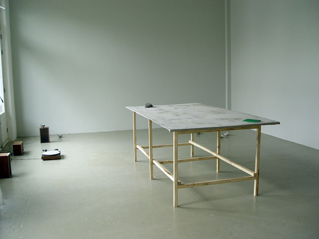
JASPER COPPES, exhibition view, 2015
Roineabhal
In het werk van Jasper Coppes (Nederland, 1983) staat de transformatie van ruimtes centraal. Met subtiele ingrepen bevraagd hij de definitie en functie van zowel gebouwde als landschappelijke locaties. Vertrekkend vanuit actief veldonderzoek verkend Coppes de materiële en immateriële condities die deze gebieden vormgeven. Grootschalige architectonische installaties, sculpturen, films en teksten zijn vaak het resultaat.
Met de tentoonstelling Roineabhal onderzoekt Coppes de processen die het landschap, cultureel erfgoed en het collectief geheugen vormen en aantasten. Tot op welke hoogte is het constante proces van geologische formatie van de aarde een reflectie van de manier waarop onze ideeën vorm nemen?
Een eroderende elpee, een betonnen tafel, kleine cementen kommetjes en een boekje getiteld ‘Indentations’ vloeien voort uit de frequente wandelingen die Coppes recent in Schotland maakte, en in het bijzonder op het eiland Harris. Dit eiland in het noordwesten van Schotland was midden jaren negentig het onderwerp van een maatschappelijke controverse, toen een internationale cementproducent er de grootste steenmijn ter wereld wilde bouwen. Een industrie waarmee tien miljoen ton anorthosiet, een steensoort die gebruikt wordt voor wegenbouw, uit de grond zou worden gehaald. De berg Roineabhal zou daarmee in een gigantische krater veranderen. Het conflict nam een beslissende wending toen ecologisch activisten hulp inschakelden van Mi'Kmaq krijgsheer Sulian Stone Eagle Herney - spiritueel leider van een inheems volk uit de Canadese provincie Nova Scotia, wiens traditionele leefgebied in 1715 werd ingenomen door het Britse rijk. Sulian Stone Eagle Herney bezocht Roineabhal. Hij gaf een verklaring af aan de Britse regering. Deze verklaring vormde een belangrijke schakel in de herwaardering onder de bevolking van het gebied die het tot de dag van vandaag beschermd tegen verder ingrijpen.
Tekst: Rieke Vos en Jasper Coppes.
Jasper Coppes (1983, Amsterdam) studeerde af aan de Gerrit Rietveld Academie in 2008, was resident aan de Jan van Eyck Academie in 2010 en 2011 en heeft een MLitt in Beeldende Kunst aan de Glasgow School of Art. Recentelijk toonde hij werk in Sedimentation bij Platform, Glasgow (2015), het International Film Festival Rotterdam (2014), Nachtelijke Dwalingen bij de Oude Kerk in Amsterdam? (2013) There was a country where they were all thieves bij Jeanine Hofland Contemporary Art (2012), In The First Circle bij Fundació Antoni Tàpies, Barcelona (2011) en Fluiten in het Donker bij De Appel Arts Centre, Amsterdam (2011).
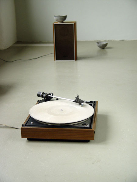
JASPER COPPES, Music from the Western Isles, 2015, solid concrete LP with Gaelic songs, signed, dated, numbered edition 7
English text
The practice of Jasper Coppes (1983, The Netherlands) unfolds around the transformation of spaces – through subtle gestures that challenge the definition and function of built and natural environments. While rooted in active field research, Coppes explores the material and immaterial conditions that shape such sites. He creates large-scale architectural installations, texts, films and sculptures.
With the exhibition Roineabhal Coppes investigates the processes that create and deteriorate the landscape, cultural heritage and collective memory. To what extend does the constant geological formation of the earth reflect the way our ideas take shape?
An eroding LP record, a concrete table, small cement cups and a little book titled ‘Indentation’ are the outcome of Coppes frequent visits to Scotland, and in particular the Isle of Harris. This island in the northwest of Scotland became the center of social controversy when a multinational cement manufacturer planned the largest super-quarry in the world. An industry to extract 10 milion tonnes of anorthosite, a type of intrusive igneous rock used to build highways, that would turn Mount Roineabhal into a gigantic crater. The decisive moment in the conflict against the cooperation’s plans arose when local ecologists called in the help of Mi’kmaq warrior chief Sulian Stone Eagle Herney - a spiritual leader of a First Nations Band native to the Canadian province of Nova Scotia, whose ancient territory has been claimed by the British in 1715. Sulian Stone Eagle Herney visited Roineabhal. He testified at the British Government inquiry, and in due course the mountain was saved from destruction.
Text: Rieke Vos en Jasper Coppes.
Jasper Coppes (1983, Amsterdam) graduated from the Gerrit Rietveld Academie in 2008, was a fellow at the Jan van Eyck Academie in Maastricht in 2010 and 2011 and holds an MLitt in Fine Art Practice from Glasgow School of Art. Recent presentations include Sedimentation at Platform, Glasgow (2015), the International Film Festival Rotterdam (2014), Nachtelijke Dwalingen at the Oude Kerk in Amsterdam
(2013) There was a country where they were all thieves at Jeanine Hofland Contemporary Art (2012), In The First Circle at Fundació Antoni Tàpies, Barcelona (2011) and Fluiten in het Donker at De Appel arts centre, Amsterdam (2011).
curated by Rieke Vos
___________________________________________
in AP
Again
4 t/m 22 augustus 2015
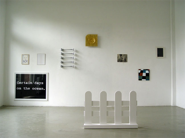
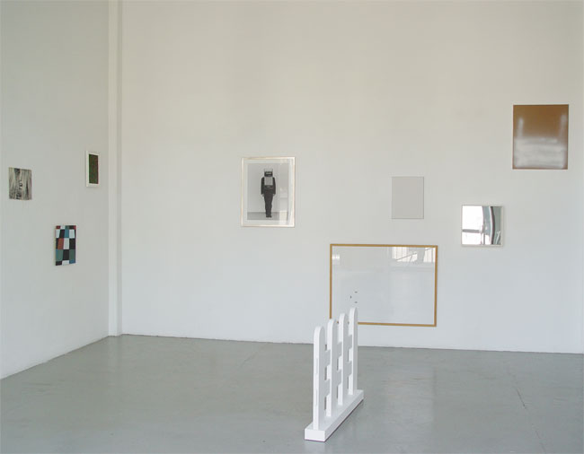
exhibition views 'Again', 2015
GIJS VAN LENTHE, zonder titel, 2015
ANSUYA BLOM
NICOLAS CHARDON
HREINN FRIDFINNSSON
VOEBE DE GRUYTER
KLAAS KLOOSTERBOER
JAAP KRONEMAN
GIJS VAN LENTHE
RAPHAEL LANGMAIR
ADITYA MANDAYAM
STEEL STILLMAN
LOUWRIEN WIJERS
___________________________________________
in AP
Silence
4 juli t/m 1 augustus 2015
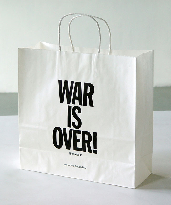 YOKO ONO, War is over! (if you want it), 2000
JOHN M ARMLEDER
CHRISTIAN MARCLAY
SIGURDUR GUDMUNDSSON
YOKO ONO
TAKAKO SAITO
curator Roxanne Hofman
Silence
Stilte is fijn. Stilte is aangenaam doordat er rust ontstaat, een moment van bezinning. Stilte staat centraal in de tentoonstelling ´Silence´, waarbij de kunstwerken elk op hun eigen manier in verbinding staan met stilte.
Sigurdur Gudmundsson´s fotowerk toont een persoon, waar een accordeon voor zijn hoofd geplaatst is. Hij is op deze manier één en al muziek.
Takako Saito heeft een grappaglas voorzien van een 'Body music'-instructie. Het lezen van de uit te voeren taak is zo evocatief, dat de verbeelding al voldoende is om het geluid te kunnen horen.
Stilte ontstaat wanneer het geluid wegvalt, zoals in het werk van John M Armleder. Hij heeft scheepshoorns van boven naar beneden onder elkaar aan de muur bevestigd. Ze kunnen geen geluid meer maken, alhoewel bij het zien van de vijf hoorns het krachtige geluid hoorbaar lijkt te zijn.
De gehalveerde LP met stiksel van Christian Marclay is ook zo een visuele onomatopee. Het collagebeeld van een open mond suggereert de indruk dat iemand zingt.
Stilte is fijn... áls die er is. Wanneer stilte ontbreekt dan kan het verlangen ernaar des te groter zijn. Zoals het schreeuwend verlangen naar rust en vrede wanneer de strijd nog voortduurt. Yoko Ono roept met haar werk ´War is over! (if you want it)´ op om deze stilte met ´Love and Peace´ te verwezenlijken. Zo bekeken wordt stilte een erg kostbaar goed en ons rest dan niet veel meer dan in stilte naar de werken te kijken.
English text
Silence
Silence is enjoyable. Silence is pleasant for the reason that it arises calmness and a moment of contemplation. Silence is at the heart of the exhibition called ´Silence´, where in some way or the other the art pieces all seem to make a sound, in spite of the obvious silence they are presented in.
Sigurdur Gudmundsson´s photo shows a person with an accordion placed in front of his head. In this way he represents music, above anything else.
Takako Saito wrote a ‘Body music' instruction on a grappa-glass. To read the text is an evocative experience, to such a degree that your imagination is already enough to hear the music.
Silence emerges when sound fades away, as in the art piece of John M Armleder. He placed five marine horns from top to bottom on a wall. These horns are unable to make a sound, although looking at the horns seems to evoke the powerful sound that the horns can make if connected to a electric circuit.
The LP of Christian Marclay roughly cut in half and sewn is also a visual onomatopoeia as such. The image of a tipped on wide-open mouth suggests that someone is loudly singing.
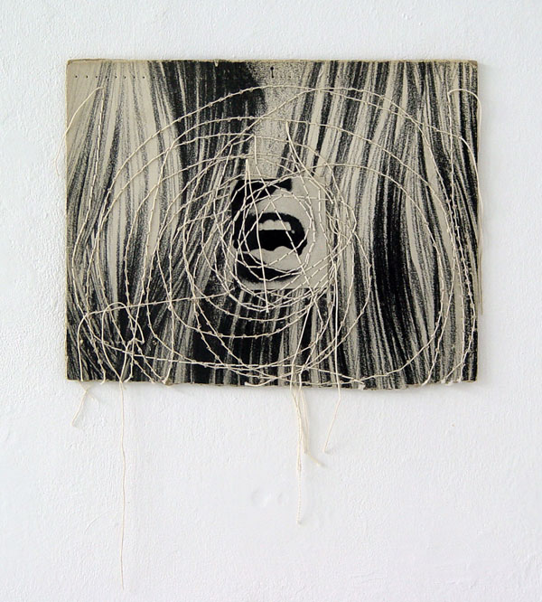 CHRISTIAN MARCLAY: Untitled, 1992
Silence is nice... that is; if it is there. When silence is missing the longing for it can be stronger than ever. Like to yearn for serenity and peace when the battle continues. Yoko Ono calls with her work ´War is over! (if you want it)´ for a realisation of this silence by means of ´Love and Peace´. In this light silence becomes a precious commodity and then it leaves us with no more than silently watching the other works.
_________________________________________
SYLVIE FLEURY
in GvG
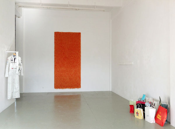 SYLVIE FLEURY: exhibition view Galerie van Gelder, 2015
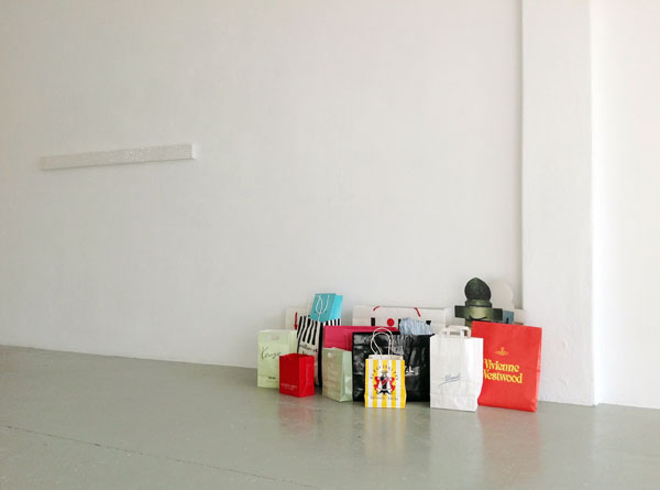 SYLVIE FLEURY: exhibition view Galerie van Gelder, 2015
C'est la vie!
SYLVIE FLEURY: exhibition view Galerie van Gelder, 2015
C'est la vie!
12 mei t/m 27 juni 2015 (verlengd t/m 15 augustus)
C'est la Vie!
Voor veel vrouwen zijn hun nieuwste aankopen een pronkstuk, zo ook voor Sylvie Fleury. Een verschil is echter dat haar pas gekochte schatten op een andere manier in gebruik worden genomen, ze veranderen namelijk in kunstwerken. Winkelen krijgt hierdoor in de context van de kunst een hele andere dimensie.
Waar winkelen vrijwel gelijk geassocieerd wordt met vrouwen, zo zijn er ook begrippen direct verbonden aan mannen. Aan deze typisch mannelijke associaties wil Fleury een einde maken. In haar werk Formula 1 Dress wordt dit bijvoorbeeld zichtbaar; de mannelijke Formule 1 race-uitrusting is door Fleury ontmand en omgetoverd tot half-jurk, half-overall.
Met de performance C’est la vie! die zij in 2013 uitvoerde vond opnieuw een transformatie plaats met een touch van mode en ontspanning. Gehuld in gekopieerde jurken met de op Mondriaan gebaseerde prints van de modeontwerper Yves Saint Laurent, betraden vijf vrouwelijke modellen vergezeld van schoothondjes het winkelcentrum Hoog Catharijne in Utrecht. Clichématig traden de modellen uitgedost als jaren 60 dames het winkelcentrum binnen voor hun vrijetijdsbesteding, namelijk winkelen. Uiteraard werden zij vergezeld door hun trouwe viervoeters als ultieme verwijzing naar ontspanning. Het winkelen en het flaneren in deze performance gaven de Mondriaan-jurken van Yves Saint Laurent een extra feministische draai. In 2015 is de performance als film uitgebracht en deze wordt nu met de bijna buitenaardse muziek van Joe Meek & The Blue Boys getoond bij Galerie van Gelder.
Sylvie Fleury (1961) werkt en leeft in Genève, Zwitserland. In 1992 had zij haar eerste solotentoonstelling in Nederland bij Galerie van Gelder. Met de tentoonstelling ‘The Art of Survival’ in de Neue Galerie am Landesmuseum Joanneum brak zij in 1993 definitief door. Zij had tentoonstellingen in Villa Merkel in Esselingen, Museum für Gegenwartskunst in Zürich, Mamco in Genève en het CAC in Málaga, Spanje. Werk van Sylvie Fleury is op dit moment te zien in Maison Particulière, Brussels, Museum Tinguely, Basel en Daimler Art Collection, Stuttgart.
English text
C'est la Vie!
Many women see their latest purchases as showpieces. This also applies to Sylvie Fleury. However, in her case she shows off her treasures in a different way, by turning them into art pieces. Shopping like that in the context of art is adds an extra dimension to the excitement of buying fashionable commodity goods.
Where as shopping is being instantly associated with women, certain terms are also directly linked to men as well. Fleury wants to bring an end to these typical male associations. This becomes visible in her work Formula 1 Dress for example, the male Formule 1 race equipment is sissified by Fleury and transformed into half-dress, half-overall.
The performance C’est la vie! which she performed in 2013 was once again a transformation, with a touch of established fashion, doing shoppings and relaxation. Atired in the outfit of Mondrian-dresses of the designer Yves Saint Laurent, five female models accompanied by lapdogs entered the shoppingmall Hoog Catharijne in Utrecht. The models, looking as sixties clichés, came to the mall for their leisure, namely shopping and walking the dogs. The parading and the shopping in this performance gave the Mondriaan-designs of Yves Saint Laurent an extra feminist twist. In 2015 this performance was released as a movie and can now be seen at Galerie van Gelder accompanied by the almost extraterrestrial music of Joe Meek & The Blue Boys from 1960.
Sylvie Fleury (1961) works and lives in Geneva, Switzerland. In 1992 she had her first solo exhibition in the Netherlands at Galerie van Gelder. With the exhibition ‘The Art of Survival’ in the Neue Galerie am Landesmuseum Joanneum in 1993 she had her major breakthrough. She also had exhibitions in Villa Merkel in Esslingen, Museum für Gegenwartskunst in Zurich, Mamco in Geneva and the CAC in Málaga, Spain. Artworks of Sylvie Fleury are currently shown at Maison Particulière, Brussels, Museum Tinguely, Basel and the Daimler Art Collection in Stuttgart.
in AP
Hands on Fabrics
19 mei t/m 27 juni 2015
John M Armleder
Elvire Bonduelle
Klaas Kloosterboer
Olivier Mosset
Wjm Kok
Kareem Lotfy
Hands on Fabrics
In ‘Hands on Fabrics’ worden concept en het daartoe ingezette materiaal tweeledig en hard in beeld gebracht. De ‘handen’ van vijf kunstenaars worden geheel zichtbaar wanneer het uitgevoerde werkplan voor het voetlicht wordt gebracht. Pas dan komen de persoonlijke stempels van de kunstenaars naar voren. Deze zijn helder te onderscheiden zodra ze in de combinatie van concept-en-beeld bekeken worden. Dan verschijnt de individuele kunstenaarsattitude.
De handeling is bij een aantal werken letterlijk te zien, maar niet iedere kunstenaar wil direct zijn persoonlijke touch laten zien. Bij de werken van Olivier Mosset is er geen fysieke hand aan te pas gekomen. Zijn handeling bestaat, binnen deze tentoonstelling, uit het letterlijk vermenigvuldigen van zijn werken. Er zijn vier identieke doeken van onbewerkt katoen te zien; apart gesigneerd en gedateerd alsof het unieke werken zijn. Door vier dezelfde werken te maken, trekt hij de uniciteit van elk van deze kunstwerken in twijfel. Het is een radicale handeling die zowel een galeriehouder als een verzamelaar danig in de war brengt als het gaat over de status ervan.
De kale linnen doeken van Wjm Kok zijn herhalingen van zowel zichzelf als van eerder gemaakt werk uit 1989 en later uit 2010. Hier in de tentoonstelling zijn op het eerste gezicht ook kopieën te zien; twee naast elkaar opgehangen identieke werken. Wanneer echter gebruik wordt gemaakt van een ander zintuig dan het oog, wordt duidelijk dat er toch een eigen identiteit aan de werken is gegeven; elk doek is bespoten met een eigen parfum.
Daarnaast zijn in ‘Hands on Frabrics’ de verrichte handelingen ook letterlijk zichtbaar, zoals bij het werk van Klaas Kloosterboer. Hij heeft namelijk een monochroom gelakt doek bekrast met schuurpapier en laat hiermee een spoor van zijn eigen hand achter. Elvire Bonduelle toont eveneens haar hand, wat zij letterlijk met haar hand doet. Zij bedrukt haar wand- en zitkussen met verfvingers.
Zo worden op verschillende niveaus handelingen van een werkplan en een kunstenaarshouding zichtbaar gemaakt.
English text
Hands on Fabrics
In ‘Hands on Fabrics’ concept and the therefore employed materials are brought into picture equivocal and harsh. The ‘hands’ of five artists become fully visible when the operated plan is brought into the limelight. It is not until then the personal signatures of the artists jump forwards. These can be distinguished clearly when the combination concept-and-image is taken into consideration. Subsequently the individual artist's attitude appears.
A few works show the act literally, but not every artist likes to present his personal touch directly. The works of Olivier Mosset do not involve a physical hand. His act consists of literally duplicating his works, in this exhibition. There are four identical canvases of un-processed cotton; all separately signed and dated as if the works are unique. By making four of the same works, the artist puts the uniqueness into question. It is a radical act that confuses both gallery owner and any collector about its status. The pale linen canvases of Wjm Kok are repetitions of previous works, made in 1989 and again in 2010. At first sight the works also appear to be identical. As soon as one uses another sense than the eye, it becomes clear that the works have been given their own identity; each canvas has been sprayed with its own perfume.
Furthermore the executed acts are literally visible too, as in the work of Klaas Kloosterboer. He namely hand sanded a polished monochrome canvas with sandpaper and left a trace of his ‘hand’. Elvire Bonduelle literally leaves traces of her hand, i.e. she printed her wall- and seat cushion with paint coloured fingers.
In this manner acts of a plan in various ways are shown and the artist's attitude becomes visible.
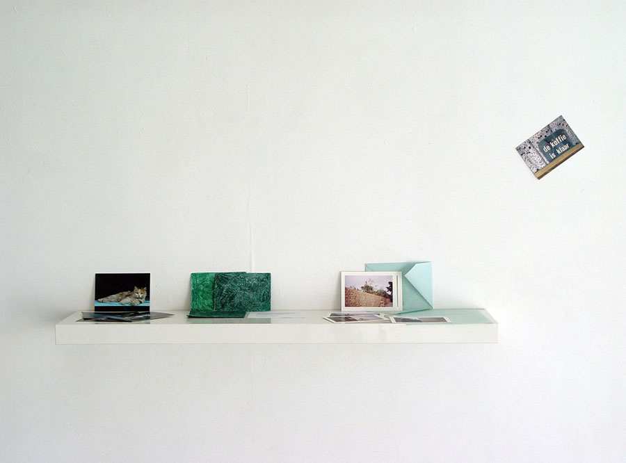 Prentbriefkaarten van François Dey, Voebe de Gruyter, Renata Šifrar en Sigurdur Gudmundsson
Postcards are to be looked at
Prentbriefkaarten van François Dey, Voebe de Gruyter, Renata Šifrar en Sigurdur Gudmundsson
Postcards are to be looked at
in GvG
21 maart t/m 2 mei 2015
NEWLY MADE CARDS
Nicolas Chardon
Karina Bisch
Voebe de Gruyter
G.J. de Rook
Sigurdur Gudmundsson
Jan Kämmerling
Klaas Kloosterboer
Wjm Kok
Jonathan Monk
Julien Monnerie
Louwrien Wijers
Steel Stillman
Marijke van Warmerdam
 MARIJKE VAN WARMERDAM: Prague 24/7, 2015
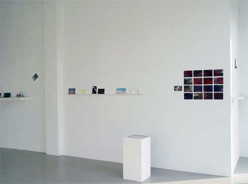 exhibition view: Postcards are to be looked at, 2015
COLLECTED CARDS
exhibition view: Postcards are to be looked at, 2015
COLLECTED CARDS
François Dey
Kristján Gudmundsson
David Horvitz
Klaas Kloosterboer
Wjm Kok
Jaap Kroneman
Lone Haugaard Madsen
Jonathan Monk
Renata Šifrar
Rúna Thorkelsdóttir
Victor Vaserely
Marijke van Warmerdam
Postcards are to be looked at.
Sinds de invoering van de iPhone worden prentbriefkaarten zelf gemaakt en in een fractie van een seconde zijn die virtueel verstuurd. De A5 en A6 prentbriefkaarten van weleer vallen zelden nog in de brievenbus, maar beelden blijven binnenstromen en heel wat meer dan voorheen. Die beeldenstroom gaat met enorme hoeveelheden. Misschien is het goed om even de rem er op te zetten en dan te kijken wat een vertraging op kan leveren. Daar gaat de tentoonstelling 'Postcards are to be looked at' over. Voor een deel zijn de prentbriefkaarten speciaal voor deze tentoonstelling gemaakt. Een ander deel van de tentoonstelling bestaat uit een keuze van bestaande prentbriefkaarten die nu even het daglicht zien in relatie tot de nieuw gemaakte kaarten.
Voebe de Gruyter heeft in samenwerking met haar zoon een geluidswerkje op ansichtkaartenformaat gemaakt. Met het 3-delige werkje kan door met de kaarten te wapperen geluid geproduceerd worden.
Klaas Kloosterboer heeft een rood-wit-blauw vlaggetje op een toeristenkaart met daarop een haring afgebeeld uitgesneden en vervolgens stukjes uitgesneden canvas als namaakvlaggetjes op de muur bevestigd.
Sigurdur Gudmundsson heeft de galeriehouder gevraagd een mooie prentbriefkaart te kopen en die midden in de afbeelding aan de galeriemuur te nagelen.
Marijke van Warmerdam heeft een filmloop gemaakt die een opmerkelijke souvenirmok uit Praag tot onderwerp heeft.
Kunstenaars hebben nagedacht over hoe een prentbriefkaart er uit zou kunnen zien door een of meerdere aspecten van de traditionele prentbriefkaart nader te belichten.
English text
Nowadays postcards are self-made due to the introduction of the iPhone and in a split second pictures are sent by virtual mail. The A6 and A5 postcards from the old days are hardly dropped in the mailbox anymore, but images keep on coming in and certainly a bunch more than before. The inexhaustible stream of images is not to stop. Perhaps it is a good thing to use the brake for a minute and then to see what a moderate slowdown could lead to. This is what the exhibition 'Postcards are to be looked at' is about.
For a part the shown postcards are specifically created for this exhibition of which several ones were sent by traditional post. Another part consists of a choice of postcards that was made in the past and that has been compiled for bringing it to the daylight and having it accompanied with the newly made cards.
Voebe de Gruyter co-operated with her son that brought them to an innovative sound piece of postcards. For getting the sound one is supposed to flap the paper work in three parts in the size of a postcard.
Klaas Kloosterboer has cut out a tourist postcard showing a tiny red-white and blue flag stuck into a haring. Next to this card 16 pieces of canvas on postcard size form a group of fake cut out mini flags.
Sigurdur Gudmundsson has asked the gallerist 'to buy a beautiful touristic postcard' that should be bluntly hammered with a big nail to the gallery wall.
Marijke van Warmerdam has made a film loop that has a striking souvenir mug from Prague as subject.
Artists have thought about how a postcard may become different by concentrating on or playing with an aspect of the traditional postcard.
JAY TAN
in AP
Some Mothers Do 'Ave 'Em
21 maart t/m 3 mei 2015
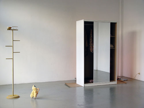 exhibition view with 'Perch' (2015), 'Boobs' (2014) and 'B is for Behind' (2015)
Hoe beïnvloeden de dingen die we maken ons gedrag, onze waarneming en ervaring? De installaties van Jay Tan hebben alles te maken met objecten die iets van ons willen en iets over ons zeggen. Laten we deze fles bekijken, is het glas, een beeld, een ruimte met lucht? Het glas geblazen tot een vaasvorm met een hals die de wijn in zich droeg die ons dronken maakte. Met haar werk vestigt Tan de aandacht op de relatie tussen mens en ding, waarbij beide soms als onderwerp en soms als lijdend voorwerp optreden.
In Some Mothers Do ‘Ave ‘Em wandel je door een scenografie van het gezinsleven. Folkloristische decoratie, urban lifestyle en budget meubels vertellen hier een verhaal dat zowel persoonlijk als sociaal-politiek is. Een pruttelende rijstkoker verspreidt de geur van thuiskomen, een kledingkast verbergt tienergeheimen en de gevallen Icarus herinnert ons aan de onbesuisdheid van de jonge uitvlieger. In dit atypisch tafereel van huiselijkheid maken we geen onderscheid meer tussen wat er al was, wat er is en wat nog komt - kunstobjecten, already mades, interieurstukken en ornamenten.
Jay Tan (1982, Groot-Brittannië) woont in Amsterdam waar ze momenteel resident is aan de Rijksakademie van beeldende kunsten. In 2010 studeerde ze af aan de MA Fine Arts van de Piet Zwart Academie in Rotterdam. Haar werk was eerder onder andere te zien op de Biennale D’art Contemporain de Rennes, Camden Arts Centre in London, Holly Bush Gardens in London en Rongwrong in Amsterdam en in 2013 was ze geselecteerd om werk te maken voor Stichting C.o.C.A met een presentatie bij Witte de With Center for Contemporary Art en Tent in Rotterdam.
tekst: curator Rieke Vos
English text
How do the things we make influence our behavior, our perception and our experiences? The installations of Jay Tan are all about how objects talk and have their way with us. Let’s look at this bottle on the shelf, is it a thing, an exemplar, a vessel? The glass blown into a form that held the wine that got us drunk. With her work Tan puts focus on the relation between humans and things, in which both take position as apparatus and substance.
Some Mothers Do ‘ Ave ‘Em invites you into a scenography of family life. Here folkloristic garnish, urban youth aesthetics and ‘provincial’ home decoration tell a story that is both personal and social-political. A simmering rice-cooker spreads an all-too-familiar smell, teenage-secrets hide behind sliding wardrobe doors and the fallen Icarus reminds us of youthful foolhardiness. In this scene of idiosyncratic domesticity we make no distinction between what was already there, what is and what will come – interiors, art objects, already mades en ornaments.
Jay Tan (1982, Great-Britain) lives in Amsterdam where she is currently a resident at the
Rijksakademie van beeldende kunsten. In 2010 she graduated from the MA Fine Arts at the Piet Zwart Academie in Rotterdam. Her work was previously shown at the Biennale D’art Contemporain de Rennes, Camden Arts Centre in London, Holly Bush Gardens in London and Rongwrong in Amsterdam and in 2013 she was selected to develop new works for C.o.C.A Foundation with a presentation at Witte de With Center for Contemporary Art and Tent in Rotterdam.
text by curator Rieke Vos

with the support of the Amsterdam Fonds voor de Kunst
left: Mix (Monochrome with Rumiko Hagiwara) / right: Mix (Monochrome with Jan van der Ploeg)
WJM KOK
in GvG
Monochromes
14 February - 18 March 2015
OPENING: Saturday 14 February 17.00 - 19.00 hours
Monochromes
In het werk van Wjm Kok valt het op dat monochromen een steeds terugkerende plaats innemen. Daarbij maakt het niet uit welke materialen of dragers hij daarvoor gebruikt: tafelbladen, afdekzeilen, polystyreen isolatieplaten, textiel, aluminium folie of parfum maken net zoveel deel uit van zijn oeuvre als zijn meer conventioneel geschilderde Mix-serie in verf op doek.
In de tentoonstelling in Galerie van Gelder zien we twee series monochrome doeken. Grey Monochrome (2015), waarvan er nu enkele getoond worden uit een gesloten serie van twaalf, met een verhuisdeken als beeld en tegelijkertijd als drager. Het egale grijs lijkt bij nadere beschouwing meer op een veld van kleurige pixels.
De andere serie schilderijen - Mix genaamd - kenmerkt zich allereerst door de verscheidenheid aan kleuren, maar er zijn, minder opvallend, ook verschillen in de methode van uitvoering en textuur. Zoals de titel Mix suggereert heeft Wjm Kok elk monochroom schilderij in samenwerking met een door hem uitgenodigde kunstenaar geschilderd. Dit project startte hij in 2008 met Henk Peeters, die als eerste bereid was hieraan mee te werken en die in 1965 zelf ooit Yayoi Kusama had gevraagd om samen een doek te maken. Bij Kok gaat het niet alleen om de uitvoering, maar hij is ook geïnteresseerd in de discussies vooraf over wat een monochroom doek bijvoorbeeld zou kunnen zijn. Of volgens de collega-kunstenaar zou moeten zijn. Bij de Mix-serie gaat het om een samenwerking, waar twee kunstenaars, na het nodige overleg, uiteindelijk elkaar ontmoeten op het doek zelf.
English text
Monochromes
In the practice of Wjm Kok one notices that monochromes turn up time and time again. It is less relevant whether he uses paint on canvas or anything else like tabletops, tarpaulins, polystyrene insulation boards, textile, aluminum foil or perfume. They are all part of one and the same oeuvre, including his more conventionally painted monochromes from the Mix series.
In the exhibition at Galerie van Gelder two series of monochromes are presented. Grey Monochrome (2015) comes from a closed series of twelve and displays a removal blanket that shows both image and support simultaneously. At closer observation, the apparently solid grey renders a field of colourful pixels.
The other series consists of paintings on canvas and is entitled Mix. Initially the variety of colours is what catches the eye. Less obvious are the differences in the methods of production and consequently the rendered texture of each canvas. As the title Mix suggests Wjm Kok painted each monochrome in collaboration with an invited artist. He started this project in 2008 by inviting Henk Peeters who was pleased to join in and who himself invited Yayoi Kusama to make a work together in 1965. For Kok this series is not only about the execution of a work made together but equally relevant is his interest in the discussions on the notion of the monochrome. Or how his collegue-artist brings in his/her perceptions and opinions on how to proceed in the making of the monochrome. The Mix series is based on collaboration, where two artists, after due deliberation finally meet on the canvas itself.
 DAVID BERNSTEIN: Let There Be Multiples, 2015
DAVID BERNSTEIN
DAVID BERNSTEIN: Let There Be Multiples, 2015
DAVID BERNSTEIN
in AP
Zenwacky
curator Rieke Vos
14 February - 18 March 2015
OPENING: Saturday 14 February 17.00 - 19.00 hours
'The Zen is waiting for the train and standing next to him is The Wacky. The Zen looks over at The Wacky who is jumping up and down, dancing up a storm, but there is no music
playing. "What is The Wacky dancing to?" wonders The Zen. The Wacky starts shooting spaghetti out of his fingertips and his head turns into a disco ball. The Zen realizes that
The Wacky must be listening to something stuck in his head. The Zen wants to dance too. But how do you dance to a song stuck in someone else’s head?' (David Bernstein)
David Bernstein is een echte verhalenverteller. Zijn verhalen komen voort uit zijn onderzoek naar allerhande dingen; gevonden of geleende objecten, ready-mades, of door hem zelf ambachtelijk vervaardigde kunstwerken. Maar wat hem vooral interesseert is hoe deze dingen de basis vormen van sociale relaties. Vanuit zijn een achtergrond als meubelmaker en industrieel ontwerper, heeft David zich in de laatste jaren ontwikkeld tot een eigenzinnig performer en schrijver, die met gevoel voor generositeit zijn publiek meeneemt in waarachtige verhalen die gaan over verbondenheid met elkaar en de dingen om ons heen.
In de tentoonstelling bij Galerie van Gelder geeft Bernstein vorm aan het concept Zenwacky, een term ontwikkeld in samenwerking met David Kirshoff. Zenwacky is een benadering, een manier van kijken, een esthetische filosofie. Het is een omgeving van rust en verwarring, van verlichte absurditeit. De galerie is veranderd in een sereen interieur, ingericht met elementen waarvan de identiteit slingert tussen ding, anekdote, structuur, sculptuur, meubel of kunstwerk – afhankelijk van onze waarneming, fantasie, ervaring en wijze waarop we ze met het leven verzoenen.
Interactie is essentieel en samenwerken is voor Bernstein natuurlijke onderdeel van zijn werk en houding. De tentoonstelling bij Galerie van Gelder komt tot stand met bijdragen van Jokūbas Čižikas, Laurent-David Garnier, Sophia Holst, David Kirshoff, Robertas Narkus, Fort Standard en Jay Tan.
David Bernstein (1988, San Antonio, Texas) is een kunstenaar woonachtig in Amsterdam waar hij in 2013 zijn MA in Fine Arts aan het Sandberg Instituut behaalde. Zijn werk, solo of in samenwerking, was eerder te zien bij The Barber Shop, Lissabon (2014); Walden Affairs, Den Haag (2014); Nomas Foundation, Rome (2013 & 2014); CAC, Vilnius (2013); Rongwrong, Amsterdam (2013); De Appel arts centre, Amsterdam (2013) en het Sculpture Center, New York (2012)
tekst: curator Rieke Vos
English text
'The Zen is waiting for the train and standing next to him is The Wacky. The Zen looks over at The Wacky who is jumping up and down, dancing up a storm, but there is no music
playing. "What is The Wacky dancing to?" wonders The Zen. The Wacky starts shooting spaghetti out of his fingertips and his head turns into a disco ball. The Zen realizes that
The Wacky must be listening to something stuck in his head. The Zen wants to dance too. But how do you dance to a song stuck in someone else’s head?' (David Bernstein)
David Bernstein is a true story teller. His stories emerge from his research into all kinds of things; found or borrowed objects, ready-mades, or carefully crafted art works. But what interests him most is the way these things constitute a basis for social relations. From his background in furniture and industrial design, Bernstein moved into performance and writing. With generosity and care he chaperones his audience into imaginative stories about our relations between each other and the objects surrounding us.
In his exhibition at Galerie van Gelder Bernstein gives shape to the concept of Zenwacky – a term he developed together with David Kirshoff. Zenwacky is an approach, a way of seeing, an aesthetic philosophy. It is an environment of ease in confusion, of enlightened absurdity. The gallery becomes a serene interior filled with elements whose identity meanders between object, thing, artwork, tool, construction, sculpture or story – all dependent on our perception, imagination and ways of bringing them to life.
Interaction is vital and Bernstein has a natural inclination to collaborate with those surrounding him. The exhibition at Galerie van Gelder includes contributions by Jokūbas Čižikas, Laurent-David Garnier, Sophia Holst, David Kirshoff, Robertas Narkus, Fort Standard and Jay Tan.
David Bernstein (1988, San Antonio, Texas) is an artist based in Amsterdam where he finished his MA in Fine Arts at the Sandberg Institute in 2013. He has presented his work, alone or in collaboration, at The Barber Shop, Lisbon (2014); Walden Affairs, The Hague (2014); Nomas Foundation, Rome (2013 & 2014); CAC, Vilnius (2013); Rongwrong, Amsterdam (2013); De Appel arts centre, Amsterdam (2013) and Sculpture Center, New York (2012).
text by curator Rieke Vos
|
.
'Klucht van de Jacht'
ÉRIC GIRAUDET DE BOUDEMANGE
in AP
27 november t/m 27 december 2014
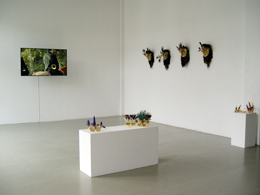
ÉRIC GIRAUDET DE BOUDEMANGE: exhibition view, 2014
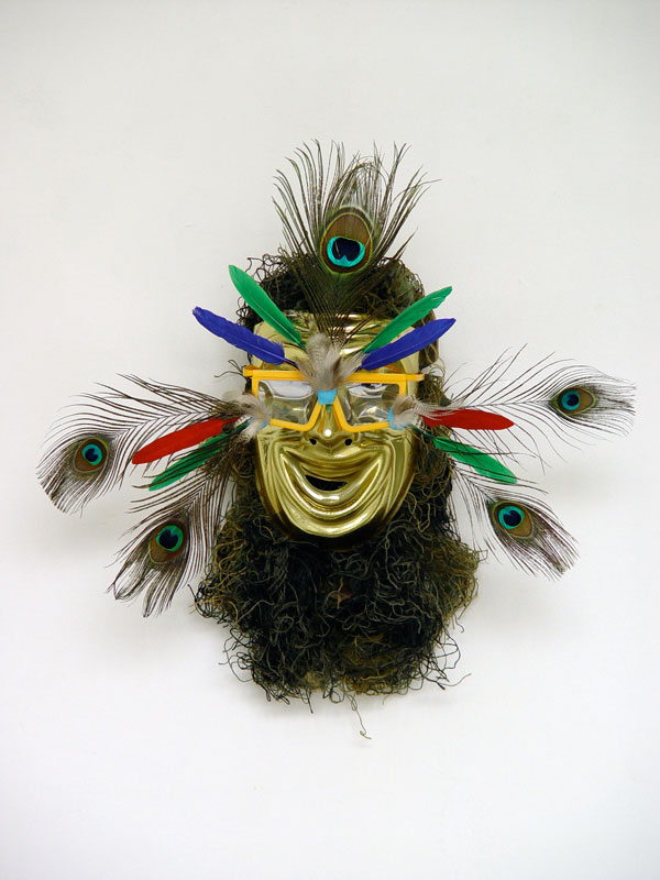
ÉRIC GIRAUDET DE BOUDEMANGE: Klucht van de Jacht, 2014
Klucht van de Jacht
Klucht van de Jacht presents the newest video installation by Éric Giraudet de Boudemange (Boulogne-Billancourt, 1983). The installation displays a 3D film on deer hunting, carnavalesque practices and sexuality presented together with 3D glasses as ritual masks used by visitors.
'Klucht van de Jacht' is entitled after a satirical and burlesque play by the seventeen-century Dutch poet and playwright W. Focquenbroch connecting hunting birds with hunting women. The video by Giraudet de Boudemange is composed of several acts unwrapping a 'hunting scenario' from the beginning of the hunt to the end with the ritual of the dogs eating the meet of the deer. The humorous and absurdist scenes are reenactments of the songs played by hunters on their trumpets to communicate the course of the hunt and describe the behavior of the deer. The video frames the hunt as a sexual carnavalesque metaphor with a succession of images of horsemen, dogs, camouflage and burlesque forest spirits with masks. The hunting songs, usually played on the trumpet, are sung a capella by a trumpet player almost like a throat singer. The song will be heard throughout the whole video as a way of mapping the forest and is seen as a geographical and ritual tool at the same time. The 3D technique enhances the feeling of a theatre stage and the mask-like 3D glasses invites visitors to be part of the installation.
The installation is the last chapter of the artists ongoing research on deer hunting, ritualized practices and folklore that led this year to Hourvari the hectic sounds of feelings, performance at Le Cyclop in Milly la Forêt and The dance of the horned, and other hunting scenes from the forest of Fontainebleau a solo show at Spazioborgogno - Museo Pecci in Milan. The art practice of Giraudet de Boudemange consists of various mediums to capture ethnographic research of traditional games and sports. In previous projects he focused on pigeon fancying, vertical pole archery, fierljeppen (pole jumping in Friesland) and coal miners games like throwing javelots (giant feathery darts) and colored bats. These partially forgotten regional games reveal the history, folk tales, local mythologies and the geographic conditions of a certain area. The traditional games are also influenced through the landscape. For example Fierljeppen, which was developed by farmers as means of moving through the Dutch farmland. The artist exposes and connects the games with personal interpretations and uses 'mapping' methods to research the socio-cultural and geographic characteristics.
curator Julia Geerlings
with the support of the Amsterdam Fonds voor de Kunst
Éric Giraudet de Boudemange is a former resident of the Rijksakademie van Beeldende Kunsten in Amsterdam (2012/2013). He graduated at the Ecole Nationale supérieure des Beaux-Arts in Paris in 2007 and at the Le Fresnoy, studio national des arts contemporains, Tourcoing in 2011. He took part in a number of residency programs including the Townhouse gallery in Cairo, Finis terrae in Ouessant and Mava in Cotonou. Giraudet de Boudemange has performed and exhibited in group- and solo exhibitions including; Le Cyclop in Milly la foret, De Appel in Amsterdam, Fondation Calouste Gulbenkian, Paris, Spazioborgogno in Milan, Galerie Waldburger/Wouters in Brussels and in 2015 at Centre Georges Pompidou in Paris.
___________________________________________
'On the Stairs'
STEEL STILLMAN
in GvG
STEEL STILLMAN: Thighs, 2014
27 November - 27 December 2014
OPENING: Thursday 27 November, 17:00 - 21:00 hours
The opening takes place as part of the Amsterdam Art Weekend 2014
Friday 28 November open from 12:00 - 20:00 hours
Saturday 29 November open from 12:00 - 20:00 hours
Sunday 30 November open from 12:00 - 18:00 hours
for English scroll down
On the Stairs
Steel Stillman’s solotentoonstelling On the Stairs in Galerie van Gelder bestaat uit foto- en tekstwerken die deel uitmaken van twee series “Incidents” en "Sentences". Stillman staat bekend om zijn deels afgedekte fotobeelden en deels om zijn abstracte muurschilderingen.
Fotografie verdonkeremaant altijd de omgeving die buiten het frame van de camera ligt, waardoor je moet speculeren over wat niet getoond wordt. Dit achterwege laten van informatie is precies wat Stillman binnen zijn fotografische beelden bewerkstelligt. Hij zegt hierover: "Wanneer ik delen in mijn foto's zwart maak, toon ik in wezen respect voor wat ik in mijn snapshots toon. Mijn doel is niet om dit bronmateriaal aan te vallen, maar veel meer om aspecten van wat er was te benadrukken."
Als tegenpool van de deels afgedekte visuele beelden, heeft Stillman twee tekstwerken in zijn tentoonstelling On the Stairs toegevoegd. Het betreft twee zinnen die kort en bondig foto's beschrijven, maar daarmee natuurlijk ook de werkelijkheid van de wereld filteren. Door de afgedekte foto's te combineren met zinnen op een pikdonkere achtergrond demonstreert Stillman de beperkingen en de discutabele associaties van ons beeldbegrip, of dat nu door visuele of linguïstische impulsen wordt aangewakkerd of niet. On the Stairs - genoemd naar een van de werken in de tentoonstelling - gaat over wat wij voelen wanneer wij kijken en wat wij begrijpen als wij zien.
Steel Stillman (1955) leeft en werkt in New York en studeerde aan de School of Visual Arts, New York en behaalde daar zijn BFA in 1979. In mei 2014 had hij een solotentoonstelling in Show Room, New York. Eerder heeft hij solo's gehad in Mandarin, Los Angeles en Envoy, New York, o.a. Recente groepstentoonstellingen zijn onder meer Minimal Baroque in Ronnesbaeksholm, Nestved in Denemarken en The Bigger Picture in The Artist’s Institute, New York.
Steel Stillman is contributing editor voor Art in America en geeft les aan School of Visual Arts, New York.
English text
On the Stairs
Steel Stillman´s solo exhibition On the Stairs at Galerie van Gelder brings together photographs and text works from two ongoing series "Incidents" and "Sentences". Stillman is known for covering up photographic images and for painting abstract shield-shaped murals. Taking photos always obscures the larger part of the circumstances outside the camera´s frame, leaving one to speculate about what is not shown. And obscuring in this way is precisely what Stillman does inside his photographic images. He says: ´When I draw black shapes, I'm actually paying respect to what was depicted in the snapshots I use as source material. My aim is not to attack the image but to draw aspects of what was there.´
As a counterpoint to his obscured pictorial works, Stillman includes two text pieces in On the Stairs, sentences that describe photographs. Words, of course, are filtering real-world situations as pictures do. By combining darkened photos and sentences against black backgrounds in his exhibition, Stillman demonstrates the limitations and disputable associations of our readings, whether these are triggered by visual or linguistic cues. All together On the Stairs - named after one of the titles in the show - is about what we sense when we see and what we read when we look.
Steel Stillman was born in New York in 1955, attended Middlebury College, and received a B.F.A. from the School of Visual Arts, New York, in 1979. Last May he had a one-person exhibition at Show Room, New York. He has had solos at Mandarin, Los Angeles, and Envoy, New York, among others. Recent group exhibitions include Minimal Baroque at Ronnesbaeksholm, Nestved in Denmark and The Bigger Picture at The Artist´s Institute in New York. Steel Stillman, who is also a writer, lives and works in New York, where he is a contributing editor of Art in America and teaches at the School of Visual Arts.
|
|
.
|
'Gliding'
MYNE SØE-PEDERSEN
in GvG
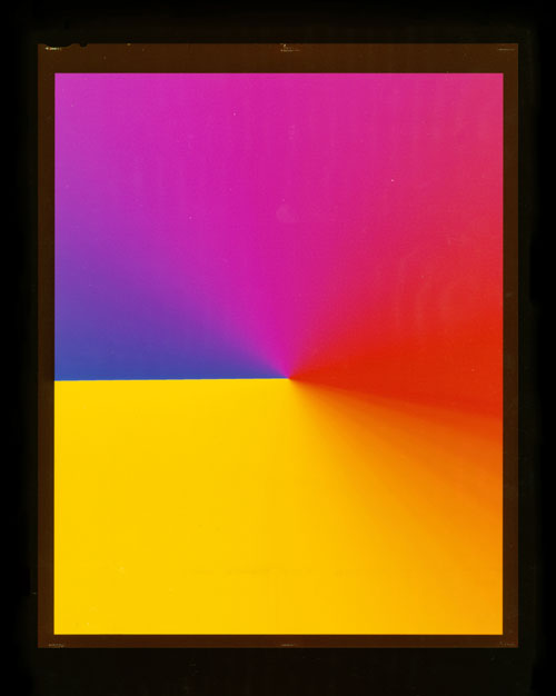
MYNE SØE-PEDERSEN: Gliding #1, 2014
MYNE SØE-PEDERSEN: Scanned Mirrors #1, 2014
18 oktober t/m 26 november 2014
OPENING: zaterdag 18 oktober, 17.00 - 19.00 uur
scroll down for English text
In de tentoonstelling 'Gliding' van de Deense kunstenaar Myne Søe-Pedersen worden foto's van spiegels en horizonnen getoond zonder dat er een camera aan te pas is gekomen. Door middel van computer software maakt zij digitale beelden die lijken op een horizon. Een zwart kader met de rand van een 8 x 10 inch dia is eraan toegevoegd en zo lijkt het beeld op een ouderwetse grootbeelddia. Eigenlijk een dubbele make-believe van een horizon die én virtueel én een fotomontage is. In een andere serie kleurenfoto's die ook met computer software is gemaakt is sprake van abstracte ruimten die uit trillende kleurpatronen zijn opgebouwd. Vandaag de dag is realiteit in de fotografie niet meer zo'n belangrijk punt van discussie en je zou kunnen zeggen dat deze werken suggereren dat alleen de indruk van een horizon of verleidelijke ruimte (vol briljante kleuren) al voldoende is om een beeld van de werkelijkheid te kunnen waarderen.
Een spiegel die onder een scanner wordt gezet - die overigens altijd is voorzien van een traditionele lens - levert een afbeelding op waarin een spiegel naar zichzelf kijkt. Het is geen nep, maar desalniettemin is het resultaat heel anders dan wanneer die met een gewone camera gemaakt zou zijn. Bij een frontale opname is in het laatste geval altijd de lens in de weerspiegeling te zien. Dit in tegenstelling tot het objectiverend licht die tijdens het scannen wordt gebruikt. Deze methode leidt naar een duistere atmosfeer van spiegels die geen mens of ding aankijken. In de tentoonstelling 'Gliding' zijn de spiegels van Myne Søe-Pedersen blind, afgezien van de facetrand en de vingerafdrukken die nog indirect naar een mens verwijzen.
Met de tentoonstelling 'Gliding' onderzoekt Myne Søe-Pedersen de mogelijkheden tussen abstractie, concreetheid en make-believe. Haar fotowerk richt zich op het vastleggen van beelden uit ons geheugen zoals door de jury van het Steenbergen Stipendium al opmerkte toen zij in 2001 een prijs kreeg: "Fotografie gaat vaak over het vastleggen van dat wat je tegenkomt. Myne concentreert zich juist op dat wat ooit was, maar voorbij is. Zij onderzoekt hoe tijd en herinnering vastgelegd kunnen worden in fotografische beelden. Het onderzoek dat zij hiervoor doet en de idee-ontwikkeling is minstens zo belangrijk als de uiteindelijke foto…."
Myne Søe-Pedersen studeerde aan de Rietveld Academie in Amsterdam en was een student van o.a. gallerist en uitgever Willem van Zoetendaal. Zij heeft solotentoonstellingen in Denemarken, Duitsland, Nederland gehad en haar werk zit in de collectie van het Gemeentemuseum, Den Haag, Dennis Hopper Collection, Los Angeles, Novo Nordisk Art Foundation, a.o.
English text
The exhibition 'Gliding' of Danish artist Myne Søe-Pedersen is about photos of horizons and mirrors in which the use of a camera is absent. Computer software has been used to make a digital horizon photo transformed to an 8 x 10 inch transparency. In fact to the digital photo the edge of a contact sheet was added making it into a make-believe transparency of a (virtual) horizon. This brings these photos down to a double fakeness that is all around us. In her other computer software works there is the illusion of deduced space flooded by abundant trembling colours. Nowadays reality is not so much an item and these series of works seem to suggest that merely the impression of a horizon or space is good enough for us.
A mirror put on a scanner - that is by the way provided with a traditional lens - creates a picture of a mirror looking at itself. It is not fake, but nevertheless very different from a mirror taken with a common camera. There is always reflecting light in the given surrounding. Opposite to a scanner where only objectifying light is available when the scan is made. This causes a gloomy atmosphere of the mirrors that Myne Søe-Pedersen puts on show in 'Gliding'. It is as if the mirrors are blind, apart from the edges.
With the exhibition 'Gliding' Myne Søe-Pedersen investigates the possibilities between abstraction, concreteness and make-believe in order to achieve impressions of chequered colours and reality. Her work is about capturing remembrance in photographic images as was noticed already when the Steenbergen Stipendium was awarded to her in 2001. The report of the jury says: "Photography is about dealing with that which one encounters. On the contrary Myne concentrates on that which was there once, and which is gone now. She examines how time and remembrance can be captured in photographic images. Her research for this and the concept development is as important as the final photo itself."
Myne Søe-Pedersen studied at the Rietveld Academy in Amsterdam and was a student of Willem van Zoetendaal, among others. She had exhibitions in Denmark, Germany, Netherlands and her work is in the collection of the Gemeentemuseum, The Hague, Dennis Hopper Collection, Los Angeles, Novo Nordisk Art Foundation, a.o.
Thanks to the Danish Art Foundation for their kind support
'From Recto to Verso'
in AP
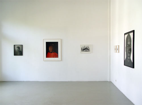 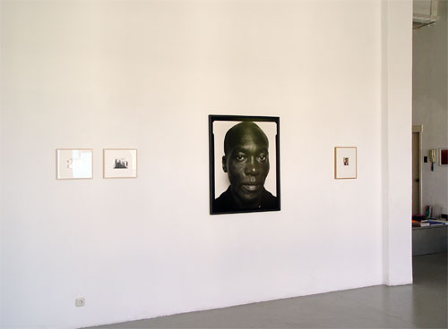 Exhibition views 'From Recto to Verso', 2014
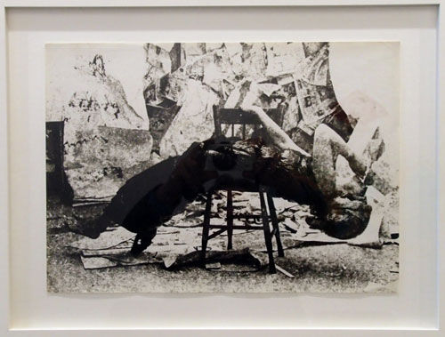 FRANS ZWARTJES: Untitled, 1969 *
Koos Breukel
Rineke Dijkstra
Marjaana Kella
Johan van der Keuken
Céline van Balen
en Frans Zwartjes
18 oktober t/m 26 november 2014
OPENING: zaterdag 18 oktober, 17.00 - 19.00 uur
curator Willem van Zoetendaal
* unique photograph on Czechian bariet paper, signed, framed.
"Decors werden meestal gemaakt door Trix Zwartjes en het is geen film still)." Willem van Zoetendaal, 7 mei 2014
 Sukuranburu Kousaten by Indigenous Genitalman
6 september t/m 15 oktober 2014
OPENING: zaterdag 6 september 17.00 - 19.00 uur
17.30 uur: performance 'In the Beginning was the Safe Word, and the Safe Word was Forgotten'
for text in English scroll down
Sukuranburu Kousaten by Indigenous Genitalman.
De installaties van Aditya Mandayam zijn rijk aan beelden. Op een indirecte manier verwijzen die naar wetenschappelijke fenomenen, historische gebeurtenissen, de dubbelzinnigheid van de natuur, vreemd of uitheems eten of naar ongebruikelijke technieken. Kortom een breed scala aan media dat hij bijeenbrengt in een dichterlijk veld van zowel zoektochten en mathematische systemen als voodoo-achtige assemblages in de vorm van gevonden materialen, film- en fotoprojecties.
Aditya Mandayam is gefascineerd door het geheel van samengestelde beeldcomplexen bestaand uit materie of tekst en de lezing daarvan. Zo'n helder niet-helder geheel is misschien te vergelijken met de samenballing van zebrapaden in Japanse metropolen die "Sukuranburu Kousaten" worden genoemd (Engelse vert. "scramble crossings"). De zichtbare wereld is een knooppunt van tegenstrijdigheden; ook hijzelf is een vat vol tegenstrijdigheden, weet hij. Dat is te zien als hij een performance doet waarbij andere krachten uit hem te voorschijn komen. Dat verschilt niet veel van wat hij ziet als hij naar de mensen om zich heen kijkt. In dat licht is het geen wonder als hij zegt: 'I am the messiah, I am the terror of the white cube; I direct people within a space of art.' Hij wil ingrijpen in een Gordiaanse knoop, maar hij realiseert zich dat hijzelf deel daarvan is.
De kritische blik van Aditya Mandayam op de wereld om hem heen kent een tegenpool als hij zelfportretten tekent of fotografeert. Hij lijkt hier te willen wegkruipen achter het masker van een door hem bedacht steeds veranderend personage zoals "Self portrait as a mystery shopper" (2013) of "Indigenous Genitalman" (2014).
Aditya Mandayam studeerde van 2011-2013 aan de Rijksakademie van beeldende kunsten, Amsterdam. In 2014 sloot hij een artist's in residence af in Wiels, Brussel en had een solotentoonstelling in Kim? in Riga, Letland.
English text
Sukuranburu Kousaten by Indigenous Genitalman.
In the installations of Aditya Mandayamimages are abundant. These refer indirectly to scientific phenomena, historic events, to the ambiguity of nature, to strange or indigenous food and unconventional techniques. In short, he makes use of a broad spectrum of media brought together in a poetic field of both search and technical devices as well as voodoo-like assemblages composed of found materials, film and slide projections.
Aditya Mandayam is fascinated by the wholeness of composed image complexes constructed of materials, text and its reading. Such a clear-unclear wholeness is perhaps comparable to the agglomeration of scramble crossings that are called "Sukuranburu Kousaten" in Japanese metropoles. The outer world is a junction point of inconsistencies, he knows. This is palpable when he does performances in which other powers are released out of him. That doesn't differ much from what he observes when he looks around watching people's behaviour. It is no wonder he says: 'I am the messiah, I am the terror of the white cube; I direct people within a space of art.' He engages himself in a Gordian knot, but he realizes that he is part of this.
The critical view of Aditya Mandayam on the world around him does know a counterpart when he portrays himself by drawing or taking a photograph. Here he seems to prefer to refuge behind a mask of a continuously changing personage made up by him, such as "Self portrait as a mystery shopper" (2013) or "Indigenous Genitalman" (2014).
Aditya Mandayam studied from 2011-2013 at the Rijksakademie van beeldende kunsten, Amsterdam. In 2014 he finished an artist's in residence in Wiels, Brussels and had a solo exhibition in Kim?, Riga, Latvia.
 'I can't ask you to hike one mountain while I hike the other'
FRANÇOIS DEY
'I can't ask you to hike one mountain while I hike the other'
FRANÇOIS DEY
in GvG
24 mei - 3 augustus 2014
for English text see below
François Dey beschouwt het voorbijgaande en het immateriële even belangrijk als de dingen, de natuur, de mensen zoals die concreet om ons heen te vinden zijn. Zo krijgt de ervaring van een wandeling in François Dey's tentoonstelling de vorm van een serie dia's die op de matglazen ruiten van de galerie bevestigd zijn. De koelkast waarop een diaprojector staat fungeert als sokkel, maar met drank erin ook nog als koelkast. In tegenstelling tot waarvoor hij gemaakt is doet de diaprojector met diaslede niet meer dan een en dezelfde dia tonen. De vloer is door François nat gemaakt en daarna bedekt met muurgruis van de galeriewanden. Na een solodans op de nog natte vloer liet hij die opdrogen, waarna afdrukken van zijn voetstappen op de vloer achter bleven als een soort gigantische print op de vloer en een overblijfsel van een ongeziene privé-gebeurtenis. Kortom hij zoekt naar uitdrukkingsvormen waarbij het immateriële in het concrete doorklinkt.
Voor François Dey is een wandeling met zijn tweeën een moment van 'human bonding', vooral als die wandeling enkele dagen in beslag neemt. De tijd van bij elkaar zijn is een tijd die onontkoombaar opgevuld wordt met een ruimte die zich bij wijze van spreken oplaadt. Het beleven van tijd is intens, vooral als bijvoorbeeld samen een berg wordt beklommen. Zo'n wandeling is qua reële tijdsduur en totaalervaring niet concreet vast te leggen, maar in 'I can't ask you to hike one mountain while I hike the other' heeft François Dey naast een eenvoudig visueel 'reisverslag' van film en dia's een vloersculptuur van opgedroogd kalkgruis in de ruimte geplaatst, waarin tijdens het verstrijken van de tentoonstellingsperiode boven op zijn voetafdrukken sporen van bezoekers terug te vinden zullen zijn.
François Dey studeerde aan de Rietveld Academie in Amsterdam en nam in 2008-2009 deel aan het Honours Program van dezelfde academie. In het kader van het IFP / Institute for Provocation - multidisciplinary research platform verbleef hij in 2013 - 2014 in China. Momenteel is hij deelnemer van de Jan van Eyck Academie in Maastricht.
English text
FRANÇOIS DEY
François Dey considers the evanescent and the ephemeral both as important as the objects, nature, people that surround us all. In this way the experience of a walk in François Dey's exhibition comes into being through a series of slides provisionally mounted on the mat windows of the gallery and not in a slide projector depicting a sequence of photos. The refrigerator on which the slide projector is placed functions as a pedestal, but with drinks inside the fridge functions still for what it was made for. Opposite to its original purpose the projector with slides tray shows continuously just one and the same slide. The floor has been made wet by François Dey followed by covering it with the lime from the sandpapered gallery walls. He danced solo on his own on the swept and still wet floor. After drying up his footprints were left as a kind of gigantic floor print and left-over of an unseen private event.
For François Dey a walk together creates a moment of human bonding that is worthwhile to get hold on. The time of being together is unavoidably filled up with a charged space, particularly when hiking a mountain takes hours and hours. The real time and experience is impossible to reproduce; yet François Dey is able to show partly the ephemeral of it. In 'I can't ask you to hike one mountain while I hike the other' he has created - next to a plain visual travel report by means of film and slides - a floor sculpture of dried up wall chalk dust. During the exhibition visitors will make a path on it, leaving their footprints on top of the artist's footprints. The latter is a change that for him is comparable to the ultimate beauty.
François Dey studied at the Rietveld Academie in Amsterdam and was invited by the academy to be part of the Honours Program in 2008-2009 deel. With the support of the IFP / Institute for Provocation - multidisciplinary research platform he lived and worked in China in 2013 - 2014. At this moment he is participant of the Jan van Eyck Academie in Maastricht.
___________________________________________
℞
RUCHAMA NOORDA
in AP
28 juni - 3 augustus 2014
OPENING: zaterdag 28 juni, 17.00 - 19.00 uur
voor Nederlandse tekst zie hieronder
For her installation at Galerie van Gelder, Ruchama Noorda employs dirt as a central ingredient in the form of fragments of built structures taken from the ruins of two early 20th century utopian communes, together with earth and plant matter collected at these sites. By compressing these materials into small circular discs, she condenses the material foundations on which these social and spiritual experiments in ‘alternative living’ once rested into portable easy to swallow medicinal tablets. The pills on display in this exhibition come from the socialist colony of Llano del Rio (1915-1918) in Southern California and Walden (1898-1907) a Life-Reform commune in the Netherlands.
These instant art-works, to be taken with water, come with a fact-sheet; a guide for overcoming the dualistic split between mind & body, the collective & individual aspects of being, the obstinacy of matter & the suppleness of intuition. Combining these earthly medications with personal photographs and material taken from magazines and shared by friends, Noorda creates a kind of pro biotic compost fed from a wide variety of data. This convocation of voices and ideas sets out to short circuit the opposition between purity and danger by means of dirt and water. Noorda’s installation revolves around questions of essence and seeks to activate that vital spark (élan vital) which she believes to be present in everyday material.
Ruchama Noorda (Leiden, 1979) is an artist who uses diverse media and materials in performances and installations. She was awarded a BA in Visual Art at the Royal Academy of Art in The Hague in 2002 and completed her MFA at the Sandberg Institute in Amsterdam in 2004. Since 2009 Noorda has been enrolled in the PhDArts program at the University of Leiden where she is researching the impact across the arts and culture in Europe and the USA of the early 20th century Lebensreform (Life Reform) movement. Noorda has exhibited in many group shows and solo exhibitions including Museum De Lakenhal, Museum Het Domein, Kunstvereniging Diepenheim, High Desert Test Sites California, Stadthausgalerie Münster and W139.
curator Julia Geerlings
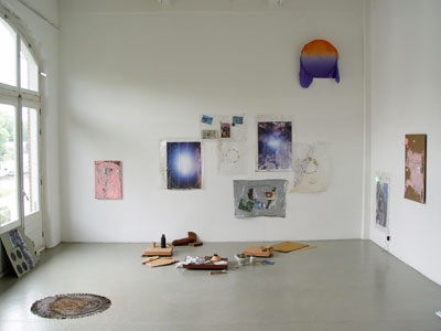
exhibition view
Nederlandse tekst
Voor haar installatie bij Galerie van Gelder in AP maakt Ruchama Noorda gebruik van een verscheidenheid aan materialen, met modder als centraal ingrediënt, in de vorm van aarde, plantaardig materiaal en brokstukken van bouwwerken uit de ruïnes van twee vroege 20e eeuw utopische kolonies. Door het comprimeren van deze landschappen in kleine cirkelvormige schijven, zet zij het materiaal om in het fundament waarop deze sociale en spirituele experimenten in 'alternatieve levenswijze' rustte, in een klein en makkelijk te slikken medicinale vorm. De installatie bevat pillen gemaakt van de socialistische kolonie van Llano del Rio (1915-1918) in Zuid-Californië en Walden (1898-1907) dat een levenshervormende gemeente in Nederland was.
Deze kant-en-klaar kunstwerken, te worden ingenomen met water, komen met een bijsluiter. De bijsluiter is een gids voor het overwinnen van het dualisme beginnend tussen lichaam en geest, het collectieve en het individuele (als aspecten van het zijn), en dat eindigt tussen materie en verstand. Via deze medicatie in combinatie met persoonlijke foto’s en materialen gevonden in tijdschriften en gedeeld door vrienden, creëert Noorda een soort van pro-biotische compost toegevoerd uit een grote verscheidenheid aan gegevens. Deze samenkomst van stemmen en ideeën veroorzaakt een kortsluiting van de tegenstelling tussen zuiverheid en gevaar door middel van vuil en water; Noorda’s installatie draait om de vragen van essentie en streeft ernaar een vitale vonk (elan vital) te activeren, welke zij gelooft dat die in alledaags materiaal aanwezig is.
Gaper, 2014 - photo magnet, edition 5
Ruchama Noorda (Leiden, 1979) is een kunstenaar die verschillende media en materialen aanwendt in performances en installaties. Ze behaalde een BA in Beeldende kunst aan de Koninklijke Academie van Beeldende Kunsten in Den Haag in 2002 en voltooide haar MFA aan het Sandberg Instituut in Amsterdam in 2004. Sinds 2009 is Noorda verbonden aan het PhDArts programma aan de Universiteit van Leiden, waar ze onderzoek doet naar de impact van kunst en cultuur in Europa en de Verenigde Staten van de vroege twintigste-eeuwse Lebensreform beweging. Noorda heeft geëxposeerd in vele groepstentoonstellingen en solotentoonstellingen zoals Museum De Lakenhal, Museum Het Domein, Kunstvereniging Diepenheim, High Desert Test Sites Californië, Stadthausgalerie Münster en W139.
curator Julia Geerlings
___________________________________________
'Ali, Nino and the Numbers'
CHRISTOPH WESTERMEIER
in AP
24 mei - 25 juni 2014
OPENING: zaterdag 24 mei, 17.00 - 19.00 uur
+
curator Julia Geerlings
for text in Dutch see below
On a daily basis we are exposed to a constant stream of images. Almost 1.000 pictures are made every second and shared on social media and websites like Tumblr, Instagram or Facebook. How do we perceive these images and how to deal with this mass of images? These are recurring questions defined in the work by Christoph Westermeier (1984, Cologne) and materialized in his photographs and image-installations. In his first projects he worked mainly with found photographs and reproductions, but since his time in Amsterdam at 'De Ateliers' Westermeier has moved himself behind the lens to take his own photographs.
Westermeier is momentarily an artist-in-residence in Istanbul, where he has been taking photographs of the changing city during his many walks through the streets of Istanbul. These images are carefully selected and posted on Instagram and Tumblr as a visual journey around the city through the eyes of Westermeier. Besides his own photographed interpretation of Istanbul he is also drawn to the historical monuments and traditional (banned) imagery found in the museums of Istanbul. He is particularly interested in the German Archaeological Institute in Istanbul where he was fascinated by its extensive photo archive of black-and-white photographs of Turkey, its population, architecture and archaeological artefacts.
The title of the exhibition 'Ali, Nino and the Numbers' is a reference to the novel Ali and Nino (1937) by Kurban Said. Westermeier refers in his work often to literature as a way to understand the world around him. Ali and Nino is a novel about a romance between a Muslim boy and a Christian girl and the clash of the Western and the Eastern culture. The 'Numbers' in the title are a reference to the archives and the photographic work in the exhibition. The image-installations in the exhibition consist out of the historical black-and-white photographs taken from the German Archaeological Institute in combination with Westermeiers own photography.
Before he re-photographed images, where he made photographs of photographs while adding objects in the background or use sunlight to enhance the image. Recently he started to re-block his collected images and photographs. The re-blocking or layering of the images on top of each other forms a mosaic of images, which refer to the many images constantly surrounding us. In this exhibition he still works with different systems of display by hanging the photographs loosely on structures, putting them in archive boxes and placing them on different surfaces like marble pieces. In this sense Westermeier made his own archaeological collection and shows the construction and reception of images at the same time.
Christoph Westermeier is currently an artist-in-residence in Istanbul through Kunststiftung NRW. He graduated at the Academy of Fine Arts Dusseldorf in 2010 and was a participant at De Ateliers in Amsterdam in 2011-2013. He was awarded with the Förderpreis NRW in 2013, the Arbeitsstipendium Stiftung Kunstfonds Bonn in 2013 ad the dHCS Scholarship by Kunstverein Dusseldorf in 2011 among others. Westermeier has exhibited in many group shows and solo exhibitions including Kunstverein Düsseldorf, Galerie Max Meyer, Stedelijk Museum Bureau Amsterdam, Westfälischer Kunstverein Münster, De Appel Arts Centre Amsterdam, KunsthausI6 in Freiburg and Museum voor Moderne Kunst Arnhem.
Julia Geerlings
Dagelijks worden we blootgesteld aan een constante stroom van beelden. Bijna 1.000 foto's worden er per seconde gemaakt en gedeeld op sociale media en websites zoals Tumblr, Instagram of Facebook. Hoe kunnen we deze beelden waarnemen en hoe moeten we omgaan met deze massa van beelden? Dit zijn terugkerende vragen gedefinieerd in het werk van Christoph Westermeier (1984, Keulen) en gematerialiseerd in zijn foto's en beeldinstallaties. In zijn eerste projecten werkte hij voornamelijk met gevonden foto's en reproducties, maar sinds zijn tijd in Amsterdam bij 'De Ateliers' heeft Westermeier zich achter de fotocamera geplaatst om zijn eigen foto's te maken.
Westermeier is op het moment een artist-in-residence in Istanbul, waar hij foto's maakt van de veranderende stad tijdens zijn vele wandelingen door de straten van Istanbul. Deze beelden worden zorgvuldig geselecteerd en op Instagram en Tumblr geplaatst als een visuele reis rond de stad door de ogen van Westermeier. Naast zijn eigen gefotografeerde interpretatie van Istanbul wordt hij ook aangetrokken door de historische monumenten en traditionele (verboden) beeldtaal te vinden in de musea van Istanbul. Hij was vooral geïnteresseerd in het Duitse Archeologisch Instituut in Istanbul, waar hij gefascineerd werd door het uitgebreide fotoarchief van zwart- wit foto's van Turkije, de bevolking, de architectuur en de archeologische artefacten.
De titel van de tentoonstelling 'Ali , Nino and the Numbers' is een verwijzing naar de roman 'Ali en Nino' (1937) door Kurban Said. Westermeier verwijst in zijn werk vaak naar literatuur als een manier om de wereld om hem heen te begrijpen. 'Ali en Nino' is een roman over een romance tussen een islamitische jongen en een christelijk meisje en de botsing van de westerse en de oosterse cultuur. De 'Numbers' in de titel is een verwijzing naar het archief en het fotografisch werk in de tentoonstelling. De beeldinstallaties in de tentoonstelling bestaan uit de historische zwart-wit foto's uit het Duitse Archeologisch Instituut in combinatie met Westermeiers eigen fotografie.
Voorheen fotografeerde hij (gevonden) foto's en creëerde hij de illusie van een driedimensionale ruimte in het beeld. Hij maakte foto's van foto's terwijl hij andere objecten in de achtergrond toevoegde of hij gebruikte zonlicht om het beeld uit te lichten. Nu is hij begonnen met 're-blocking' of het afdekken van zijn verzamelde afbeeldingen en foto's. Het afdekken van de beelden door de afbeeldingen over elkaar heen te plaatsen vormen een mozaïek, dat verwijst naar de vele beelden constant aanwezig om ons heen. In deze tentoonstelling werkt hij weer met verschillende tentoonstellingssystemen, zoals de foto's los op structuren te hangen, de foto's in archiefdozen te plaatsen en op verschillende oppervlakken aan te brengen zoals op marmer. In dit opzicht creëert Westermeier zijn eigen archeologische collectie en geeft het proces en de receptie van beelden om ons heen tegelijkertijd weer.
Christoph Westermeier is momenteel een artist-in-residence in Istanbul via Kunststiftung NRW. Hij studeerde aan de Academie voor Schone Kunsten in Düsseldorf in 2010 en was een deelnemer aan De Ateliers in Amsterdam in 2011-2013. Hij werd bekroond met de Förderpreis NRW in 2013, de Arbeitsstipendium Stiftung Kunstfonds Bonn in 2013 de dHCS Scholarship via Kunstverein Dusseldorf o.a.. Westermeier heeft geëxposeerd in vele groepstentoonstellingen en solotentoonstellingen, waaronder Kunstverein Düsseldorf, Galerie Max Meyer, Stedelijk Museum Bureau Amsterdam, Westfälischer Kunstverein Münster, De Appel Arts Centre Amsterdam, KunsthausI6 in Freiburg en Museum voor Moderne Kunst Arnhem.
Julia Geerlings
___________________________________________
2014
Ansuya Blom, 'Through Shutters', 2013 (detail)
Through Shutters
ANSUYA BLOM
19 April - 21 May 2014
Zo goed als elke dag beschrijven wij elkaar en beschrijven wij mensen in het algemeen; die is zús, die is zó. Wellicht komt die drang voort uit een behoefte om structuur aan te brengen, ook al verschuift die steeds lichtelijk, net zoals wij het meubilair van een interieur verschuiven. Uiteindelijk zetten wij stoelen, bedden en tafels weer graag terug op 'zijn plaats'. Vraag daarbij is wat in essentie werkelijk vast ligt en wat niet. In de tentoonstelling 'Through Shutters' van Ansuya Blom zijn interieur en mens bijeengebracht. Het is typerend voor de manier waarop zij de zich toegeëigende thema's combineert, zoals een interieur uittekenen en een persoon beschrijven, zoals 'S.' (Seymour) die met een zoekende hand op zwart beschilderd karton door haar uitgelijnd is. Maar wie is 'S.'? Van wie is de uitvergrootte hand die vanuit de huidplooien en palmlijnen grip op een interieur probeert te krijgen?
In de tentoonstelling is een klein werk met de titel 'Just' (2014) te zien. Het is een interieurtekening waarin de lijnen niet volledig zijn doorgetrokken, zodat een tafelpoot ontbreekt of ergens anders de contouren van een kast maar voor een deel waarneembaar is. Kleine stipjes als vertrekpunt zijn met witte inkt aangebracht met klaarblijkelijk de bedoeling om een stoel of lamp te tekenen, maar halverwege is dat idee gestaakt. Het is alsof door de kieren van lamellen is gekeken waarbij slechts delen van het interieur te zien zijn. Misschien is dat precies zoals wij naar de wereld om ons heen kijken; we zien de delen en vullen het ontbrekende in.
press release in English
Virtually every day we describe each other and portray people in general; this one is such, that one is so. Possibly this urge stems from the need for installing a structure, even if it slightly shifts all the time, just like we move our furniture at home. Eventually we gladly put a chair, table and bed back in "its place". The question is what is really allocated and what isn't. In Ansuya Blom's exhibition 'Through Shutters' interior and individual are brought together. It is characteristic of the way in which she combines her appropriated themes such as drawing an interior and portraying some one like "S." (Seymour) who is outlined on a black painted cardboard with a searching hand, but who is "S."? And whose enlarged hand is it that tries to get a grip on an interior starting from skin pleats and palm lines?
In the exhibition there is a small work called "Just" (2014). It is a drawing - made with eyes closed - depicting a not fully completed interior. Small specks as a starting point are applied with white gouache ink apparently with the aim of drawing a chair or lamp, but halfway that idea was abandoned. It is as if one has looked through the blinds and only parts of the interior could be seen. Perhaps this is precisely how we look at the world around us; we see the parts and fill in what is missing.
 Amalgam
curated by Julia Geerlings
CARLOS IRIJALBA
19 April - 21 May 2014
Amalgam is a combination or mixture of diverse elements, which will create something different. Spanish artist Carlos Irijalba (Pamplona, 1979) is interested in the alchemistic qualities of amalgam and its opaque function and history on different territories. In his work he investigates the physical properties of a given terrain and uses the outcome as material in his practice. Amalgam as a modifiable substance is used in dentistry for dental fillings, as a substance for healing. Asphalt in landscape is an amalgam used for roads to cover up the natural layers of soil. This opaque mass seals the accumulative memory present in the soil, which transforms the substance in a material to forget. A way of extracting memory is by drilling the layers of soil as a timeline. In the exhibition this drilling is presented in the insertion of bismuth alloy. This grayish-white metallic element shares a specific characteristic with water that in solid state (when it turns into ice) floats on its liquid state.
The different appearances of matter are of interest to Irijalba. In the sense of how history is visible in matter and how you perceive it. Mexican-American writer, artist and philosopher Manuel DeLanda stated in New Materialism: Interviews & Cartographies (2012); ‘All objective entities (substances) are products of a historical process, that is, their identity is synthesized or produced as part of cosmological, geological, biological, or social history’i>. In the exhibition the pieces of asphalt are perceived as a layer of human intervention of geological history. The traces of Bismuth intervene in the soil tubes like the dental fillings in teeth. The sheets of photographs of the teeth in the show are recurring in the metal foam A4’s. Metal foam is a material used for aircrafts and now presented as a paper format on which information is often transmitted. In the exhibition the ‘Amalgam’ works are responding to the study of matter and meaning. Accumulations, crystallizations and eruptions do not exclusively happen in certain behaviours of visible matter, but also occur in genetics, language or social dynamics. In the words of Irijalba: ‘Amalgam as an opaque capacity function as a substance to forget. Amalgam is to override, to overwrite. To disallow the past with a substance, as opaque in appearance as transparent in it's lack of structure.’
press release in Dutch
Amalgaam is een combinatie of een mengsel van diverse elementen. Spaanse kunstenaar Carlos Irijalba (Pamplona, 1979) is geïnteresseerd in de alchemistische kwaliteiten van amalgaam en de geschiedenis ervan op verschillende terreinen. In zijn werk onderzoekt hij de fysische eigenschappen van een bepaald grondgebied en gebruikt de uitkomsten als materiaal voor zijn kunstpraktijk. Amalgaam wordt gebruikt in de tandheelkunde voor vullingen en als materie voor genezing. Asfalt in het landschap is een amalgaam dat gebruikt wordt voor wegen als afdekking van de natuurlijke bodemlagen. Deze onduidelijk samengestelde massa sluit het cumulatieve geheugen in de bodem af, die substantie transformeert in een materiaal dat vergeet. Een manier om iets uit het geheugen naar boven te halen is het doorboren van bodemlagen als een tijdlijn. In de tentoonstelling worden deze boringen gepresenteerd met de toevoeging van bismuth. Dit grijs-witte metaal heeft als specifiek kenmerk dat het zich in vaste toestand gedraagt als water dat in vaste toestand verkeert, namelijk wanneer het verandert in ijs en blijft drijven op zijn vloeibare toestand.
Carlos Irijalba is geïnteresseerd in de verschillende verschijningsvormen van materie in het algemeen. In de zin van hoe geschiedenis zichtbaar te maken is in materie en hoe je waarneemt. De Mexicaans-Amerikaanse schrijver, kunstenaar en filosoof Manuel DeLanda vermeldt in 'New Materialisme : Interviews & cartografieën' (2012): "All objective entities (substances) are products of a historical process, that is, their identity is synthesized or produced as part of cosmological, geological, biological, or social history". In de tentoonstelling worden stukken asfalt getoond als een laag van menselijke interventie in een stuk geologische geschiedenis. De sporen van bismuth interveniëren met de bodemboringen zoals de vullingen in de tanden. Foto's van tanden en kiezen komen terug in A-viertjes van metaalschuim. Metaalschuim is een materiaal dat meestal gebruikt wordt voor vliegtuigen en wordt nu gepresenteerd op een papierformaat waarop informatie vaak wordt overgedragen. In de tentoonstelling 'amalgaam' zijn de kunstwerken een weerslag van het onderzoek naar materie en betekenis. Opeenhopingen, kristallisaties en uitbarstingen vinden niet uitsluitend plaats in zichtbare materie, maar komen ook voor in de genetica, taal of sociale dynamiek. In de woorden van Irijalba : "Amalgam as an opaque capacity function as a substance to forget. Amalgam is to override, to overwrite. To disallow the past with a substance, as opaque in appearance as transparent in it's lack of structure."
Carlos Irijalba is momenteel resident bij de Rijksakademie van beeldende kunsten in Amsterdam ( 2013/2014 ). Hij studeerde af aan de Basque Country University en UDK Berlijn in 2004. Hij werd bekroond met de Guggenheim Bilbao Photography Grant in 2003 en de Marcelino Botín Art Grant in 2007/ 08 . Hij ontving de Purificacion Garcia Photography First Prize en de Revelation Photo España Prize, onder andere. Irijalba heeft in galeries, kunstinstellingen en musea tentoongesteld, waaronder CCCB Barcelona, Herzliya Museum Israël of The Yokohama Art Center en LMCC New York.
Julia Geerlings
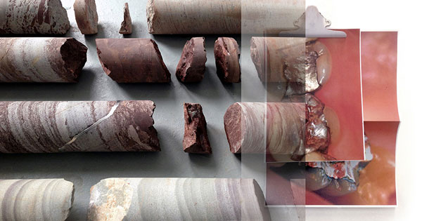
Carlos Irijalba is currently a resident at the Rijksakademie van Beeldende kunsten in Amsterdam (2013/2014). He graduated at the Basque Country University and UDK Berlin in 2004. He was awarded with the Guggenheim Bilbao Photography Grant in 2003 and the Marcelino Botín Art Grant in 2007/08. He also received the Purificacion Garcia Photography First Prize and the Revelation PhotoEspaña Prize among others. Irijalba has exhibited in galleries, art institutions and museums worldwide, including CCCB Barcelona, Herzliya Museum Israel or The Yokohama Art Center and LMCC New York.
+ presentation CUT magazine about art, issue 10, including small photo edition of Carlos Irijalba, edition 35, signed, numbered and dated
 Nicolas Chardon: carré noir (grille rose), 2013
FRAMES
NICOLAS CHARDON
Nicolas Chardon: carré noir (grille rose), 2013
FRAMES
NICOLAS CHARDON
25 januari - 5 maart 2014
OPENING: zaterdag 25 januari, 17.00 - 19.00 uur
Het werk van Nicolas Chardon beweegt zich bij voortduring tussen dat wat bestaat, namelijk bedrukt textiel als objet trouvé, en dat wat hij schilderend daar aan toevoegt. Dat doet hij door grid en spel samen te voegen tot een pakkend beeld. Ernst en humor gaan dan hand in hand. Al jarenlang maakt hij gebruik van ruitjesstof die hij als leidraad gebruikt voor zijn geometrische doeken. Een witte ondergrond laat licht doorschijnend de bedrukte ondergrond van het textiel zien. Vervolgens beschildert hij geometrische vormen over de licht doorlatende ondergrond, terwijl hij nauwlettend de golvende lijnen van de ruitjesstof volgt. Nicolas Chardon verrast door de inventieve wendingen die hij op deze manier elke keer tot stand weet te brengen.
In de tentoonstelling ‘Frames‘ in Galerie van Gelder brengt Nicolas Chardon andermaal een ode aan Kazimir Malevich. Op zijn speelse manier schildert hij het suprematische werk ‘Zwart vierkant‘ en kadert dat met een witte omranding in en vervolgens kadert hij dat weer met onbeschilderde ruitjesstof. Het is het kaderen van werk dat al gedaan is, maar het is ook het kaderen van zijn werk in de iconografie van de beeldende kunst. Wat hij toevoegt is een extra gevoeligheid door mee te gaan met een zelf gecreëerde context; de golvende bewegingen van de opgespannen ruitjesstof. Het is een opvallende sensitiviteit voor materiaal en geometrische vormen.
English text
The work of Nicolas Chardon moves continuously back and forth between what exists - i.e. printed fabric as objet trouvé - and what he paints on top of this. He does that by bringing together grid and play. Seriousness and humour go hand in hand. Already for years he uses grid fabric that is the base of his geometric paintings. A white painted foundation reveals the underlying printed fabric in a shaded transparent way. Afterwards he paints geometric shapes over this light foundation, while he vigilantly follows the undulating lines of the underlying lines of the grid. In this way Nicolas Chardon surprises again and again by his inventive twists.
In the exhibition "Frames" in Galerie van Gelder Nicolas Chardon once again brings an ode to Kazimir Malevich. In his playful manner he paints the suprematic work "Black square" and frames this with a white border after which he frames this again with the unpainted grid of the bare fabric. It is about framing of work that has been done already, but it is also framing his work within the iconography of the visual arts. What he adds is an extra sensitivity by adapting to a context created by himself; the undulating movements of the stretched grid fabric. It is a remarkable affection for material, geometric shapes and surrounding.
&
in AP
WILD PATTERNS
NICOLAS CHARDON's invited artists:
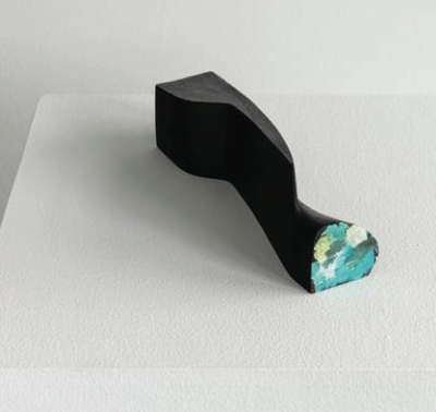
Clément Rodzielski: Untitled, 2012
Bernard Aubertin
Karina Bisch
Emil Michael Klein
Camila Oliveira Fairclough
Julien Monnerie
Clément Rodzielski
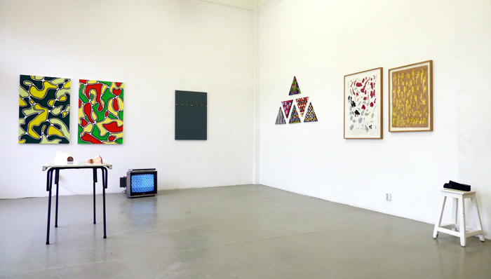
Wild Patterns
Of het nu gaat om verf die van een spatel is afgeveegd, een collage van repeterende beelden op een driehoek, een kleurrijk schilderij met vervloeiende patronen, zes manchetknopen op een rij of objecten aan een kant met een kwast aangestipt, het is hoogstwaarschijnlijk het repetitieve beeld dat deze werken samenbrengt. Of samen vasthoudt. Het is een wilde groep werken van vrienden van Nicolas Chardon gekozen op grond van een geclassificeerde chaos om indirect deel te worden van zijn solotentoonstelling ‘Frames‘ in Galerie van Gelder.
English text
Wild Patterns
Whether wiped off paint from a spatula, a collage of repetitive images on a triangle, a colourful running pattern painting, six cuff links on a row or patch painted objects, it is most probably the repetitive image that brings them together. Or keeps them together. It is a wild bunch of classified chaos of friends invited by Nicolas Chardon and brought together by him in AP to become indirectly part of his solo exhibition "Frames".
|
.
|
|
SIGURDUR GUDMUNDSSON
29 november 2013 - 15 januari 2014
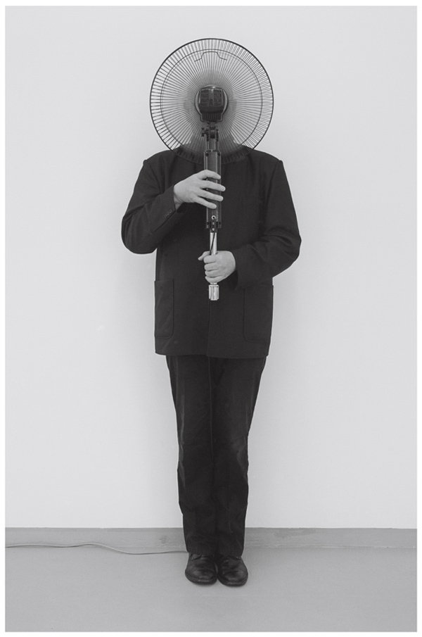
SIGURDUR GUDMUNDSSON: Untitled (Pose), 2011, photograph, 67 x 47,5 cm
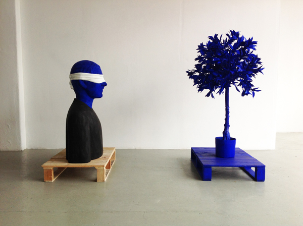
SIGURDUR GUDMUNDSSON: Come back muse, 2013
COME BACK MUSE
Na ruim dertig jaar wordt Sigurdur Gudmundsson nog steeds geprezen om de poëtisch beschouwelijke fotowerken die hij in de periode 1972-1980 tot stand bracht. Begin 1980 maakte hij nog enkele fotowerken en besloot daarna heel ander werk te gaan maken. Hij richtte toen zijn aandacht volledig op het maken van sculpturen, tekeningen in betonnen lijsten, donkere king size-schilderijen en grafiek. Hij huurde een groot atelier in IJmuiden waar hij o.a. betonnen piramides met zwanen op een enorme sokkel plaatste. Dit kreeg de titel Het Grote Gedicht. Het werd door toenmalig directeur van het Stedelijk Museum Amsterdam Edy de Wilde met groot enthousiasme aangekocht voor de collectie van het museum en in 1984 werd het op de afscheidstentoonstelling La Grande Parade voor het eerst getoond.
In de tentoonstelling Come back muse worden de fotowerken van de jaren 70 en 80 in de vorm van sculpturen een nieuw leven ingeblazen. De ik-persoon, de kunstenaar die wij van deze foto's kennen, zien wij in de sculpturen terug en verkeert als voorheen in contemplatieve situaties. Deze 3D-werken zijn misschien te ervaren als de beroemde foto's uit het verleden, maar zij voegen decennia later onmiskenbaar iets aan zijn beeldend dichten toe, bijvoorbeeld in het ene werk kaart hij een gender-aspect aan en in een ander werk maakt hij figuren tot vrienden die afgebeeld staan op schilderijen van collega-kunstenaars.
|
|
.
|
MAKEDO DOMAKE - Mon Deux
2nd set of performances
Friday 1 November 2013
starts at 19.00 hours
Makedo Domake - 2nd set, 2013
Yayati Papita, That Palpitating Talapati, and has invited friends over to Galerie van Gelder resulting in:
four new performances by
KATE LEVANT
RODERICK HIETBRINK
KROoT JUURAK
and
EKKO LOKKWA
in AP:
JOEY VERBERKT
curator Gerben Willers
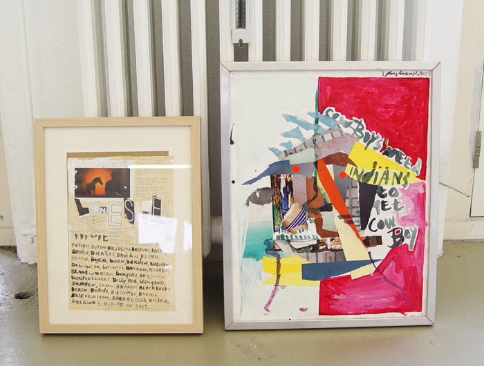
19 oktober - 27 november 2013
OPENING: vrijdag 18 oktober, 18.00 - 20.00 uur
MAKEDO DOMAKE
1st set of performances
Friday 18 October - Thursday 31 October 2013
starts at 19.00 hours
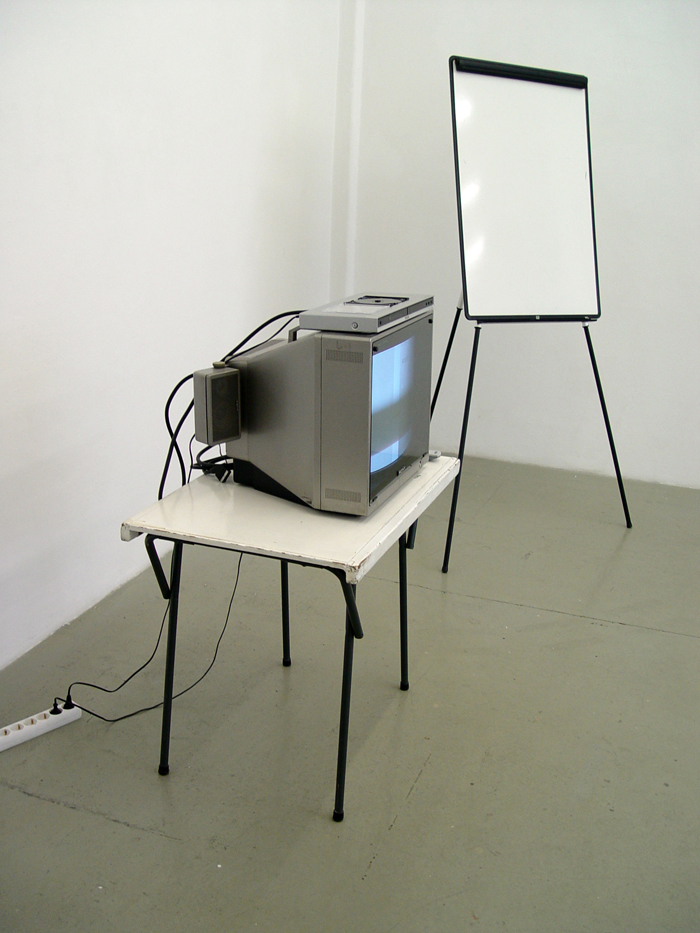
Bea McMahon: 'Lecture on rock', 2013
Since this summer, Yayati Papita, That Palpitating Talapati, has invited friends over to Galerie van Gelder.
'Lecture on rock' by Bea McMahon.
Solo exhibitions include Bea McMahon, Treignac Projects, France, 2013;
Root, Temple Bar Gallery and Studios Dublin, 2012, Flat Time
House, London 2011 and Warp and Woof CCA Glasgow 2011. Group
exhibitions include One foot in the real world, Irish Museum of Modern
Art 2013; In the house of Mr & Mrs X, Temporary Gallery, Cologne,
2013; All Humans Do, White Box, New York, 2012.
She is represented by Green on Red Gallery in Dublin and is currently resident at
Rijksakademie van beeldende kunsten, Amsterdam.
'Swan Song' is a brief performance by Aditya Mandayam with clapping and shaking.
'El Contagion' is an audiovisual extravaganza by Juan-Pablo Villegas Delgado.
Makedo Domake is a series of spatiotemporal ambiences. An assemblage
titled 'Salutations to the Nassa Hablood' that will remain on display in
the gallery for period of time unknown yet; a bit longer until Thursday 31 October.
Contributors to 'Salutations to the Nassa Hablood' include Ola, Roy,
Adriana, Kate, Olof, Jay, Popo, Dolores, Frankie, Los Fosfenos, oh and
Kees too of course, and Biggi and Nan, Emsi, Madziu, the Magma Dama. Oh
and yeah Oscar too.
And a few more people.
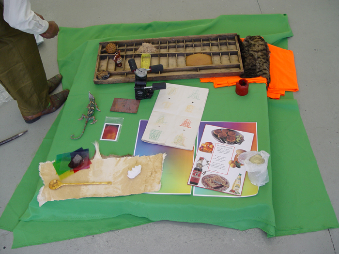
Aditya Mandayam: 'Swan Song', 2013

KLAAS KLOOSTERBOER: 08102, 2008 - exhibition view
KLAAS KLOOSTERBOER
Principle of Uncertainty / Open
In de quantummechanica bestaat een theorie die ervan uit gaat dat het onmogelijk is om exact de plaats van een bewegend deeltje en tegelijkertijd
de impuls (d.i. hoeveelheid energie) ervan te meten. Het is er allebei, maar er moet bij een precies waarnemen een keuze gemaakt worden indien je
een van de deeltjes goed wil zien. In de tentoonstelling 'Principle of Uncertainty / Open' van Klaas Kloosterboer zijn beide delen van een en
hetzelfde werk opmerkelijk goed te zien: twee plaatsbepalingen die zich voordoen als een geheel. De impact (d.i. hoeveelheid energie) van het ene
deel is bijna even goed te zien als de impact van het andere deel, waarbij beide delen niet voor elkaar onderdoen. Er is geen sprake van een
arbitraire situatie; het totaalding als kunstobject is een krachtige eenheid. In de tentoonstelling 'Open / Principle of Uncertainty' bij Ellen de
Bruijne Projects heeft deze twee-eenheid een losser en meer open karakter, maar beide tentoonstellingen kunnen desalniettemin als een spiegel van
elkaar gezien worden.
English text
In quantum mechanics it is stated that it is impossible to know the exact place of a moving particle and simultaneously the impulse (i.e. amount of
energy) of it. It is both there but in case one wishes to perceive this exactly one has to choose for either of them. In the exhibition 'Principle
of Uncertainty / Open' of Klaas Kloosterboer both parts of one and the same work is remarkably well to observe: two locations that occur as a whole.
The impact (i.e. amount of energy) of one part is almost equally displayed as the impact of the other part, while both parts are not inferior to
each other. There is no arbitrary situation; the total thing as art object is a strong unity. In the exhibition 'Open / Principle of Uncertainty'
at Ellen de Bruijne Projects this two-in-one unity is more loose and open, but nevertheless both exhibitions could be seen as a mirror of each
other.
tegelijkertijd is er een solotentoonstelling van Klaas Kloosterboer in Ellen de Bruijne Projects genaamd: Open / Principle of Uncertainty
in AP:
JONAS LUND
curator Gerben Willers
7 september - 12 oktober 2013
Curate This
CINDY SHERMAN,'Woman in Pool', 2007 (beach towel)
'Curate This' is het eerste project van gastcurator Gerben Willers in AP. Hij nodigde hiervoor de Zweedse kunstenaar Jonas Lund (SE 1984) uit, die
op zijn beurt hem als curator vroeg om een aantal kunstenaars in een tentoonstelling Curate This bijeen te brengen. Op basis van zijn werk
'Internationale top 100 meest gewaardeerde curatoren 2013' heeft Jonas Lund een algoritmische formule bedacht en de curator gevraagd deze toe te
passen op de kunstenaarsnamen uit de collectie multiples en edities van Galerie van Gelder.
English text
'Curate This' is the first project of guest cuarator Gerben Willers in AP. He invited Swedish artist Jonas Lund (SE 1984) who in his turn asked
him as curator to bring a group of artists together in an exhibition named 'Curate This'. Based on his work 'Internationale top 100 highest ranked
curators 2013' Jonas Lund constructed an algorithm and he asked the curator to apply this to the artist names from the collection multiples and
editions of Galerie van Gelder.
August 2013: open by appointment
This and That and That
JOHN M ARMLEDER
ANSUYA BLOM
ELVIRE BONDUELLE
WJM KOK
OLA VASILJEVA
and others
MATTHEW LUTZ-KINOY
Matthew's Secret
The Meadow, 2013 download e-publication for i-pad here
25 mei - 7 juli 2013
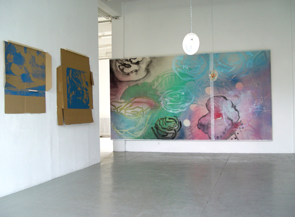
Cardboard prints, 2010 and The Grid, 2013
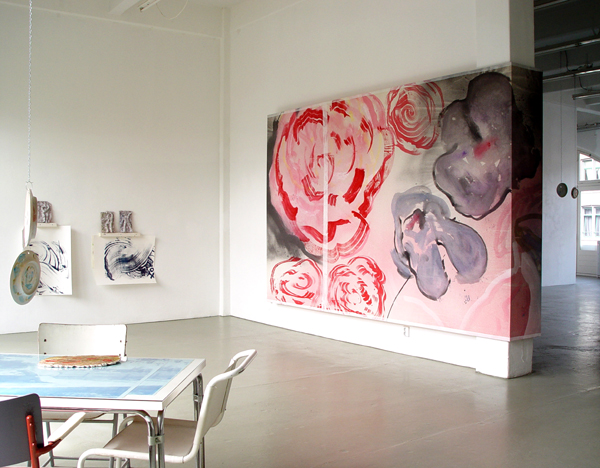
The Grid, 2013
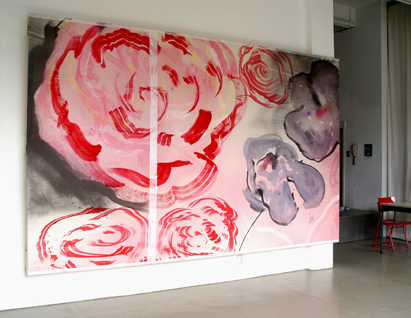
The Grid, 2013
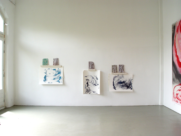
Dancers in the blue, Sand prints with Studies for Norwich and by chance, Cromer, 2013
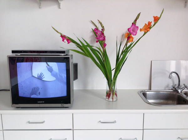
Don't change, don't go, don't leave, just freeze, 2005 - 2008
video
from the artist's archive - shown with flowers as instructed by the artist
voor Nederlandse tekst zie hier onder
PRESS RELEASE
Matthew's Secret
Matthew Lutz-Kinoy is the kind of artist for whom a bedroom could be cited as the principle material for a work. There's
the bed, the desk, the video camera and books. There is also plenty of stuff that is not obviously useful, but infers
the cultivation of an aesthetic. A box of golden thread (with pieces no longer than an inch), a bag of scrap cloth (but
of pretty color), scraps of tissue (worth keeping).
These objects sit on his desk, waiting to get
arranged into a collage. But he decides that the collage should include more than the pieces of material, and the paper alone.
It should include the piece of paper and the desk on which it sits, with the lamp, and the bundle of colored pencils. The
scissors and the glue - what comes together, what comes apart. It should include his hand, which works on it, and whatever
else is around. Because, after all he is there at the desk, a body connected to a hand, wearing some clothes that he might
have made, or altered or just chosen out.
While working he might need a nap, or desire to
look out the window and so the collage is drawn out wider to include this path around the room - the desk, the bed, the window.
He starts to video these miniature narratives as a performance carried out in private, an intrinsically precocious moment,
that can never be bound in a single video but a practice, where these pieces of scrap, and this image, the whole desk, can be
part of a more complicated montage with the things in his mind, mood, and imagination.
Matthew's work is about being able to place a
tendency for abstraction within a more broad experience of life, and then to communicate this experience back into formalism
through a deeply personal species of performance. One pushing the other, which then responds and re-in forms itself - dual
impulses that drive a life of creativity and not just a discipline.
-James English Leary 2006
"Matthew Lutz-Kinoy" THE INVENTION OF SOLITUDE PUBLICATION, page 26,
published by Aston and Horrox, ISBN 978-0-9549748-1-6
|
.
|
|
ELVIRE BONDUELLE
Race and Rest
13 april - 22 mei 2013
for English text see below
Race and Rest
Het werk van Elvire Bonduelle richt zich in haar tentoonstelling 'Race and Rest' op twee tegengestelde begrippen "actie en contemplatie". Op allerlei manieren
bedenkt zij mini events om te communiceren met haar bezoekers. In haar gehele werk is dit terug te vinden. In 2012 kocht ik een aantal loterijkaartjes ten
behoeve van een tekeningen-event in Onestar Press in Paris. In gezelschap van wachtende bezoekers met genummerde kaartjes maakte zij ter plekke
kleurpotloodtekeningen die werden verloot. Ik was niet in Parijs aanwezig en ik was haar tekeningensessie helemaal vergeten. Na drie weken kreeg ik een envelop
in de bus waarin een lotnummer en een gewonnen kleurpotloodtekening van een motorfiets van Elvire Bonduelle zat. Ik was onder de indruk van de evocatieve
eenvoud ervan. Nu heeft zij haar eerste solotentoonstelling in Nederland.
Elvire Bonduelle zegt: "It is through my quest for happiness, developed in my practice since the beginning of 2000, that those two poles came into being. I
realized that in my life making art was the best way to give room to both my body and my spirit. This is why I love making art; it involves two oppositions on
the same level. One is sometimes fighting with materials, carrying heaving things, hurting your back, and sometimes while studying in libraries for hours, you
think and try hard to understand what clever people expressed in books... So basically my intention, both in life as in my art, is to find a good balance
between physical action and spirituality."
Over haar tentoonstelling zegt Elvire Bonduelle: "In the exhibition there will be a lot of pieces linked to the idea of contemplation, holy things, spirituality,
hope (for God's existence?) and belief (in life after Death?). I look at my oil paintings as true sacred art. Pure skies that makes you dream of a better life,
open and beautiful and good. Their arcade shape with a mini altar piece and a new video called 'Maison Voiture Chien' /'House Car Dog' (with the number 3 a kind
of Holy Trinity) refers to the Middle Ages, my favourite period for arts with very religious and naive and virtuous spirits. I feel a lot of tenderness and
empathy with their human condition and I find it very present in this kind of pedagogical art (you know, they did these paintings mostly to teach religion to
the people who couldn't read). I would like also to educate people even if I am just a poor little woman who didn't have a very strong experience of life ...
But in my paintings there is nobody left, only the sky, maybe God and every one disappeared. Perhaps this is iconoclastic."
Over rennen en rusten zegt Elvire Bonduelle: "I like the idea of belief through this quest of happiness; maybe the only way to be happy is to believe in your
own happiness. I spend a lot of energy brainwashing myself in believing I am happy, and it works! Being polite helps also a lot; you must be smiley, so you
become truly smiley :-)
To relax and take time for positive thoughts in the exhibition there will be cushions to sit on and on which one can have a comfortable break; our body needs to
be rested to have a positive spirit. That's a good way to stay out stupidity, and even nasty situations sometimes; we are too nervous if I look around. It's
like when I'm in a hurry on my bicycle and I scare the pedestrians by going very fast and very close to them and thinking "go away you bastard!" Very stupid of
me, I hate myself when I do that!"
"The cushions in my exhibition are there with a purpose. They are about comfort. I mean, there is a piece of art on which you can have a rest. At the other hand
there is conformity, this idea of standards and of social norms. One is running, i.e. one is getting a house, a car and a dog, some children, do this or that.
This all in competition with the world we are living in. You even may want to have the most beautiful and powerful and nicest of them…. It is the story I tell
in a song… and you wish to have a nice kitchen with a big oven for making the best cake..., which of course gives pleasure…
So you have the video clip and the altarpiece directly related to the idea of racing, and others are linked by opposition.
Yes, sometimes you have to "Sit On It"!! I like the idea that you can sit on art: to say it isn't so precious and sacred than what (art) believers think. It is
also iconoclast, in another way. Also I already made plenty of chairs, because I think they are our adaptors to earth, to life. Cushions are there, because I am
getting older; I want comfort now!"
In 2012 had Elvire Bonduelle een solopresentatie 'L'art, le joli et le fonctionnel' in Onestar Press en nam deel aan 'To the Moon via the Beach' met curators
Liam Gillick, Phillipe Parreno, Hans Ulrich Obrist, Tom Eccles en Beatrix Ruf, in Arles, Frankrijk. In 2013 nam zij deel aan 'Book Machine - Un Nouveau Festival'
in Centre Georges Pompidou, Parijs. In juni 2013 is zij curator van een groepstentoonstelling Waiting room #3 in Galerie Laurent Mueller in Parijs. Een
solotentoonstelling in 2014 is te zien in Sabrina Amrani Gallery, Madrid in Spanje.
In 2012 verscheen bij Onestar Press in Parijs 'Les dessins à la règle - Catalogue raisonné', 250 genummerde en gesigneerde exemplaren, waarvan 25 door de
kunstenaar zijn ingekleurd (350 pages).
English text
Race and Rest
The work of Elvire Bonduelle is most of the time about "action and contemplation, i.e. two opposite notions" as she says. The title of her exhibition 'Race and
Rest' refers to this. In various ways she often plans what she calls mini-events. This is actually the way through which I found her work. In 2012 I bought some
tombola tickets for a drawing event at Onestar Press in Paris. One evening she made drawings in front of a waiting audience holding their lottery tickets. Each
ad hoc finished drawing was given away to the one who got the right tombola number. I was not in Paris and forgot about this completely. After three weeks an
envelope dropped on my doormat and it appeared to be that I had won a drawing showing a motor bike in colour pencil. I was impressed by its evocative simplicity.
Now she has her first solo show in The Netherlands.
Elvire Bonduelle says: "It is through my quest for happiness, developed in my practice since the beginning of 2000, that those two poles came into being. I
realized that in my life making art was the best way to give room to both my body and my spirit. This is why I love making art; it involves two oppositions on
the same level. One is sometimes fighting with materials, carrying heaving things, hurting your back, and sometimes while studying in libraries for hours, you
think and try hard to understand what clever people expressed in books... So basically my intention, both in life as in my art, is to find a good balance
between physical action and spirituality."
About her exhibition Elvire Bonduelle says: "In the exhibition there will be a lot of pieces linked to the idea of contemplation, holy things, spirituality,
hope (for God's existence?) and belief (in life after Death?). I look at my oil paintings as true sacred art. Pure skies that makes you dream of a better life,
open and beautiful and good. Their arcade shape with a mini altar piece and a new video called 'Maison Voiture Chien' /'House Car Dog' (with the number 3 a kind
of Holy Trinity) refers to the Middle Ages, my favourite period for arts with very religious and naive and virtuous spirits. I feel a lot of tenderness and
empathy with their human condition and I find it very present in this kind of pedagogical art (you know, they did these paintings mostly to teach religion to
the people who couldn't read). I would like also to educate people even if I am just a poor little woman who didn't have a very strong experience of life ...
But in my paintings there is nobody left, only the sky, maybe God and every one disappeared. Perhaps this is iconoclastic."
About her racing and resting Elvire Bonduelle says: "I like the idea of belief through this quest of happiness; maybe the only way to be happy is to believe in
your own happiness. I spend a lot of energy brainwashing myself in believing I am happy, and it works! Being polite helps also a lot; you must be smiley, so you
become truly smiley :-)
To relax and take time for positive thoughts in the exhibition there will be cushions to sit on and on which one can have a comfortable break; our body needs to
be rested to have a positive spirit. That's a good way to stay out stupidity, and even nasty situations sometimes; we are too nervous if I look around. It's
like when I'm in a hurry on my bicycle and I scare the pedestrians by going very fast and very close to them and thinking "go away you bastard!" Very stupid of
me, I hate myself when I do that!"
"The cushions in my exhibition are there with a purpose. They are about comfort. I mean, there is a piece of art on which you can have a rest. At the other hand
there is conformity, this idea of standards and of social norms. One is running, i.e. one is getting a house, a car and a dog, some children, do this or that.
This all in competition with the world we are living in. You even may want to have the most beautiful and powerful and nicest of them…. It is the story I tell
in a song… and you wish to have a nice kitchen with a big oven for making the best cake..., which of course gives pleasure…
So you have the video clip and the altarpiece directly related to the idea of racing, and the others are linked by opposition.
Yes, sometimes you have to "Sit On It"!! I like the idea that you can sit on art: to say it isn't so precious and sacred than what (art) believers think. It is
also iconoclast, in another way. Also I already made plenty of chairs, because I think they are our adaptors to earth, to life. Cushions are there, because I am
getting older; I want comfort now!
In 2012 Elvire Bonduelle had a solo presentation 'L'art, le joli et le fonctionnel' at Onestar Press and participated in 'To the Moon via the Beach' with
curators Liam Gillick, Phillipe Parreno, Hans Ulrich Obrist, Tom Eccles and Beatrix Ruf, in Arles, France. In 2013 she participated in 'Book Machine - Un
Nouveau Festival' in Centre Georges Pompidou, Paris. In June 2013 she will curate a group show called Waiting room #3 Galerie Laurent Mueller in Paris. A solo
exhibition in 2014 is scheduled at Sabrina Amrani Gallery, Madrid, in Spain.
'Les dessins à la règle - Catalogue raisonné', 250 numbered and signed copies of which 25 customized by the artist, 350 pages, Onestar Press, Paris.
JAAP KRONEMAN
NAAKT
2 maart - 10 april 2013
JOHN M ARMLEDER
24 Years Ahead
1 december 2012 - 23 februari 2013
JOHN M ARMLEDER: Untitled, Furniture Sculpture, 1988
for English text see below
PERSBERICHT
24 Years Ahead
Vier en twintig jaar geleden, in 1988, had John M Armleder zijn eerste solotentoonstelling in Galerie van Gelder. Diverse werken uit deze periode zijn na lange
tijd weer in de galerie te zien: een installatie met roterende discoballen, Furniture Sculptures, dot paintings, Pour Paintings, fotowerken, tekeningen, edities
en multiples. Om tot de kern van zijn werk te komen wordt tot nu toe in alle kritieken uitgebreid geschreven over de verschillende media, de technische toepassingen
en zijn stijl van werken, maar deze zaken komen voort uit iets dat veel wezenlijker is en dat is zijn manier van denken en doen. De rest is niet meer dan een
gevolg daarvan.
John M Armleder houdt zich niet bezig met het belang van de schilderkunst, drukwerk, design, abstractie of figuratie. Het nadrukkelijk kiezen voor een
bepaald medium of stijl van werken acht hij niet van belang en technieken in het algemeen hoeven als zodanig voor hem ook niet door de buitenwereld gezien of
begrepen te worden. Net zomin wil hij persé consequent in zijn oeuvre zijn. Hij laat een dergelijke bewuste keuze voortdurend links liggen en ook dat is geen
wet van Meden en Perzen, want het onverwachte in het maakproces kan hem altijd weer verbazen: "I can only confess being always close to mesmerized by the
quasi-stupidity which qualifies the formal problems depicted in my pieces. But they do excite me enough to get through with them, and the whole process each
time shakes the complete system of values I thought I had understood before".* Alle gevolgen neemt hij dan daarbij op de koop toe. De bereidheid om een
ontkenning van wat hij dacht ontdekt te hebben te omarmen, door middel van de praktijk of door het krijgen van een nieuw idee, is de grote kracht van deze
kunstenaar. Dat maakt zijn kunst en vooral zijn beweeglijk denken in de kunst zo bewonderenswaardig en invloedrijk.
* John M Armleder in conversation with Helmut Federle, Zurich, 1985
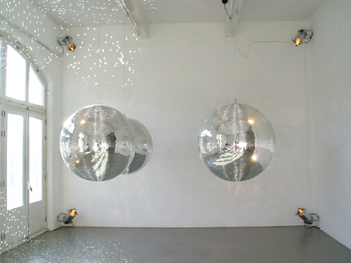
JOHN M ARMLEDER: Untitled, 2000
English text
PRESS RELEASE
24 Years Ahead
In 1988, twenty-four years ago, John M Armleder had his first solo show in Galerie van Gelder. Various works from this period are on show again in the gallery
after many years: an installation of rotating disco balls, Furniture Sculptures, dot paintings, Pour Paintings, photo works, drawings, editions and multiples.
In order to get down to the root of his work all critiques describe extensively the use of different media, the technical process of the making of and the often
abstract style of his works. These issues emanate from something which is more essential and this is his manner of thinking and doing. The rest is no more than
a matter of consequence.
John M Armleder is not being concerned at all about notions as painting, printed matter, design, abstraction or figuration. Diverse media and styles of working
and taste are not really that important and as such these don't need to be seen or understood by the outer world, necessarily. No more than wishing to be
consequent in his oeuvre perse, he leaves these alone and even that is not a law of the Medes and Persians. His Furniture Sculpture (1988) made of three second
hand scooter saddles bought in an Amsterdam motorbyke shop show his playfulness at one point and the added abstract painting on two saddles his affinity with
strips and lines. The unexpected in the process of making can always surprise him again and again: "I can only confess being always close to mesmerized by the
quasi-stupidity which qualifies the formal problems depicted in my pieces. But they do excite me enough to get through with them, and the whole process each
time shakes the complete system of values I thought I had understood before".* He is prepared to put up with all consequences. His readiness to embrace a
negation of what he thought to have discovered before, through practice or by means of getting a new idea or making another move, is the great strength of this
artist. This makes his art and above all his susceptible thinking in the arts so admirable and influential.
* John M Armleder in conversation with Helmut Federle, Zurich, 1985
* events at new space in Planciusstraat 9 A, 1st floor:
PERFORMANCE:
Friday 30 November, 2012, 18.30 hours
FRANÇOIS DEY and BALTHAZAR BERLING
'When I look at myself in the mirror I don't see two men', 2012
featuring Suzanna as dancer
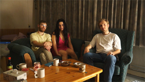
PERFORMANCE
Sunday 2 December, 2012, 15.30 hours
SUZAN NOESEN
'Visual Detention and Distance', 2012
1 september - 13 oktober 2012
To make a show
it takes a thought
and more than one word
 OLA VASILJEVA: Speach cloud, 2012, keramiek, matte glaze
Part II
ANSUYA BLOM
OLA VASILJEVA: Speach cloud, 2012, keramiek, matte glaze
Part II
ANSUYA BLOM
ELVIRE BONDUELLE
NICOLAS CHARDON
SYLVIE FLEURY
DAN GRAHAM
KRISTJAN GUDMUNDSSON
SUZAN NOESEN
HENK PEETERS
OLA VASILJEVA
MARIJKE VAN WARMERDAM
for English text see below
PERSBERICHT
'To make a show it takes a thought and more than one word' (Part II) is een tentoonstelling waarin werken op een onderzoekende manier aan tekst en beeld
gerelateerd zijn. De werken bestaan uit meer dan alleen tekst met een leeg vlak als achtergrond, zoals dat bijvoorbeeld in de moppenschilderijen van
Richard Prince of in de doeken met stencilletters van Christopher Wool te zien is. In de bijeengebrachte werken spelen de beelden die door taal worden
opgeroepen niet de belangrijkste rol. Hier hebben woorden en zinnen een sterke neiging om niet meer dan een beeld van typografische aard te zijn, doordat
een beeldend element de inhoud van de tekst of suggestieve code wegdrukt, zoals in het werk met plussen en minnen van Kristjan Gudmundsson, dat de titel
'Een filosofisch plan van een bloedverwant' (1986) draagt. Of in een tekening van Suzan Noesen die een lemniscaat-achtig probleem aansnijdt.
In de tentoonstelling is sprake van werken waarbij de inhoud van de tekst door een opvallende kleur of overduidelijke gebruiksfunctie naar de achtergrond
wordt gedrukt. Een installatie met tekstbroches 'Pour faire joli' (vert.: 'Om leuk te maken') op kledingstukken van Elvire Bonduelle is een voorbeeld van
hoe tekstinhoud naar de achtergrond gedrukt wordt. In enkele werken wordt niet meer dan de suggestie van een mededeling gegeven, zoals in het lege
vloerpaneel van Nicolas Chardon, de niet ingevulde zwarte spreekballon van Ola Vasiljeva en in 'The Walk III' van Ansuya Blom waarin een handschrift een
leesbare tekst suggereert. In alle gevallen blijft het picturale beeld domineren.
Kortom, in 'To make a show it takes a thought and more than one word' (Part II) is sprake van een verbeelding die zich beweegt tussen de suggestie van een
mededeling en de eenduidigheid van een gebruiksfunctie. De betekenis van een papieren boodschappentas van Dan Graham met een beschouwende tekst over de
menselijke maat en de onmetelijkheid van de kosmos kan niet trivialer, maar anderzijds: wat is meer voor de handliggend dan een feitelijke tekst op een
boodschappentas?
English text
PRESS RELEASE
'To make a show it takes a thought and more than one word' (Part II) is an exhibition in which art works in an investigating manner are related to text and
image. The works are not just about texts with an empty plane as background, as seen for example in the joke paintings of Richard Prince or in the stencilled
letter paintings of Christopher Wool. In the works on show the linguistic image does not play the most important role. Here words and sentences have a strong
tendency to behave as no more than of typographical value, caused by a pictorial element that pushes aside the meaning of the text, such as in the work with
plusses and minuses of Kristjan Gudmundsson, that is called 'A philosophical plan of a blood relative' (1986). Or in a drawing of Suzan Noesen, in which a
lemniscate-like form seems to cause a problem.
In the exhibition in various ways the content of a message is suppressed due to a striking colour or the practicality of e.g. a shopping bag. An installation
of clothing with text brooches 'Pour faire joli' (i.e. 'To make nice') of Elvire Bonduelle is an example of how text content is shoven away. In several works
no more than a suggestion of a message is given, as in the empty floor sign/sculpture of Nicolas Chardon, the wordless black speech balloon of Ola Vasiljeva
and in 'The Walk III' van Ansuya Blom in which a handwritten text suggests a readable text. In all these cases the pictorial image is dominant.
In short, in the exhibition 'To make a show it takes a thought and more than one word' (Part II) text and image move between a suggestion of an announcement and
the unequivocality of an applied function. The meaning of a paper shopping bag of Dan Graham with a contemplating text about human measurement and the immensity
of cosmos cannot be more trivial, but on the other hand what is more obvious than a factual text on a shopping bag?
GIJS VAN LENTHE
Starend naar Gods lichtbak
 GIJS VAN LENTHE: Untitled, 2012, potlood op papier
De 22-jarige Gijs van Lenthe zou een goede nieuwe vertegenwoordiger van de Nul-beweging kunnen zijn. In een ultra korte film is met stilstaande camera een
kartonnen doos te zien. Plotsklaps wordt er een hoop vochtig zand met geruis in de hoek van een doos gegooid. Er gebeurt verder niets, of het zouden nauwelijks
waarneembare schaduwbewegingen moeten zijn van iemand die buiten beeld loopt. De film eindigt bikkelhard in het zwart en de monitor, zelf ook weer een doosvorm,
blijft in de expositieruimte over. Een banaan is aan zijn steel met nietjes aan een wand bevestigd, eronder hangt een lege ultra lichtgewicht plastic zak van
de supermarket. Een paar meter er vandaan staan op de vloer honderden recht opstaande en tegen elkaar aangeschoven enveloppen in een ellipsvormige nul. Hier en
daar steekt een stapeltje opengescheurde enveloppen omhoog. Minimaal is het werk van Gijs van Lenthe voor alsnog zeker te noemen.
Tijdens de opening zal hij een kort begeleidend commentaar leveren op wat hij in zijn kunst tegenkomt.
 To make a show it takes a thought...
Part I
19 June - 20 August 2012
JOHN M ARMLEDER
NICOLAS CHARDON
KRISTJAN GUDMUNDSSON
JCJ VANDERHEYDEN
HENK PEETERS
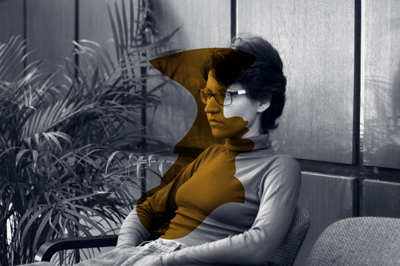 OLA VASILJEVA: 'Vestibule',film still, 2012
OLA VASILJEVA in GvG
OAOA Vestibule
7 april - 30 mei 2012
installatie: keramiek, video, posters
for English text see below
Een door Ola Vasiljeva ingerichte tentoonstelling verandert de ruimte in losse momenten en mini-installaties, die grotendeels intuïtief door haar bijeengebracht zijn. Samen vormen die een prettige verwarring. Die tweeledigheid vindt
zijn grondslag in de manier waarop zij een tentoonstellingsidee in een ruimte ontwikkelt. Zij maakt haar werk als losse objecten die zij voor een installatie-idee inzet. Vervolgens wordt die bevolkt met keramische objecten, video,
diverse ornamenten, meubilair en eigenhandig gemaakt drukwerk.
In OAOA Vestibule toont Ola Vasiljeva haar belangstelling voor het begrip 'vestibule', dat zij als een tussenin ruimte ervaart die relatief groot is ten opzichte van de doorgangsfunctie ervan. Zij noemt het een "verlegen plek",
een introverte ruimte die geen uitgesproken functie heeft. Zij zegt daarover: "A vestibule is a little bit on the edge of being either a room or a corridor, something in between. Nobody stays there too long and the space is not
supposed to catch your attention the most."
Ola Vasiljeva refereert graag naar arts & craft, muziek, subculturen en klassieke literatuur. Voor de installatie in Galerie van Gelder heeft zij OAOA (The Oceans Academy of Arts) toegevoegd als platform voor ideeën over kunst.
Het is door Ola Vasiljeva en John Hey is in 2008 opgericht. OAOA maakt werk, verzamelt en toont kunst met een opmerkelijke afwezigheid van enige hiërarchie tussen wat een tentoonstellingsruimte definieert, de kunstwerken en de rol
van de deelnemers. OAOA werkt niet alleen samen met andere kunstenaars, maar ook met musici en mensen die niet specifiek iets met hedendaagse kunst te maken hebben.
Ola Vasiljeva's werk was de afgelopen jaren te zien in Helsinki, Berlijn, Londen, Vilnius, Los Angeles aen New York. Haar meest recente solotentoonstelling was in 1646, Den Haag.
Ter gelegenheid van de tentoonstelling 'OAOA Vestibule' verschijnt een nieuwe publicatie van The Oceans Academy of Arts: 'Journal Vestibule Versions', issue # 6.
'To make a show it takes a thought and more than one word' (Part II) is een tentoonstelling waarin werken op een onderzoekende manier aan tekst en beeld gerelateerd zijn. De werken bestaan uit meer dan alleen tekst met een leeg vlak als achtergrond, zoals dat bijvoorbeeld in de moppenschilderijen van Richard Prince of in de doeken met stencilletters van Christopher Wool te zien is. In de bijeengebrachte werken spelen de beelden die door taal worden opgeroepen niet de belangrijkste rol. Hier hebben woorden en zinnen een sterke neiging om niet meer dan een beeld van typografische aard te zijn, doordat een beeldend element de inhoud van de tekst wegdrukt, zoals in het werk met plussen en minnen van Kristjan Gudmundsson, dat de titel 'Een filosofisch plan van een bloedverwant' (1986) draagt. Of in een tekening van Suzan Noesen die een lemniscaat-achtig probleem aansnijdt.
In de tentoonstelling is sprake van werken waarbij de inhoud van de tekst door een opvallende kleur of overduidelijke gebruiksfunctie naar de achtergrond wordt gedrukt. Een installatie met tekstbroches 'Pour faire joli' (vert.: 'Om leuk te maken') op kledingstukken van Elvire Bonduelle is een voorbeeld van hoe tekstinhoud naar de achtergrond gedrukt wordt. In enkele werken wordt niet meer dan de suggestie van een mededeling gegeven, zoals in het lege vloerpaneel van Nicolas Chardon, de niet ingevulde zwarte spreekballon van Ola Vasiljeva en in 'The Walk III' van Ansuya Blom waarin een handschrift een leesbare tekst suggereert. In alle gevallen blijft het picturale beeld domineren.
Kortom, in 'To make a show it takes a thought and more than one word' (Part II) is sprake van een verbeelding die zich beweegt tussen de suggestie van een mededeling en de eenduidigheid van een gebruiksfunctie. De betekenis van een papieren boodschappentas van Dan Graham met een beschouwende tekst over de menselijke maat en de onmetelijkheid van de kosmos kan niet trivialer, maar anderzijds: wat is meer voor de handliggend dan een feitelijke tekst op een boodschappentas?
English press release
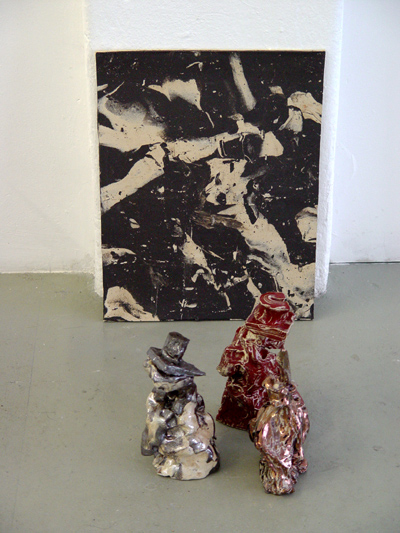
OLA VASILJEVA: detail installation 'OAOA Vestibule', 2012
7 April - 16 May 2012
installation: ceramics, video, posters
OAOA Vestibule
An exhibition installed by Ola Vasiljeva transforms the space through an intuitive staging of loose moments and mini installations, that as a whole create a kind of pleasant confusion. This ambiguity finds its essence in the way in
which she unrolls a concept for her exhibition in a given space.
In "OAOA Vestibule" Ola Vasiljeva shows her interest in the notion of "vestibule", a space that is in-between; functioning only as a passage to other rooms in the building. She refers to the vestibule as an introvert place that has
no outspoken purpose; 'A vestibule is a little bit on the edge of being a room and a corridor, it's something in between... a shy space; that doesn't necesseraly demand ones attention.'
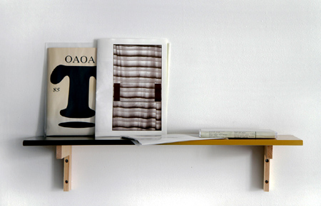 OLA VASILJEVA: bookshelve with OAOA publications and jewel box with 3 cassette tapes, 2012
Ola Vasiljeva's work broadly references arts & crafts, music, sub-cultures and classical literature. Here she introduces OAOA (The Oceans Academy of Arts) to her installation in Galerie van Gelder; a collective that exists as a
platform for ideas on art, which was founded by Ola Vasiljeva and John Hey in 2008. OAOA creates, collects and shows art with a remarkable absence of any hierarchy between what constitutes an exhibition space, a work of art or even
the roles of those involved. OAOA collaborates not only with artists, but also with musicians and people who are not specifically involved in contemporary art.
Ola Vasiljeva's work has recently been shown in Helsinki, Berlin, London, Vilnius, Los Angeles and New York. Her most recent solo exhibition was at 1646, in The Hague. To coincide with the OAOA Vestibule exhibition, The Oceans
Academy of Arts has published issue # 6 of it's zine.
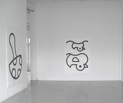 WJM KOK: exhibition view with 'Maxi-Color (Mushroom) #' and 'Maxi-Color (Ducks) #', 2012
WJM KOK in GvG
More than One of Each
18 februari - 1 april 2012
schilderijen
OPENING: zaterdag 18 februari, 17.00 - 19.00 uur
for English text see below
Het oeuvre van WJM Kok bestaat voornamelijk uit schilderijen die monochroom zijn of daarnaar verwijzen. Zo is hij bekend geworden met monochroom
beschilderde tafelbladen van Ikea-tafels die met de poten aan de muur als een schilderij worden opgehangen. En hij deinst er niet voor terug om gewoon
afdekzeil of standaard piepschuimplaten als monochrome schilderijen te presenteren. Maat, kleur, materiaal laat hij door de fabrikant bepalen. In zijn
algemeenheid maakt hij dikwijls gebruik van wat de industrie, de buitenwereld, te bieden heeft. Vandaar dat bijvoorbeeld papierformaat A4 een
standaardmaat is waarmee hij bij voorkeur werkt.
In de tentoonstelling 'More than One of Each' maakt WJM Kok andermaal gebruik van materiaal dat al bestaat, maar nu materiaal dat van hemzelf is,
namelijk grote doeken die hij maakte tussen 1988 en 1992. Voor deze serie heeft hij afbeeldingen uit een kleurboek getiteld 'Maxi-Color' als
uitgangspunt genomen en overgezet op doeken van 200 x 145 cm. Aan de hele serie is met deze tentoonstelling een concept van presenteren toegevoegd dat
de abstractie van de kleurboekafbeeldingen vergroot. Een omkering van de doeken zorgt voor een radicaal andere kijk op de gemakkelijk herkenbare
contourtekeningen uit het kleurboek. Die ingreep verandert niets aan de schilderijen zelf, maar zet met de wijze van presenteren het werk op losse
schroeven en verdubbelt de omvang van het werk. Een verdubbeling die in de vorm van een certificaat is vastgelegd met een # -teken achter de titel. Elk
doek dat voorzien is van een dergelijk certificaat geeft de eigenaar de mogelijkheid met autorisatie van de kunstenaar het werk ook ondersteboven op te
hangen.
More than One of Each
WJM Kok's body of work is comprised mainly of either monochrome paintings or of works that refer to monochrome paintings. He is known particularly for
a series of monochrome painted tabletops from Ikea tables, presented as a painting with their legs against the wall. For him, the validity of presenting
tarpaulin or sytrofoam insulation panels as monochrome paintings is not an issue. He prefers to let the size, color and material to be determined by
industrial standards. He often makes use of general formats from the outside world. For example, the standard A-4 paper size is a format that he
prefers to use.
In the exhibition 'More Than One of Each', WJM Kok makes again use of material that already exists. However in this case he uses his own material of
large paintings that he made between 1988 and 1992. In this painting series, he selected images from a coloring book entitled 'Maxi-Color' as a
departure point and transferred them onto 200 x 145 cm. sized canvases. With this exhibition, a new concept of presentation has been added which
intensifies the abstraction of the original coloring book images. The upside-down position of the paintings causes a radically different gaze towards
the otherwise easily recognizable contour drawings from the coloring book. This intervention does not change anything in the paintings themselves but
in a way doubles the scope of the series by calling into question how the work can be viewed. This doubling/duplication is furthermore recorded in the
form of a certificate with a #-sign added to the title of the work. Each canvas provided with such a certificate gives the owner the opportunity - with
authorized permission of the artist - to also hang the painting upside-down.
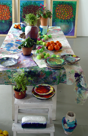 RÚNA THORKELSDÓTTIR: detail installatie, 2012
RÚNA THORKELSDÓTTIR in AP
Changing Still Lives
18 februari - 21 maart 2012
installatie
OPENING: zaterdag 18 februari, 17.00 - 19.00 uur
for English text see below
Rúna Thorkelssdóttir (Reykjavik, 1954) werkt al decennia lang met gevonden materiaal uit de natuur of wat daar sterk mee verbonden is. IJsland kent een
lange traditie van landschapschilders en Johannes Sveinsson Kjarval is daar binnen het meest bekend. Zijn werk, in combinatie van de nadrukkelijke
aanwezigheid van de natuur in dit land, beïnvloedt jongere generaties kunstenaars die veelvuldig de natuur tot onderwerp nemen. Vanwege haar jarenlange
compagnonschap in kunstenaarsboekenwinkel Boekie Woekie in Amsterdam kent Runa Thorkelssdóttir het werk van Fluxus-kunstenaars van zeer nabij. Ook zij
weet in haar werk ernst en humor met elkaar te verbinden. In haar installatie in Galerie van Gelder is te zien dat voor haar kunst en leven op een
genereuze en ontspannen manier nauw met elkaar verbonden zijn.
In de installatie 'Changing Still Lives' is een tafel bedekt met poetsdoeken uit het atelier van Runa Thorkelssdóttir. Te midden van verfborden,
beschilderd fruit, ook vers fruit, een enkele plant staan drinkglazen, wijnflessen en water voor de bezoeker klaar. Hoog boven de tafel hangen lappen
bloemetjesstof bedrukt met door haar ontworpen bloemtekeningen, die in 2009 door Comme des Garçons voor jurken, rokken, shirts en vesten gelimiteerd in
productie zijn gebracht. Op de vloer staan gelijmde vazen waarvan de gebroken stukken in verschillende kleuren voor een vrolijk mozaïekeffect zorgen.
Schilderijen met traditionele bloemen-in-vaas zijn opgebouwd uit beschilderde schijfjes citroen en staan net zoals verfborden op een vanzelfsprekende
manier op de vloer. Opmerkelijk is dat de bijeengebrachte voorwerpen op en rondom de centraal opgestelde tafel bovenal een woonkamersfeer oproepen en
daardoor onttrekt de installatie zich aan de code van een reguliere tentoonstelling.
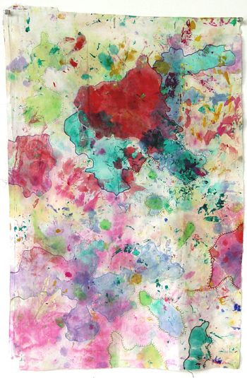
RÚNA THORKELSDÓTTIR: Paint Cloth 2, 2012 / 67 x 44 cm, paint, embroidery on fabric
Changing Still Lives
Rúna Thorkelssdóttir (Reykjavik, 1954) works already for decennia with materials found in nature or with ingredients strongly related to these. Iceland
knows a long tradition of landscape painters and among them Johannes Sveinsson Kjarval is the most outstanding one. In combination with the dominant
presence of nature in this country, Kjarval's work influences younger generations of artists who take frequently nature as a theme. Due to her
companionship of many years standing with artist's bookshop Boekie Woekie in Amsterdam Runa Thorkelssdóttir knows many works of Fluxus artists from
very close by. She also manages to connect seriousness and humour with her work. In her installation in Galerie van Gelder art and life are closely
connected to each other in a generous and relaxed way.
In 'Changing Still Lives' a table is set with cleaning cloths from the studio of Runa Thorkelssdóttir. Among plates with paint, painted fruit, a single
plant the visitor awaits drinking glasses, bottles of wine, water, nuts and fresh fruit. High above the table hang pieces of cloth with prints of
flowers, which in 2009 were produced in a limited edition by Comme des Garçons for robes, skirts and shirts. On the floor repaired vases are placed, of
which the broken parts in different colours create a happy mosaic effect. Paintings with traditional flowers-in-vase are composed with painted slices
of lemon and are just like the ceramic plates with paint in a self-evident way placed on the floor. It is remarkable that the combined objects on and
around the central placed table evoke first of all the atmosphere of a living room. With this the installation backs out of the code of a regular
exhibition.
|
.
|
|
past exhibitions:
A for artists / E for exhibitions
PART I and II
3 januari - 15 februari 2012
Jacques André
John M Armleder
Ansuya Blom
Nicolas Chardon
François Dey
Hannes van Es
Sylvie Fleury
Hreinn Fridfinnsson
General Idea
Liam Gillick / Henry Bond
Voebe de Gruyter
Kristján Gudmundsson
Sigurdur Gudmundsson
Klaas Kloosterboer
WJM Kok
Jaap Kroneman
Raphael Langmair
Jenny Lindblom
Laboratorio Saccardi
Christian Marclay
Olivier Mosset
Myne Søe-Pedersen
Steven Parrino
Henk Peeters
Steel Stillman
Joëlle Tuerlinckx
Helgi Thorsson
JCJ Vanderheyden
Lily van der Stokker
Runa Thorkelsdottir
Ola Vasiljeva
Marijke van Warmerdam
Louwrien Wijers
for English text see below
Op de tentoonstelling 'A for artists / E for exhibitions' is een aantal werken uit de jaren tachtig en negentig in Galerie van Gelder zien,
gecombineerd met recent werk van jonge kunstenaars van nu. In 1985 introduceerde Galerie van Gelder kunstenaars die aan het begin van hun carrière
kennis maakten met fluxus, pop, minimalisme en conceptualisme. Door deelname aan internationale beurzen kregen kunstenaars van de galerie voor het eerst
aandacht in het buitenland, zoals op de Stockholm Art Fair, Smart Show, Art Basel, Arco, MiArt, Art Forum Berlin: JCJ Vanderheyden (1986), Hreinn
Fridfinnsson (in 2007 solo in de Serpentine Gallery, London), Kristján Gudmundsson (1987 in Galerie van Gelder, Carnagie Art Award in 2010). In 1988
exposeerde John M Armleder met een solotentoonstelling in de galerie en daarna volgden solo's van Olivier Mosset (1990), Sylvie Fleury (1992), Steven
Parrino (1993), Lily van der Stokker (1994), Marijke van Warmerdam (1992 and 1995), Jill Magid (2003), Nicolas Chardon (2007), Ola Vasiljeva (2010) and
Louwrien Wijers (2011). En vele groepstentoonstellingen met werk van Takako Saito, Liam Gillick, Henry Bond, Christian Marclay, General Idea, Joseph
Beuys, Gerhard Richter, Dieter Roth, Glenn Ligon, Yayoi Kusama, Richard Prince, Lawrence Weiner, Wolfgang Tillmans en anderen.
The exhibition 'A for artists / E for exhibitions' is for a large part an overview of artworks the gallery has shown since its start in 1985. Quite
some remarkable works of the eighties and nineties are combined with art works of a younger generation. Galerie van Gelder introduced artists who at
the beginning of their career got acquainted with Fluxus, Pop, minimalism and conceptualism. Many of these artists were presented on art fairs such as
Stockholm Art Fair, Smart Show, Art Basel, Arco, MiArt, Art Forum Berlin through which they had access to an art world outside of The Netherlands
through which they got national and international attention: JCJ Vanderheyden (in 1986 first solo exhibition in Galerie van Gelder), Hreinn
Fridfinnsson (in 2007 solo in de Serpentine Gallery, London), Kristján Gudmundsson (1987 in Galerie van Gelder, Carnagie Art Award in 2010). In 1988
John M Armleder's first show in the gallery, followed by solo exhibitions of Olivier Mosset (1990), Sylvie Fleury (1992), Ansuya Blom (1992), Steven
Parrino (1993), Lily van der Stokker (1994), Marijke van Warmerdam (1995), Jill Magid (2003), Nicolas Chardon (2007), Ola Vasiljeva (2010) and Louwrien
Wijers (2011). And many group exhibitions with work of Takako Saito, Liam Gillick, Henry Bond, Christian Marclay, General Idea, Joseph Beuys, Gerhard
Richter, Dieter Roth, Glenn Ligon, Yayoi Kusama, Richard Prince, Lawrence Weiner, Wolfgang Tillmans and others.
15 oktober - 23 november 2011
LOUWRIEN WIJERS in GvG
persbericht / press release
Words to be framed
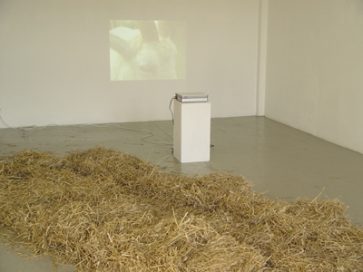
LOUWRIEN WEIJERS, view exhibition
15 oktober - 17 november 2011
JACQUES ANDRÉ in AP
persbericht / press release
De Kleine Koopman
curated by Tim Ryckaert and Amélie Laplanche of MORE Publishers, Brussels, Belgium
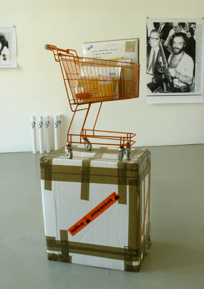
JACQUES ANDRÉ: view exhibition De Kleine Koopman, 2011
3 September - 12 October 2011
NICOLAS CHARDON press release
in GvG
STRUCTURE
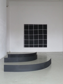
NICOLAS CHARDON, installation view of exhibition
3 September - 8 October 2011
FRANÇOIS DEY persbericht / press release
in AP
To Do This Week
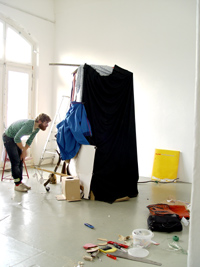 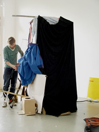
FRANÇOIS DEY: artist installing dark room/studio photo camera, 2011
In Between
21 mei t/m 3 juli 2011
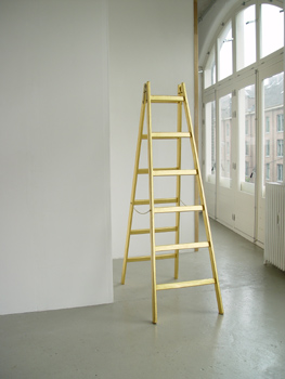
SYLVIE FLEURY: 'Ladder', 2008
ANSUYA BLOM, SYLVIE FLEURY, HREINN FRIDFINNSSON, JENNY LINDBLOM, SUZAN NOESEN, HENK PEETERS, SIGMAR POLKE, LILY VAN DER STOKKER, OLA VASILJEVA,
MARIJKE VAN WARMERDAM
9 april - 18 mei 2011
KRISTJÁN GUDMUNDSSON in GvG
RAPHAEL LANGMAIR in AP
26 February - 3 April 2011
JENNY LINDBLOM in GvG
WEI NA in AP
8 januari - 22 februari 2011
SUZAN NOESEN in AP
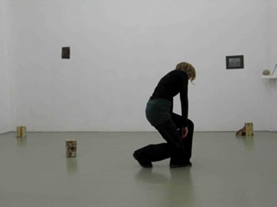
More information to gather at the opening
persbericht / press release
MYNE SØE-PEDERSEN in GvG
Reading
8 januari - 22 februari 2011
In de tentoonstelling 'Reading' van Myne Søe-Pedersen in Galerie van Gelder hangt een foto van een zwart vierkant, dicht bij het plafond. Dit zwarte
vierkant, vaag zichtbaar in een half transparante envelop, is een 6 x 6 cm negatief van een stedelijke ruimte en op deze manier niet in druk zichtbaar
gemaakt. Dit werk á la Malevich kijkt neer op de bezoekers en de andere werken in de ruimte. Het grootste gedeelte van de tentoonstelling 'Reading'
toont een verlaten ruimte van een modewinkel in Kopenhagen kort voordat het gesloopt werd. Draden, pluisjes van kleding en stukken glas zijn de
overblijfselen van zakelijke activiteiten. De non-activiteit en de stilte zijn voelbaar als een voldongen feit, maar tegelijkertijd is in de foto’s
door middel van spiegeling en abstrahering verwarring gecreëerd, die met name in de vloerpatronen en kleine kleurritmen te vinden is.
Met het gebruik van echte spiegels in de galerieruimte heeft de kunstenaar, te midden van haar fotowerken, drie nuances van tijd samengebracht:
de onzichtbare ruimte van het negatief, de gefotografeerde ruimte van de modewinkel en de fysieke ruimte van de galerie. Daarmee heeft zij
modaliteiten van tijd verweven tot een spel van waar en niet waar, echt en onecht en van verleden en heden.
English text:
In the exhibition 'Reading' of Myne Søe-Pedersen in Galerie van Gelder a photo of a black square in a semi-transparent envelope hangs close to the
ceiling. This black square shimmering vaguely through the envelope is a 6 x 6 cm negative representing a municipal space, in this way not visible in
print and therefore unrevealed. This work á la Malevich looks down on visitors and the other works in the space. A large part of the exhibition
'Reading' is showing a desolate space of a women’s fashion shop in Copenhagen before the building was demolished. Threads, bits of fluff and broken
glass are left-overs of previous business activities, while the silence is detectable as a matter of fact, yet confusion is created by means of
mirroring and abstraction through floor patterns and rhythms of colour.
With the use of real mirrors in between the works in the gallery space the artist has put together three nuances of time. The invisible space of the
negatives, the photographed space of the vanished fashion shop and the physical space of the gallery interweave past and present into a play of true
and untrue, real and unreal, past and not past.
JAAP KRONEMAN
 This is exactly what I want to say
installatie van keramieken objecten op sokkels en andere werk, 30 oktober - 22 december 2010
Jaap Kroneman is een van de grondleggers van Flat Real art, een tak van de beeldende kunst, die de concrete werkelijkheid gebruikt. De geobserveerde
werkelijkheid wordt door hem als basis genomen en in de uitvoering, in zijn werk, platgemaakt, waarbij de werkelijkheid herkenbaar geabstraheerd wordt.
In wezen is sprake van een omgekeerde vorm van 'Art Concret'. Zijn aanpak is anders dan bij kunstenaars die uit de 'Pop Art' komen, die het gewone en
de banale werkelijkheid vergroten. Evenmin is bij hem sprake van een gebruik van de werkelijkheid zoals die te zien is bij kunstenaars van de
Düsseldorfer Schule, die de werkelijkheid op een verstilde en droge manier registreren. Of zoals bij de nieuwste generatie fotografen die het
vastleggen van de feitelijkheid der dingen vervangen hebben door alleen nog maar de suggéstie van feitelijkheid te fotograferen á la Thomas Demand.
Voor Jaap Kroneman is het niet genoeg te registreren van wat er is. Hij schraapt beelden uit de werkelijkheid kaal, slaat die plat en houdt dan een
schets in zijn handen over. Het klinkt als een ouderwets beroep, maar je zou hem in plaats van een Flat Real Artist een beeldenpletter kunnen noemen.
De aanpak van schrapen en pletten van Jaap Kroneman geeft zijn werk een improviserend karakter, terwijl de kern van dat wat hij wil zeggen onaangetast
blijft, met als gevolg een wonderlijke combinatie van schets en schoonheid. Zijn beelden doorbreken dikwijls op humoristische wijze codes en zien er
bijna altijd geschonden uit, met een klaarblijkelijk satanisch plezier is dat gedaan.
|
.
|
OLA VASILJEVA
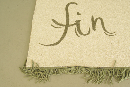
Petit-Maître
installatie met objecten en video, 4 september - 16 oktober 2010
OPENING: zaterdag 4 september 17.00 - 19.30 uur
performance: 18.00 uur
De installatie 'Petit-Maître' van Ola Vasiljeva in Galerie van Gelder bestaat uit props zoals die in een theatervoorstelling te vinden zijn, maar in
de context van een galerie zijn deze onontkoombaar meer dan requisieten voor een toneelstuk. Hier kan de bezoeker temidden van de uitgestalde
objecten rondlopen - wetend dat er sprake is van een kunstcontext, waarin bovenal artefacten te zien zijn en juist geen props. Waar het Ola om gaat
is noch prop, noch artefact. Haar opstelling en omgang met de dingen leiden tot het opmerkelijke resultaat dat de afzonderlijke voorwerpen erg
afhankelijk van elkaar zijn als die iets zouden willen representeren van wat er in de tentoonstelling als geheel te ervaren is.
In de vorige eeuw had Raoul Dufy een voorwereld van schetsen, objects trouvés e.d. die hij gebruikte voor het maken van zijn felgekleurde
schilderijen. Net zoals hij het gevondene en het voorbijgaande als zijn 'Petit-Maître' beschouwde, zo gebruikt Ola haar props met het doel een warme
huiselijke atmosfeer te scheppen. In haar interieurinstallatie wordt echter de code van huiselijkheid doorbroken, zoals bijvoorbeeld een gordijn dat
half naar beneden komt, maar dat er redelijk normaal uitziet als je het plaatst en beschouwt als een sculptuur in de context van een hedendaagse
galerie.
Ola Vasiljeva was van 2008-2010 deelnemer aan de Rijksakademie Amsterdam en heeft sinds 2008 de OAOA - The Oceans Academy Of Arts met o.a. John Hey
als collectief opgericht. De academie geeft onregelmatig een gelijknamig blad uit.
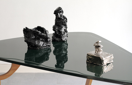
|
|
.
|
|
|
|
.
|
NICOLAS CHARDON
15 June - 16 October 2010
paintings and object
|
.
|
9 January - 24 March 2010
objects, photos, drawings, painting, printed matter, perfumes
THE EPHEMERAL
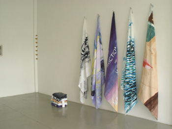
Erik Beltran
Joseph Beuys
Nicolas Chardon
Hreinn Fridfinnsson
Orpheu de Jong
Alex Katz
Karen Kilimnik
W.J.M. Kok
Jaap Kroneman
La Monte Young
Pierre Leguillon
Charlotte Moorman
Olivier Mosset
Raymond Pettibon
Elizabeth Peyton
Man Ray
Ed Ruscha
Yann Sérandour
Steel Stillman
Ben Vautier
Marijke van Warmerdam
. en presentatie CUT magazine about art, issue 7
|
|
.
|
|
PAST EXHIBITION:
MARIJKE VAN WARMERDAM
De klap voorbij / Past the blow
schilderingen op inkjet prints, di-bond/canvas
10 oktober t/m 19 december 2009
+
presentatie 'CUT - magazine about art' # 6, special issue Marijke van Warmerdam/ bi-langual: NL and ENG
met bijdragen van Maarten Doorman en Dominic van den Boogerd
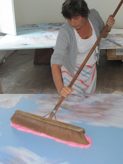
|
|
.
|
For English text see below
Het doorbreken van een idee.
Een blik in het atelier van de kunstenaar bewerkstelligt dikwijls een gevoel van intimiteit en voyeurisme. Er wordt even een inkijk gegeven van hoe het
werk gemaakt wordt. Maar het is een blik die zelden iets wezenlijks aan het werk toevoegt. Dat pleit er erg voor om geen keukengeheimen en
voorbereidingen van de kunstenaar prijs te geven.
Het kennis nemen van een mentale klap die een kunstenaar heeft opgelopen voegt evenmin iets toe aan het werk. Wat moet je als kijker met persoonlijke
zaken van de maker als die niet ter zake doende betekenissen opleveren. Toch is kunst ook therapie. Dat is niets nieuws. De hele dag door hebben wij
daarmee te maken, maar in de kunst kan het ontdoen van zielepijn vrijelijk beoefend en in de hedendaagse kunst zelfs tot thema gekozen worden. Marijke
van Warmerdam is daar altijd wars van geweest om misinterpretaties in de receptie te voorkomen. Die leiden van de zaken af.
In de tentoonstelling 'De klap voorbij' is een persoonlijke ervaring van de kunstenaar aanleiding geweest om een nieuwe reeks werken te maken, waarin
een mentale klap op een meer universele manier wordt geïncasseerd. Daarmee breekt Marijke van Warmerdam met het idee dat het persoonlijke in haar kunst
er niet toe doet.
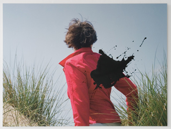
Breaking through an idea.
A glimpse into the studio of an artist often leads to a feeling of intimacy and voyeurism. A brief insight is given into how the work is made. But it
is glimpse that seldom adds anything essential to the work. That is a strong argument for not divulging any of the trade secrets and preparations of
the artist.
Neither does the knowledge that the artist has sustained a mental blow add anything to the work. What is the observer supposed to do with the personal
affairs of the maker if they produce meanings that are not pertinent? Nevertheless, art is also therapy. That is nothing new. It's something we have to
deal with throughout the day, but in art, ridding oneself of anguish can be freely practised and in contemporary art can even be chosen as a theme.
Marijke van Warmerdam has always been averse to that, in order to avoid misinterpretations in the reception of a work. They distract from the issue.
In the exhibition 'Past the blow' a personal experience of the artist gave rise to a new series of works in which a mental blow is taken in a more
universal manner. With this, Marijke van Warmerdam breaks with the idea that the personal aspect of her art is irrelevant.
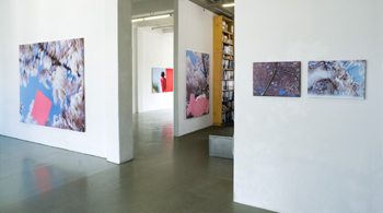
Marijke van Warmerdam is particularly well known for her film loops, which radiate a crystal clear simplicity. In her exhibition 'Past the blow' she
presents a series of paintings on photos and canvas. Her film loops are characterized by visual reduction, velocity, repetition and simplicity, and
these traits can again be found here in her first exhibition of paintings. In the front space, the same photo is relentlessly repeated five times and
these photos, which are painted with squeegee and broom, dominate the space. In the second part of the exhibition canvases with blossom branches are
shown, which evoke an unmistakable atmosphere of springtime and which are also provided with a mere streak or brush of paint. How simple may painting
become? An answer is left to the observer.
Born in The Netherlands in 1959, Marijke van Warmerdam lives and works in Amsterdam and for the past few years also in Karlsruhe. She was represented
in the biennials of Sydney, Berlin, Kwangju and Venice, among others. In 1997 she participated in Documenta X in Kassel. She has had retrospective
exhibitions in the Van Abbemuseum in Eindhoven, Migros Museum in Zurich, ICA in Boston, Muhka in Antwerp, MAC in Marseille, The Fruitmarket in
Edinburgh and IKON in Birmingham.
Issue # 6 of 'CUT - magazine about art' will be dedicated entirely to the work of Marijke van Warmerdam and the magazine will be launched in the gallery on Saturday 10 October.
|
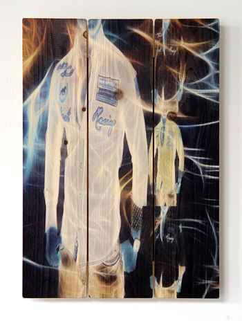
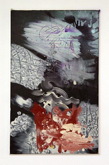
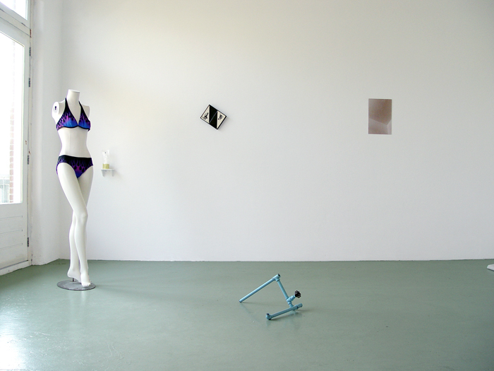
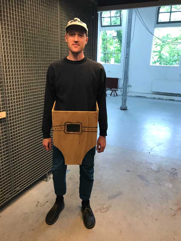
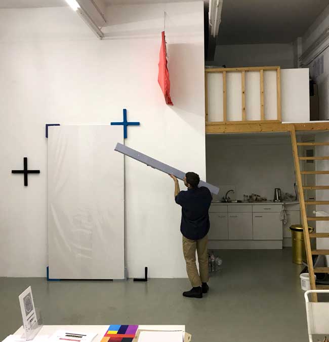
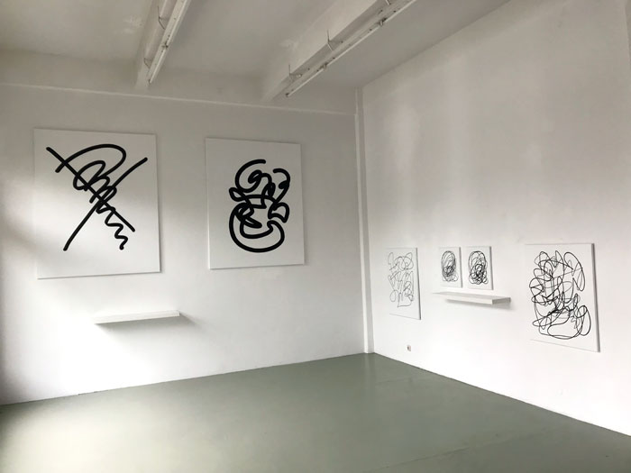
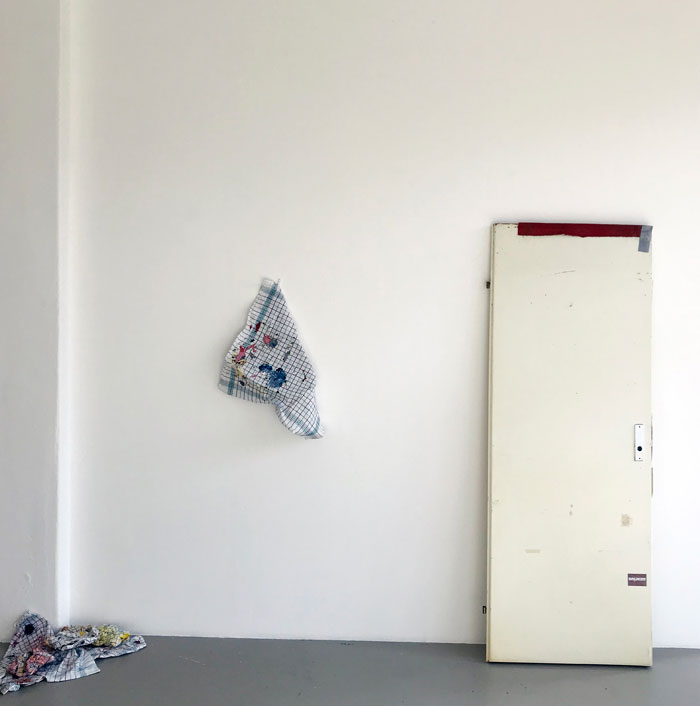
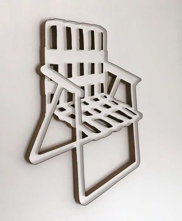
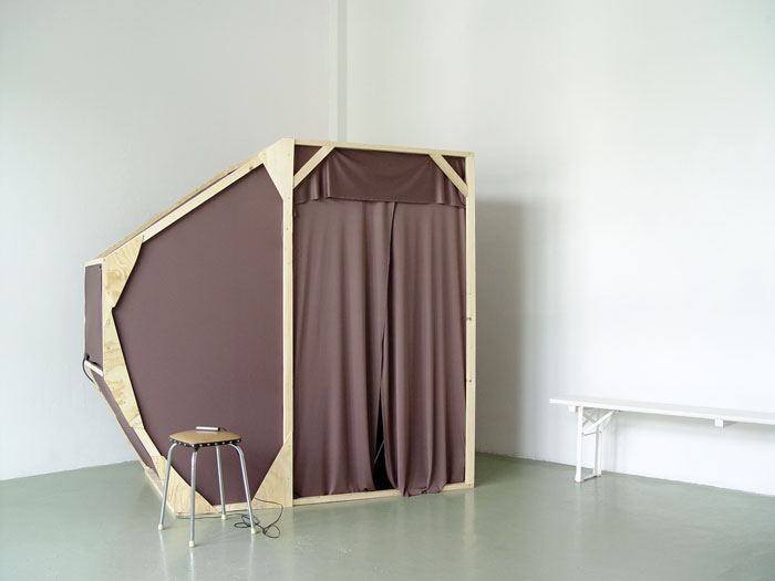
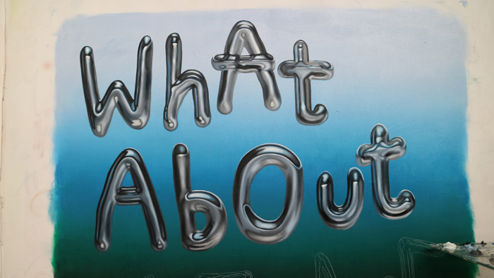
-screenshot.png)
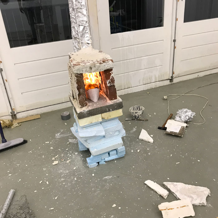
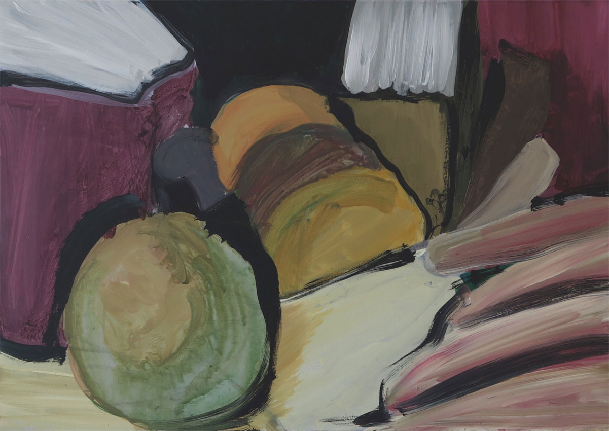
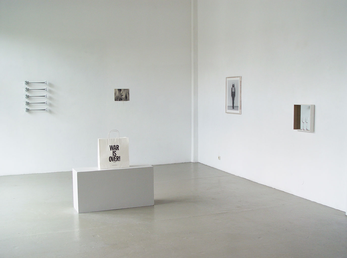